Through 12 workshops with 266 team members, I facilitated a unified vision for Wayfair's supplier platform — turning disconnected tools into one coherent, supplier-first experience.
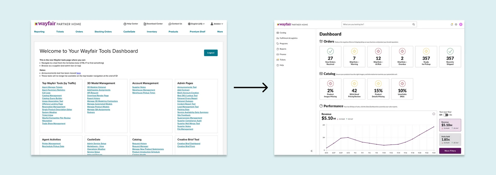
From 2013 to 2020, Wayfair built hundreds of supplier applications independently to keep pace with rapid business growth. The result was a set of disconnected tools rather than a unified platform. Suppliers had to navigate different layouts, inconsistent terminology, and applications that didn't feel related to each other at all.
Our team focused on three areas that needed the most attention: Information Architecture, Layout Frameworks, and Design Fundamentals.
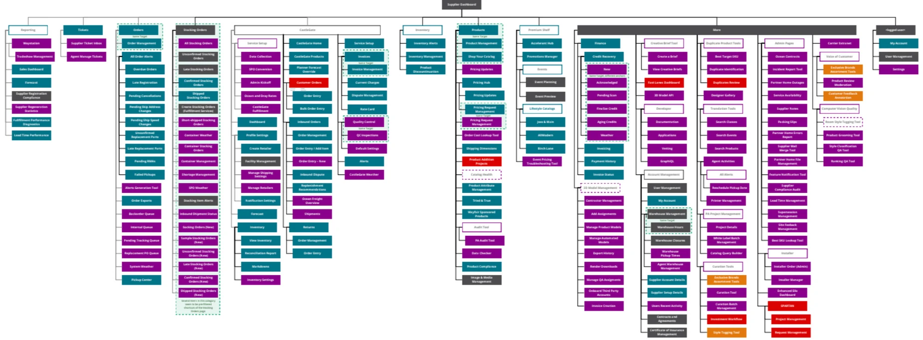
The old information architecture — disconnected applications built independently over seven years.
I collaborated with Alex and Heather to facilitate two navigation workshops with the full design org. In the first, I had 104 designers write down as many questions as possible about the navigation — a deliberate technique for keeping people from jumping to solutions too quickly. The questions that surfaced showed clear alignment: simplify the structure, use supplier language, and build around how suppliers actually work.
We then ran a card-sort exercise where groups edited the information architecture, and Heather synthesized all the edits into three distinct navigation options. I worked with Heather and researcher Chris to run a tree-jack study with real suppliers to find the winning structure.
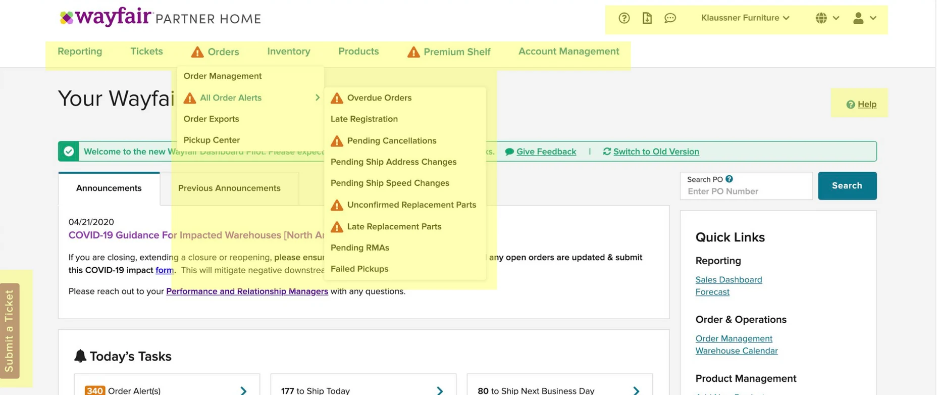
Before: the old navigation — organized around Wayfair's internal structure, not around how suppliers actually work.
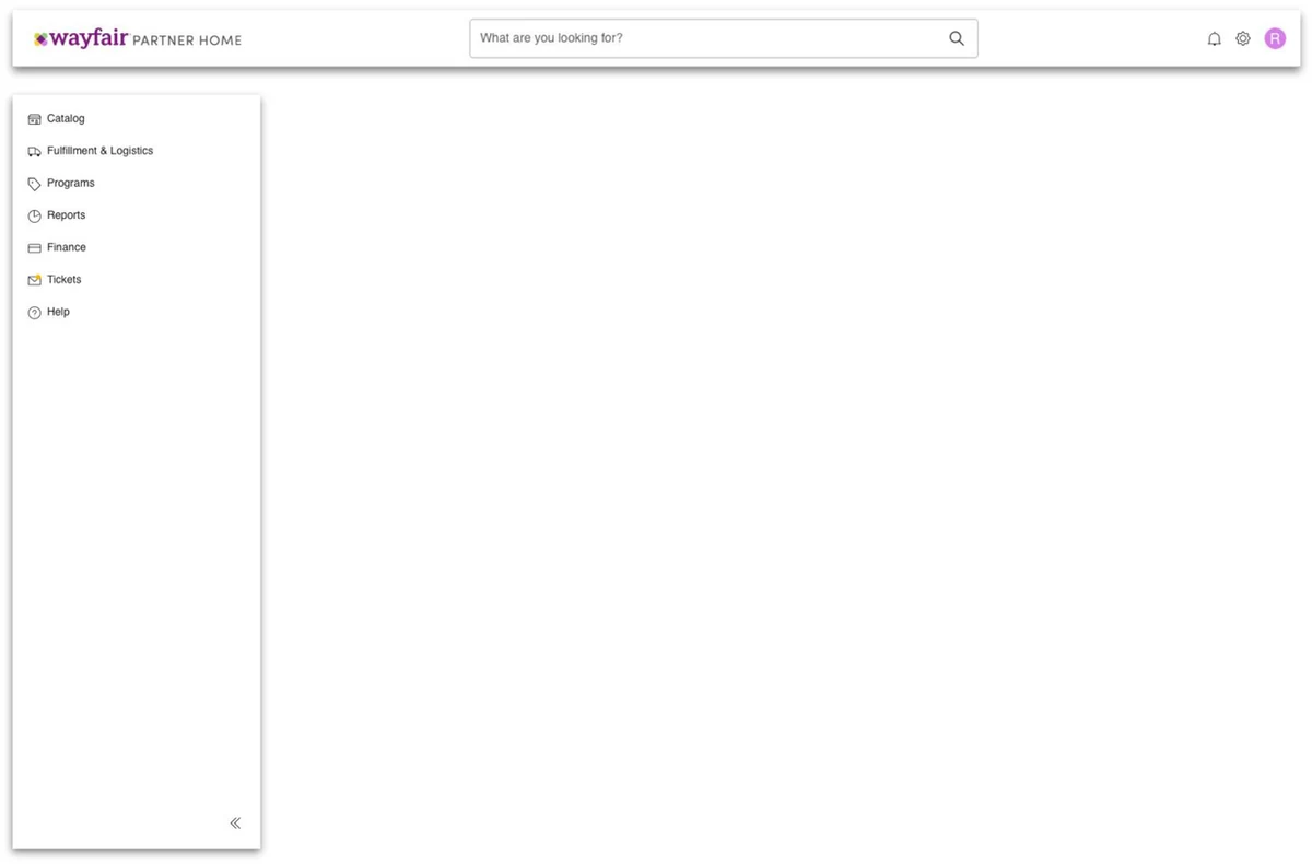
After: a sidebar navigation organized around supplier tasks, goals, and roles — validated through tree-jack testing.
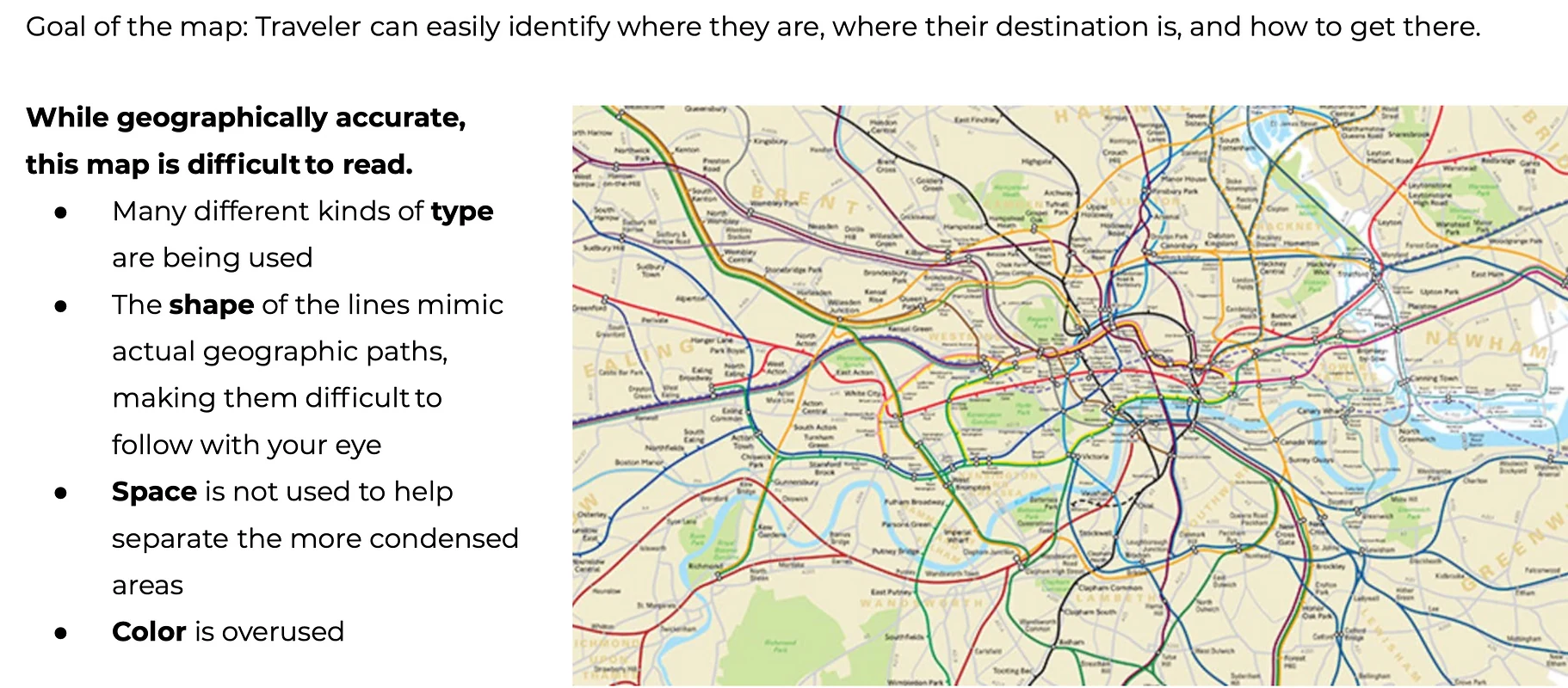
Former map of London Tube: Demonstrated to designers how something geometrically accurate isn't always easy to read.
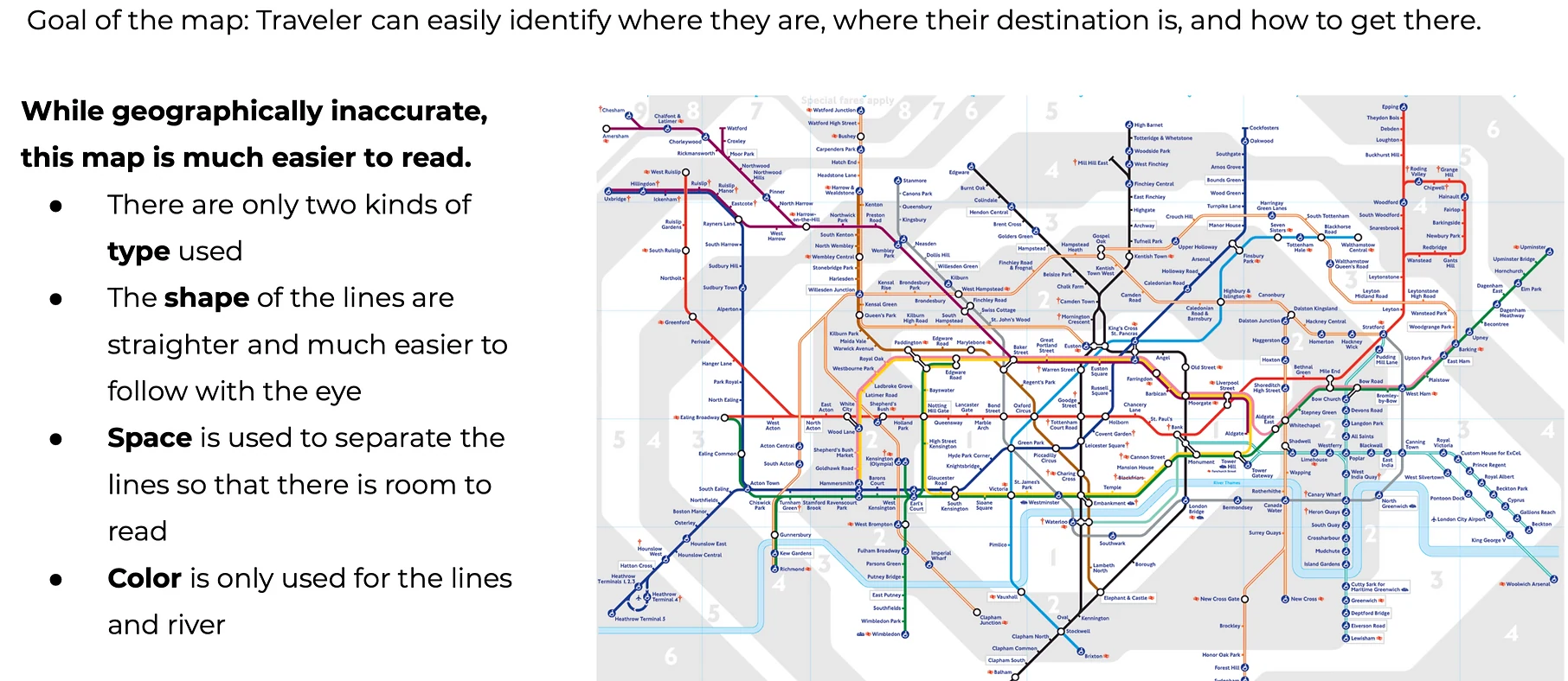
Modern map of London Tube: While geometrically accurate, it's much easier to read based on the simplification, which is what our IA and nav needed.
I ran a Design Fundamentals workshop with Pablo and Heather, opening with the London tube map as a visual metaphor. The original map is overwhelming to parse. A simplified version immediately directs your attention. The point was clear: consistent design fundamentals create clarity. The team felt it right away.
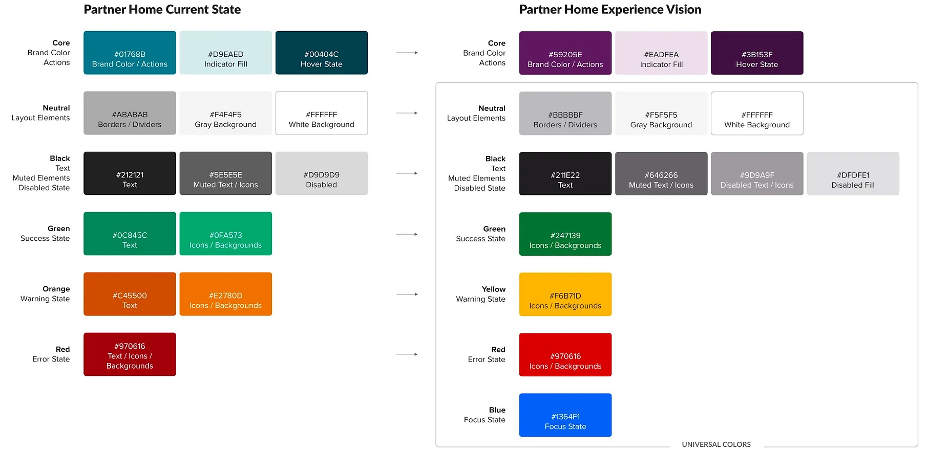
Color: a new professional palette and aligned Universal Colors shared with the Storefront design system.
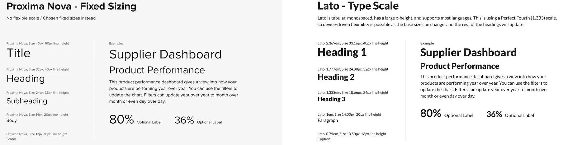
Typography: Lato with a full type scale — multilingual support, better scanability, and strong legibility.
Space: 8px grid, white space over dividers, and hierarchy created through breathing room.
Iconography: outlined icons shared with Storefront — faster to recognize, consistent across experiences.
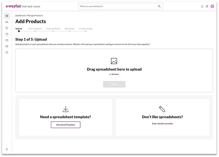
I worked with Karolina and Raquel to create a prototype showing a full "day in the life of a supplier" — logging in, checking catalog performance, using the new navigation, responding to tickets, getting in-context help, updating media, launching a product, and editing a SKU. The entire supplier journey in one cohesive flow.
I presented the prototype to senior leadership and all workshop participants. Teams immediately started asking when they could begin redesigning their applications.
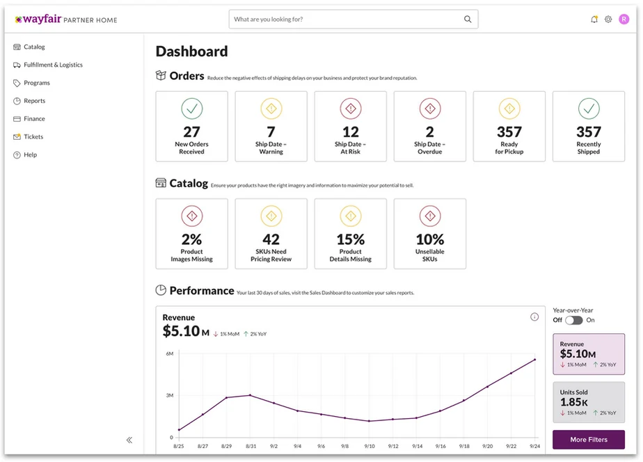
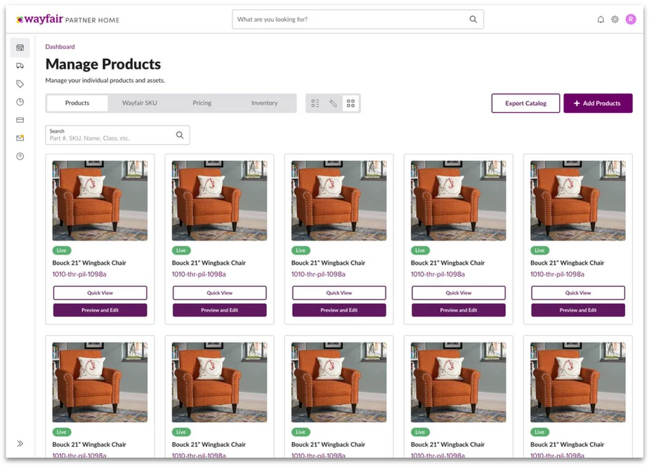
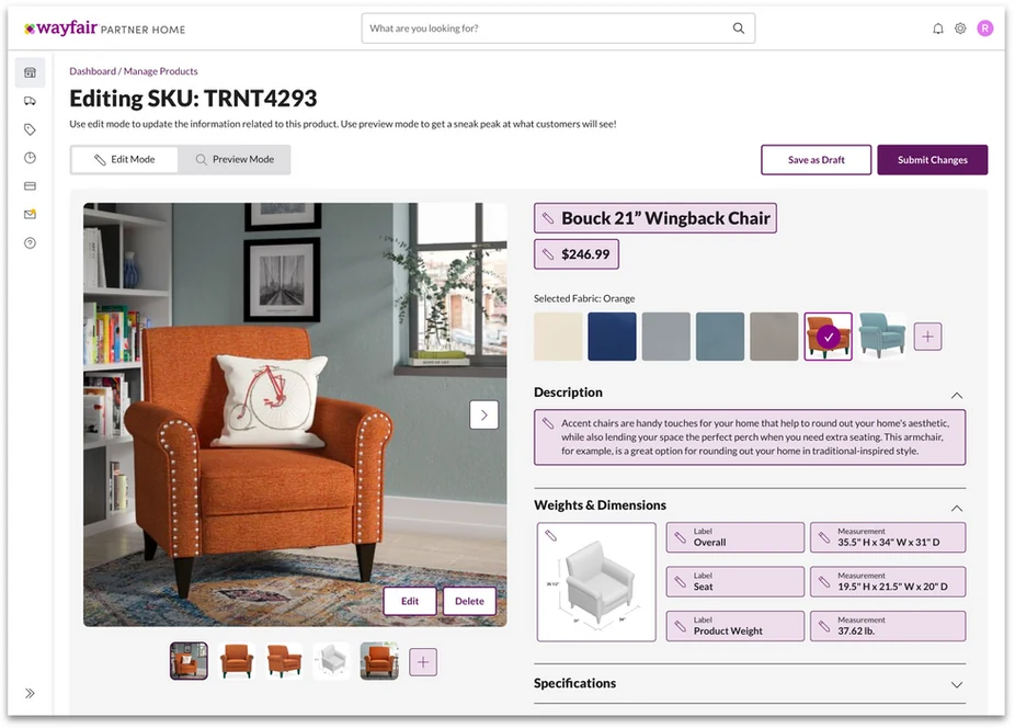
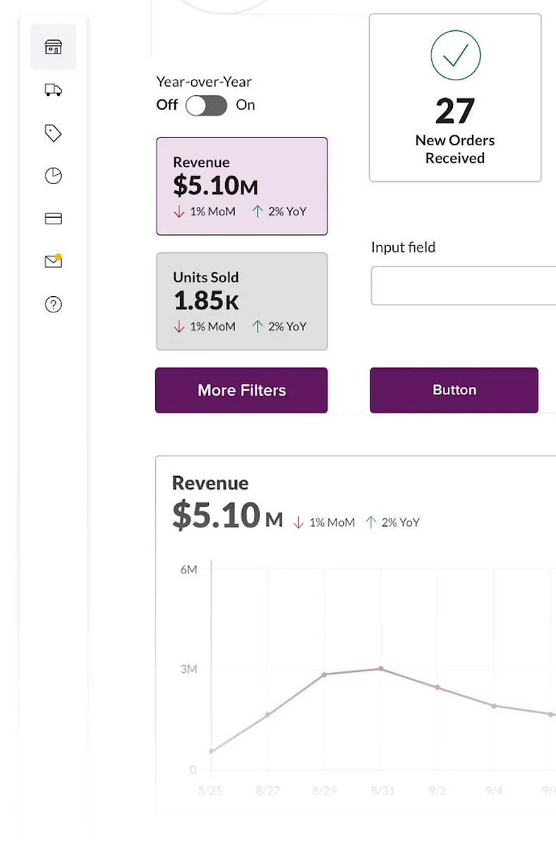
Vision prototype: dashboard, product management, catalog, and SKU editing — all in one unified experience.
After presenting the vision, Raquel and I led a "stress test" — asking a small group of designers to reflow their existing applications using the new design system. This surfaced gaps and edge cases before we asked all 27 designers to do the same. It made the broader rollout much smoother.
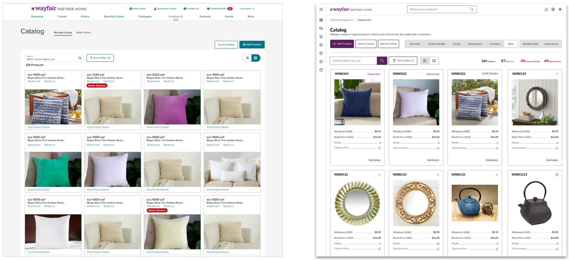
Catalog View redesigned — dramatically more scannable with the new design system applied.
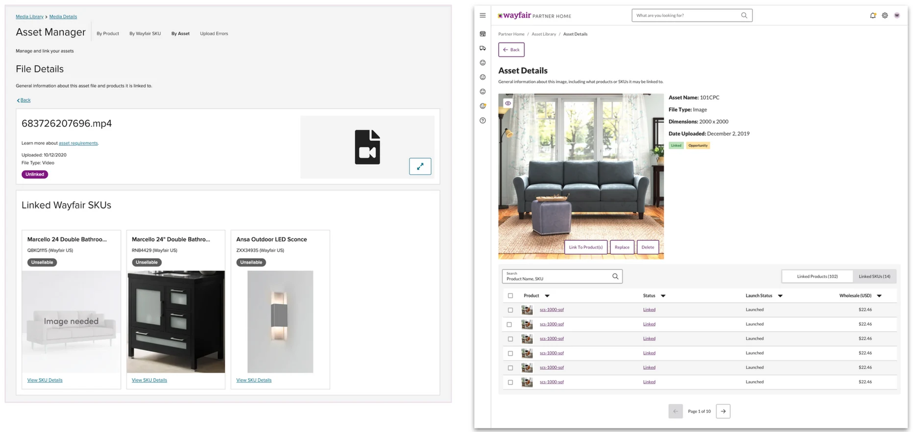
Asset Detail View redesigned — clear hierarchy through consistent type, color, and spacing.