With 27 designers adopting a new design system, I built a repeatable process for creating shared design patterns — then tested it with Status Indicators to make sure it actually worked.
Based on the Wayfair Partner Home Design Vision, 27 designers were ready to use a new design system to redesign Wayfair's entire supplier platform. For the first time, product design teams were working together on one platform rather than in silos.
But there was no process for how 27 designers could share common design patterns — combinations of components that multiple teams needed. If one team solved a pattern problem, no one else would benefit. Patterns were being reinvented independently across the org, and consistency was suffering for it.
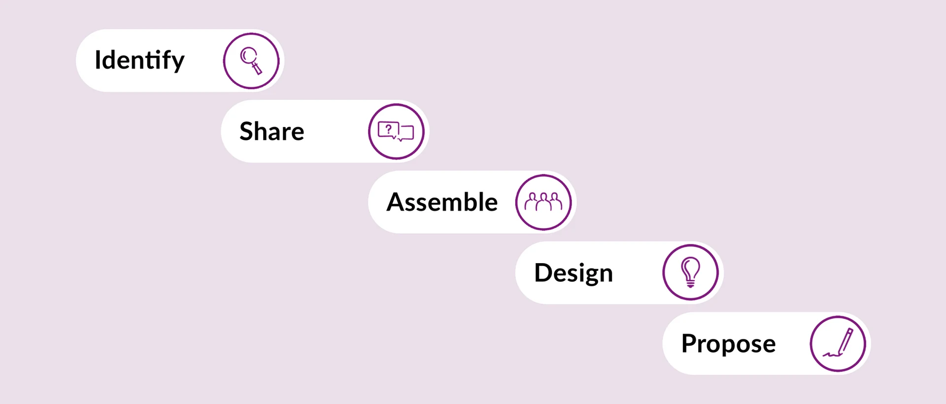
The process allowed any designer to flag a pattern they needed in their work, share it with the design system team (Homebase) and the platform team to check for overlap, assemble the right cross-functional group using a membership table I created, design and test the solution together, and formally propose it as a shared pattern for the whole org.
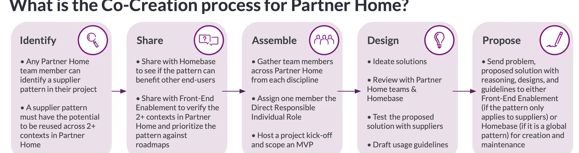
The five-step co-creation process — from identifying a pattern problem to org-wide adoption.
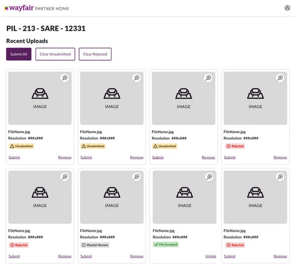
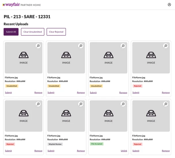
Status indicators were inconsistent across the entire supplier platform. The same concept — "this item needs your attention" — was expressed with different visuals, colors, and language in different applications. Pablo Franco and I identified this as the right first test case for the new process.
Inconsistent status indicators across the supplier platform — the same concept expressed differently everywhere.
I asked Will and Maryna to start with competitive analysis of other design systems. Kristen drafted status definitions and consolidated labels across the platform. The team then explored multiple visual directions — but an assumption surfaced along the way: that toned-down visuals would be preferable when so many statuses appeared on the same page. User testing proved that assumption wrong.
Three visual directions explored. The toned-down version (A, far right) was the team's initial assumption — but testing showed suppliers strongly preferred B and C.
Runming and I conducted seven user tests with real Wayfair suppliers. The results surprised us: zero out of seven chose the toned-down visuals. Three preferred badges with icons, and three preferred badges without — the icon variant won because it helped suppliers who spoke English as a second language understand statuses more quickly. Suppliers also naturally expected a popover to appear when hovering over a badge.
Kristen and I submitted three proposals to Homebase: adding icons to badges for accessibility, allowing a popover on badge interaction, and introducing a standardized global status label list. All three were approved.
Then I ran a retrospective with the co-creation team. What went well: cross-functional collaboration and frequent design critiques. What to improve: the scope grew too wide as we pulled in more designers, which slowed us down. I added a formal "Assemble" table to help future teams decide exactly who needed to be involved — no more, no less — and added a kickoff step to the process.
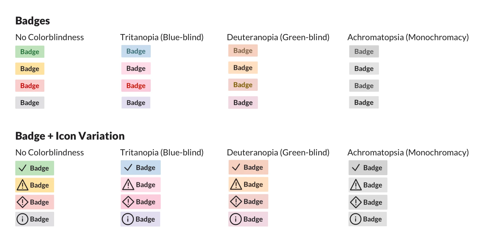
Final proposal: badges with icons for accessibility, tested across colorblindness scenarios.
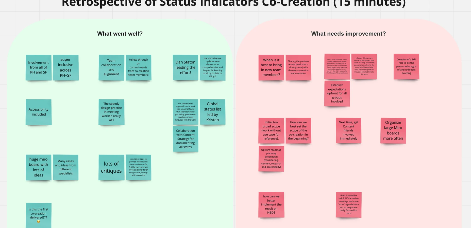
The retrospective that refined the process — identifying scope management as the key improvement area.