Building a design system from scratch for 500+ enterprise applications — components, usage guidelines, version control training, and the contribution process that helped 70+ designers grow it together.
For every component, the process was the same: identify the gap, research and competitive analysis, define MVP user stories, design and wireframe, feedback from design and engineering, iterate, write usage guidelines, release, and maintain.
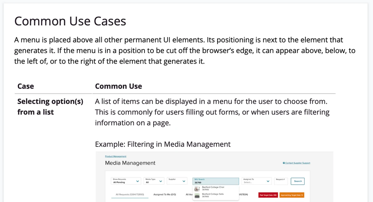
The existing MenuList component only supported a single line of text. Designers across the platform were creating custom dropdown menus to support secondary text, images, icons, and status — and causing inconsistency everywhere they did. I managed this component project while a student co-op, Sophia, led the design work herself.
We defined five user stories covering secondary text, images, icons, multi-select, and nested items. Sophia designed wireframes and mocks, we reviewed with design and engineering, iterated based on technical constraints, and released a component any designer could configure to their exact needs.
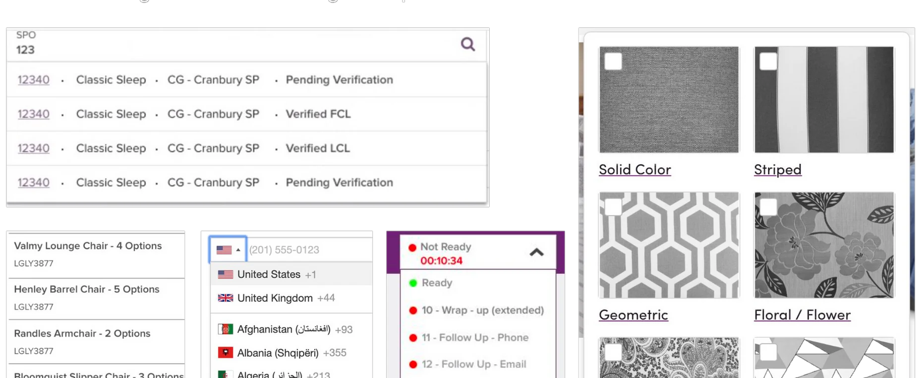
Before: custom menus created across the platform because the existing component was too limited.
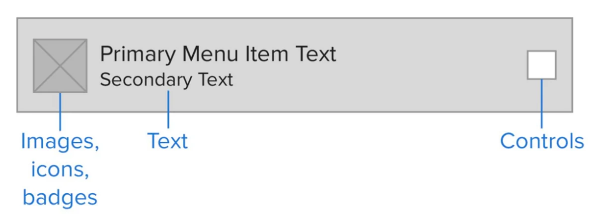
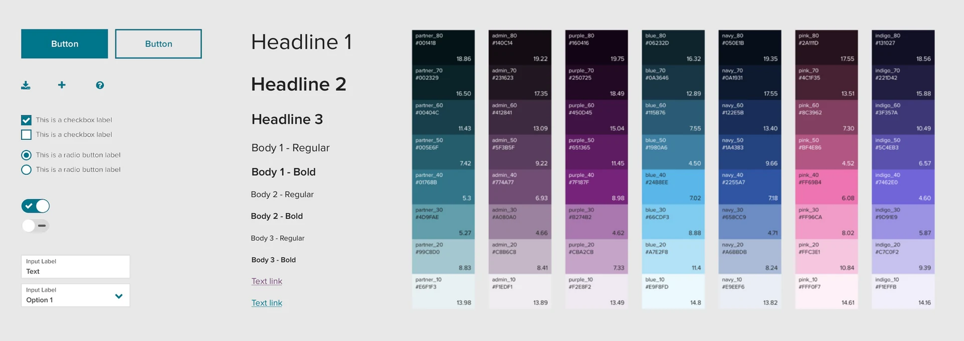
The new MenuList: all features as configurable options — secondary text, images, icons, multi-select, and nested items.
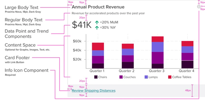
Data Point Card — for consistent dashboard metrics and statistical displays across the platform.
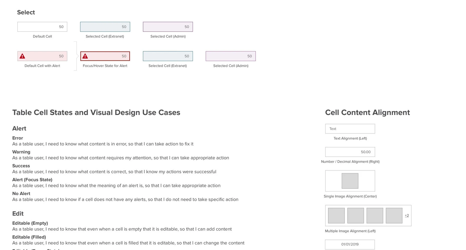
Table component — the most complex in the system, from simple data views to inline cell editing.
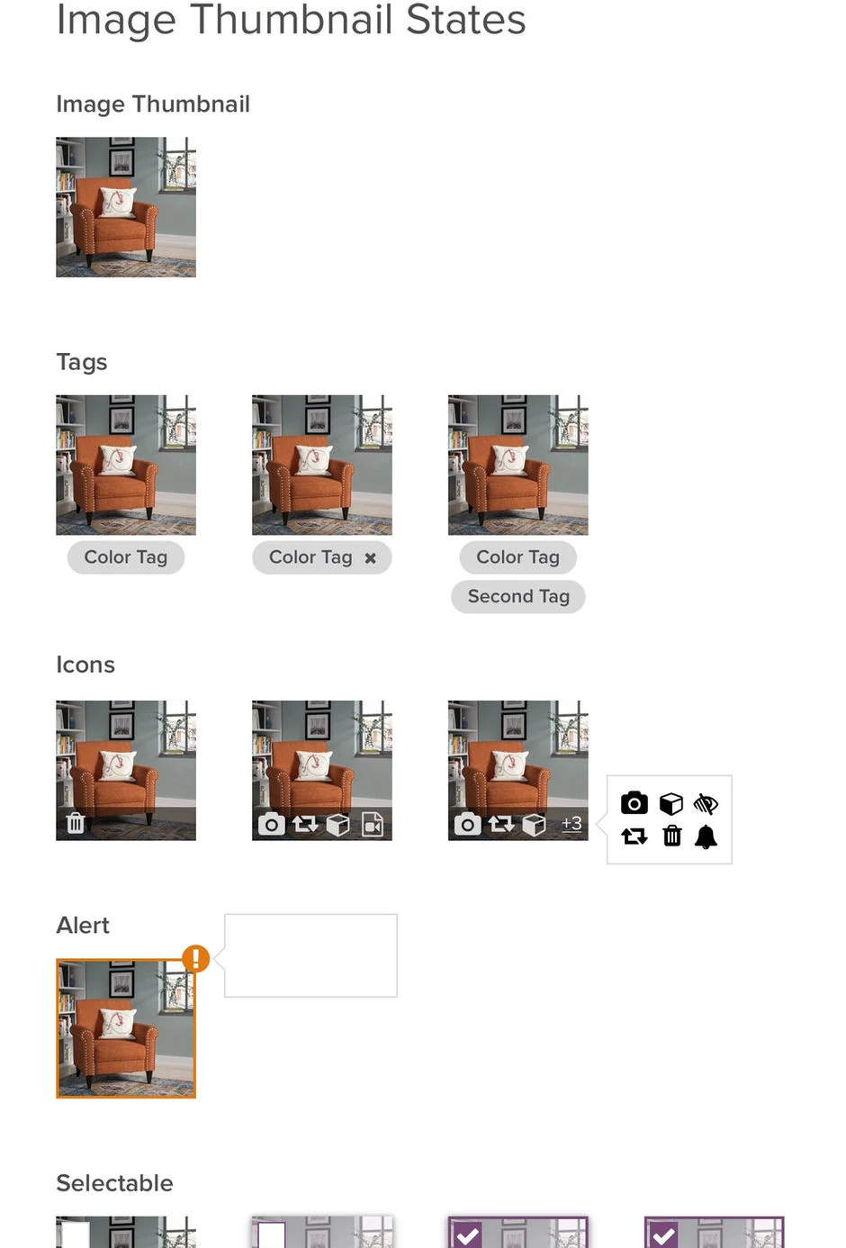
Image Thumbnail — replacing inconsistent image displays with one flexible, configurable component.
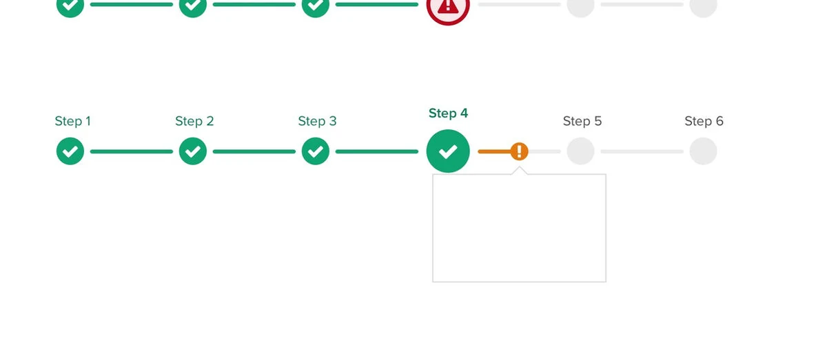
Progress Stepper — updated with icons, status indicators, and mid-step alerts based on team feedback.
Every component I shipped came with detailed usage guidelines published to the Homebase design system site. Writing clear, specific guidelines was one of the most important parts of the work — a component without good guidance gets misused or ignored. I made sure each component's page covered when to use it, when not to use it, what the different configurations mean, and how to apply it accessibly.
Good guidelines reduced the number of one-off questions we got, helped new designers onboard faster, and made it possible for the system to scale without the core team becoming a bottleneck for every decision.
Usage guidelines on the Homebase design system site — clear guidance on when to use each component and how to apply it correctly.
When Wayfair decided to adopt Abstract for design file version control, our team needed to get 70 enterprise designers up to speed quickly. This was one of the parts of the job I enjoyed most — as a former teacher, I love finding ways to help people learn new tools without feeling overwhelmed.
I created an "Abstract 101" onboarding training session from scratch, covering what Abstract is and why we were moving to it, the core concepts of branching and merging, how to review and approve changes from teammates, and common workflows for day-to-day design file management. I ran the live session multiple times and kept the documentation updated as the tool evolved.
Beyond Abstract, I also built broader onboarding training for designers, engineers, and PMs — covering what a design system is, why using one matters, and how to get started with Wayfair's system specifically. This gave everyone who joined the org a strong foundation from day one.
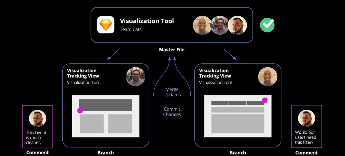
Abstract 101 training — helping 70 enterprise designers learn version control for design files.
A design system can't scale on the core team alone — it needs contribution from everyone. One of the things I'm most proud of from my time on Homebase is creating a clear, accessible contribution process that any designer in the org could follow.
The process walked through every stage: identifying a component gap, checking with the Homebase team to avoid duplication, assembling the right cross-functional group, designing and testing the solution, and submitting a formal proposal for review. We communicated it broadly through Slack, email, and Show & Tell, and built it into new hire onboarding so it became part of how designers thought about their work from the start.
This contribution model became one of the foundations for the Co-Creation Process I formalized later when the org expanded to 27 designers.
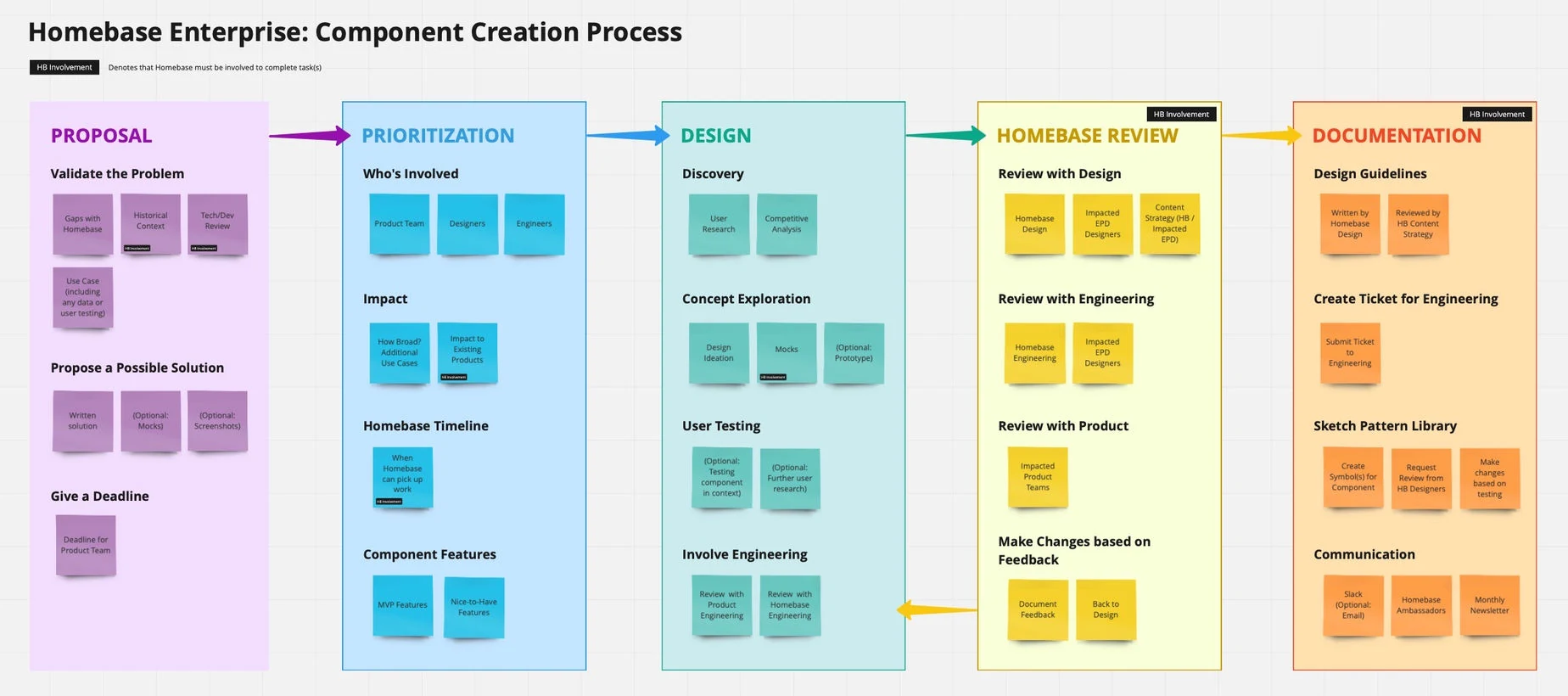
The Homebase Component Process I designed — a clear, visual guide for any designer to contribute to the system.