Drawing on 40+ user interviews, I designed a tool to replace a costly third-party product — finally built around how media employees actually work.
Wayfair was using a third-party Digital Asset Management (DAM) tool to store images, icons, videos, and documents across the company. It was expensive to license and over time had become disorganized and difficult to search effectively — leaving employees frustrated and the business paying for something that wasn't delivering the value it should.
Our task: design a new internal Wayfair Asset Management tool that could replace it entirely — and build it around the real workflows of the people who used it most.
Wayfair stylists create furniture scenes for the website — they need to browse and search thousands of 3D models, save the ones they want, and export them to scene-building software. We launched the first version of the tool specifically for stylists, then iterated based on their feedback before expanding to other user groups.
Over 40 interviews and usability testing sessions, I built a detailed stylist persona and mapped their complete workflow. Two findings shaped the design most:
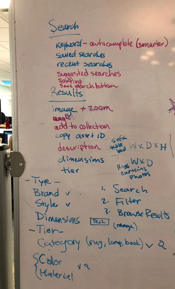
Whiteboard explorations before going digital — working through the stylist search and save flow on paper first.
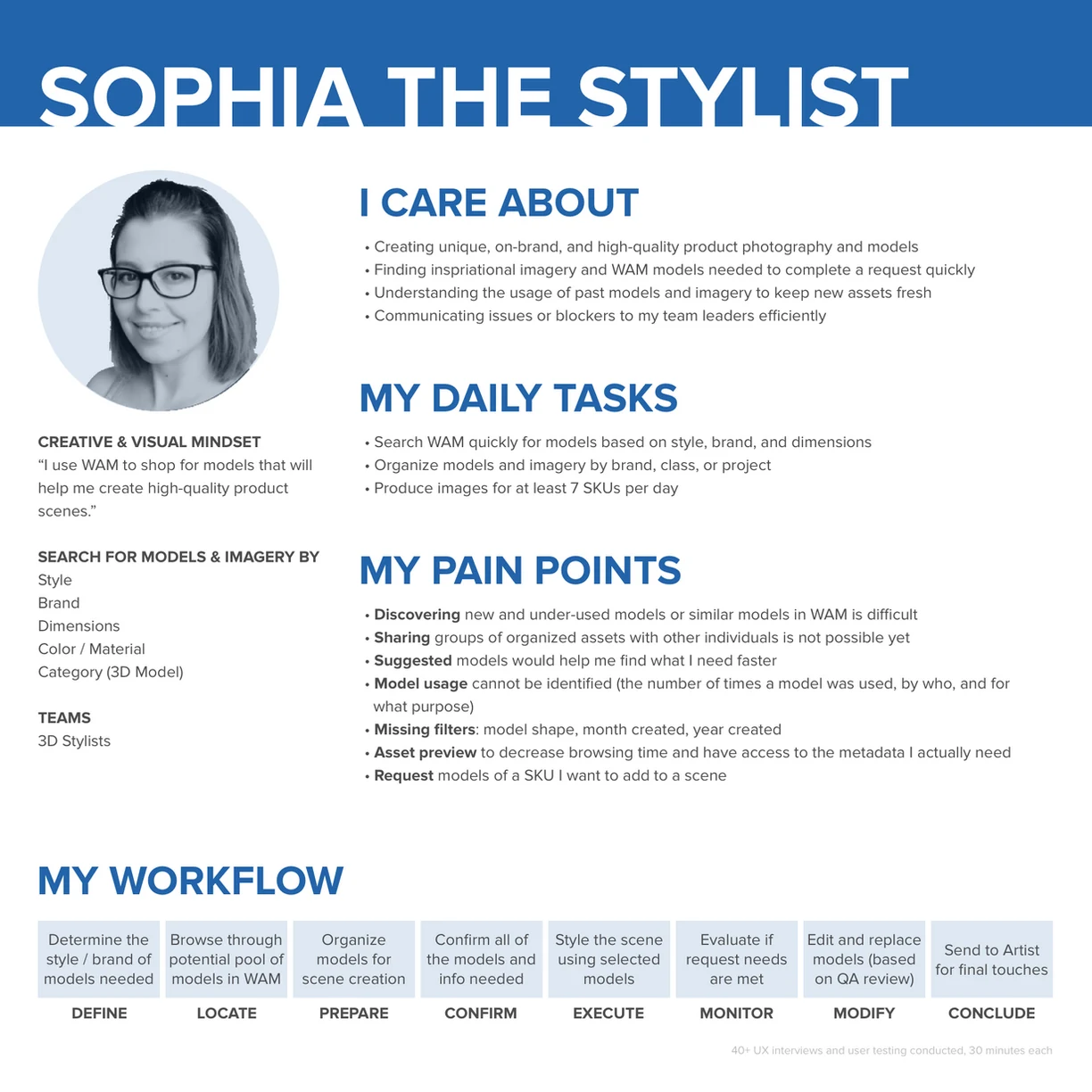
Stylist persona — grounded in the real daily workflows of Wayfair's 3D image team.
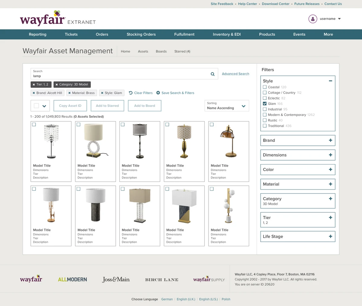
Lo-fi search design — filters ordered by stylist priority, assets selectable for export.
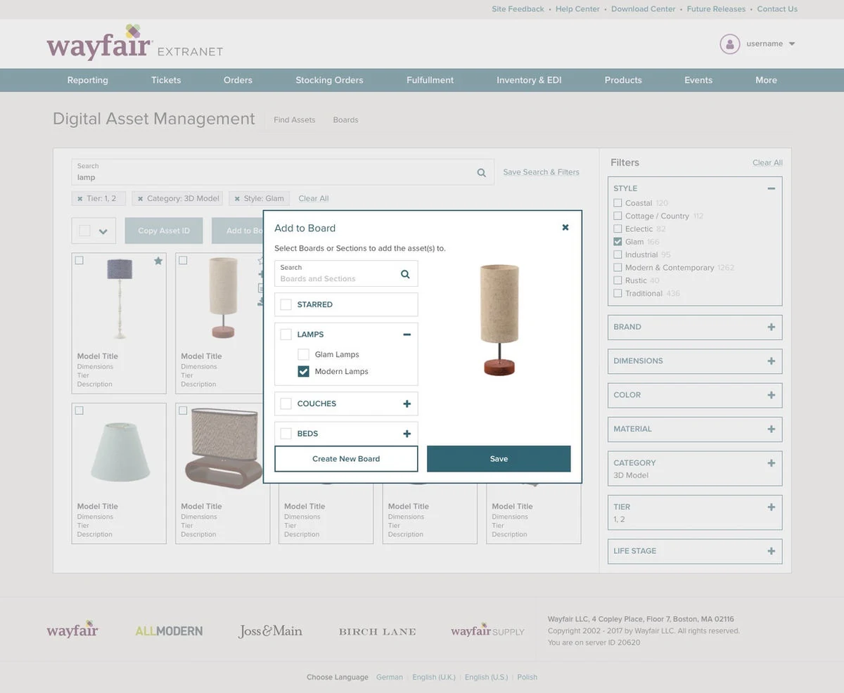
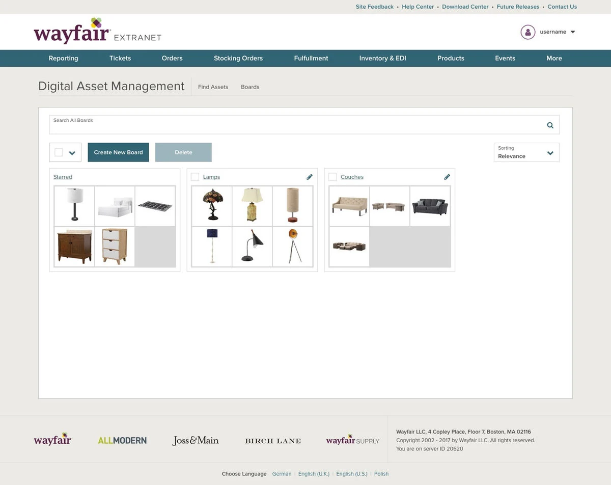
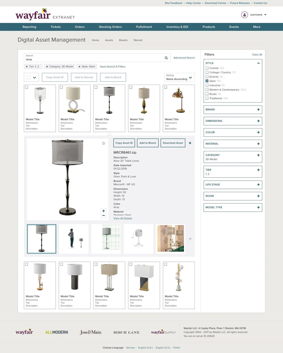
Add to board, manage saved boards, and expanded preview with inline metadata — three experiences built around how stylists actually work.
After launching for stylists, I expanded research to all media employees — conducting eight additional interviews with "Requesters" (employees who order and manage imagery from suppliers and marketing teams), then working with PM Nick Jones to complete interviews with the remaining media employees across all roles.
The result was a complete set of six personas and a workflow map showing every media role and the tasks they performed with imagery and 3D models — giving the whole team a single shared picture of who we were designing for.
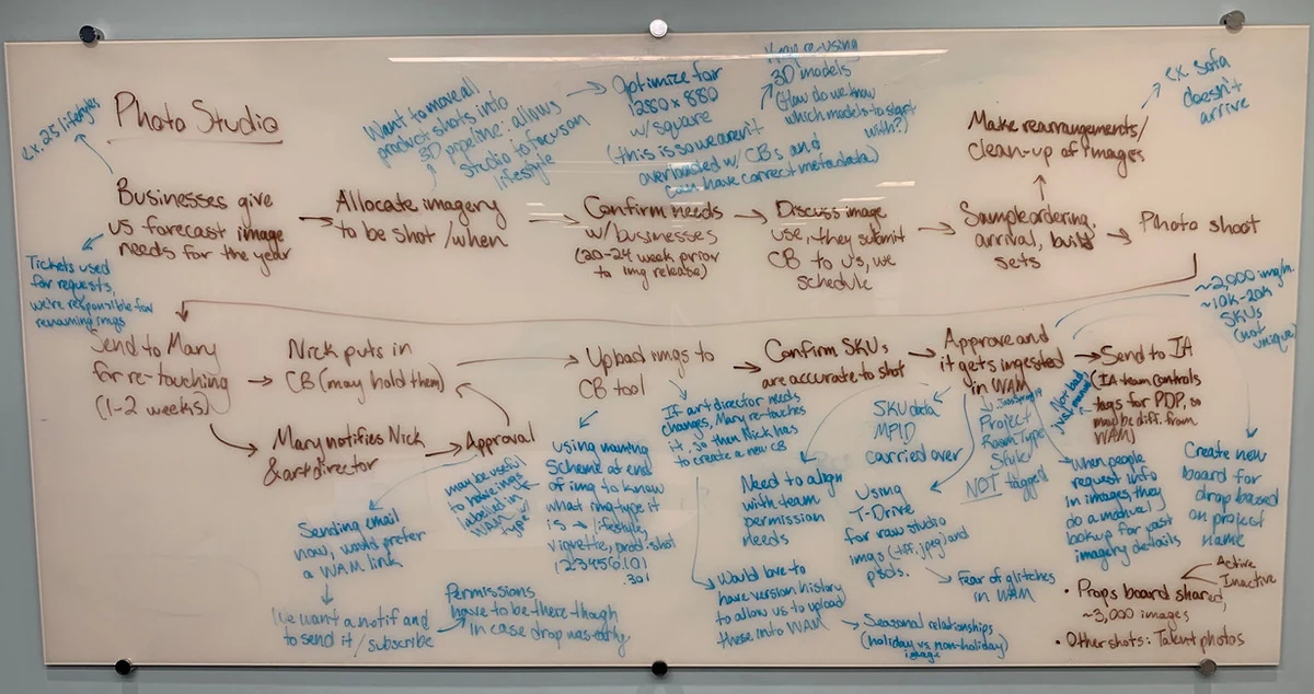
Whiteboard flow mapping the Requester workflow before designing their experience.
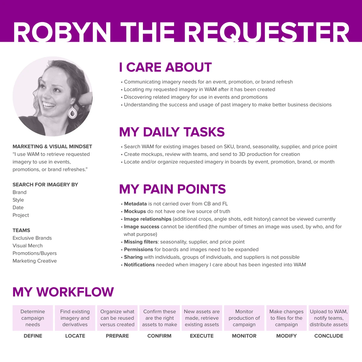
Requester persona — built from eight interviews with employees who order imagery across the business.
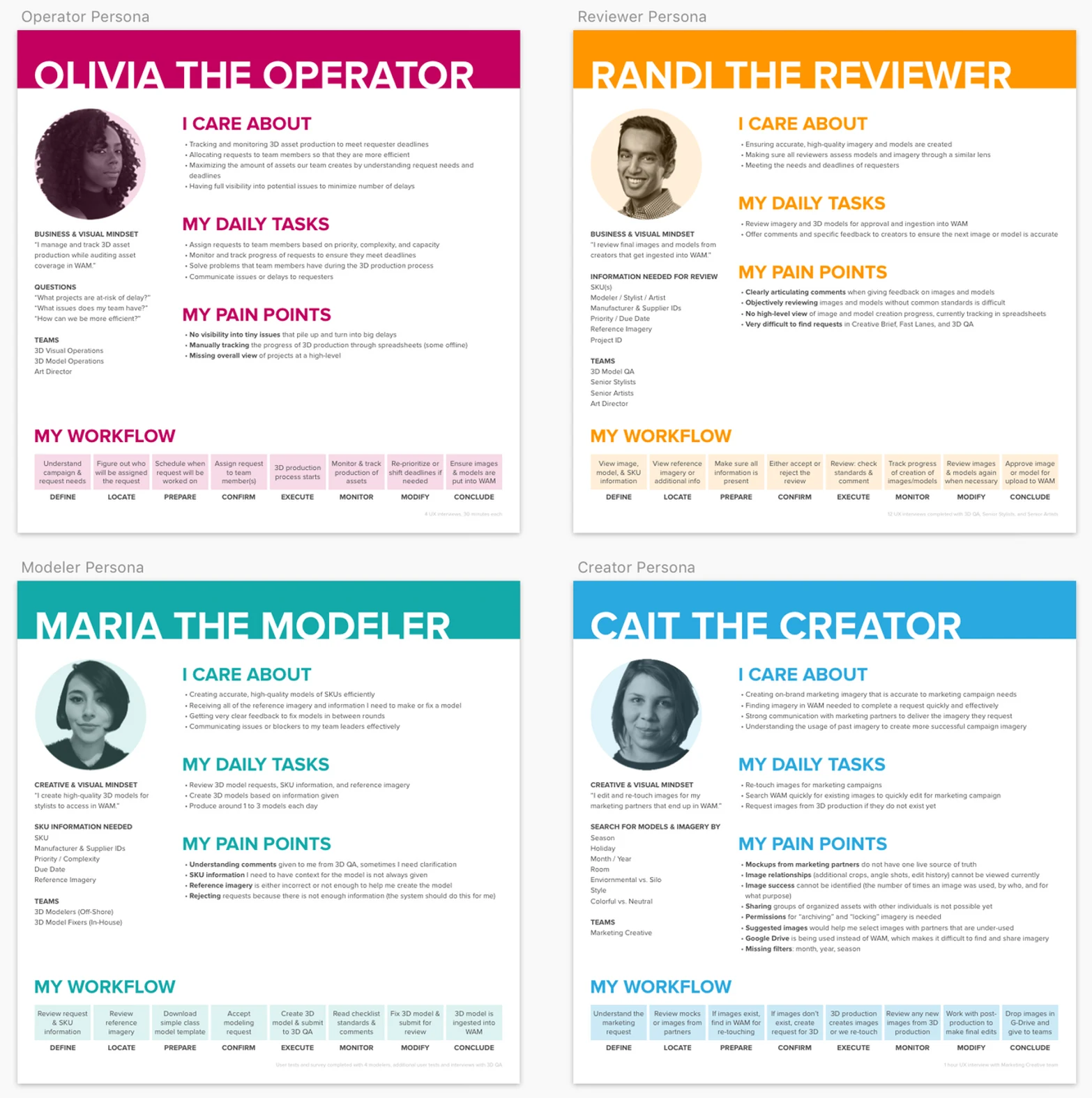
All six WAM personas — the full picture of who we were designing for.
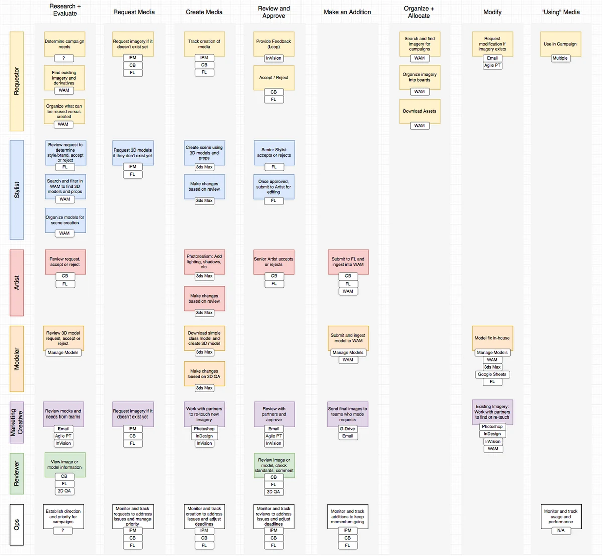
The complete media workflow map — every role, every task, used as a shared reference throughout all design decisions.
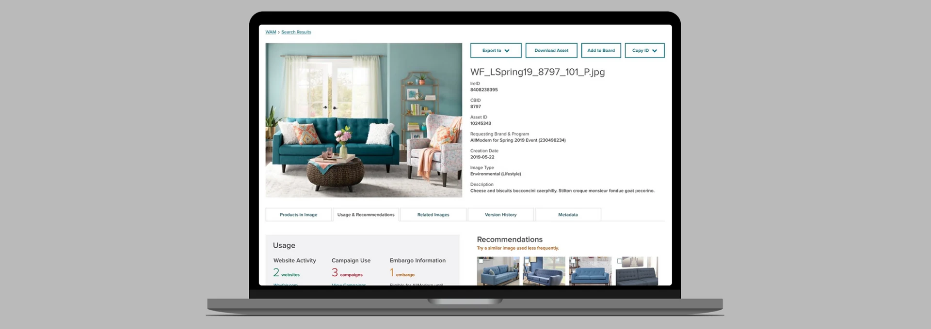
Individual asset pages had long, unstructured metadata lists that were hard to parse. I used a card sort to understand how different users grouped metadata together, then held a design studio with the team to sketch layout options. The result was a tabbed layout that grouped information logically, tested well with users, and required only one small adjustment after testing (swapping the order of two tabs).
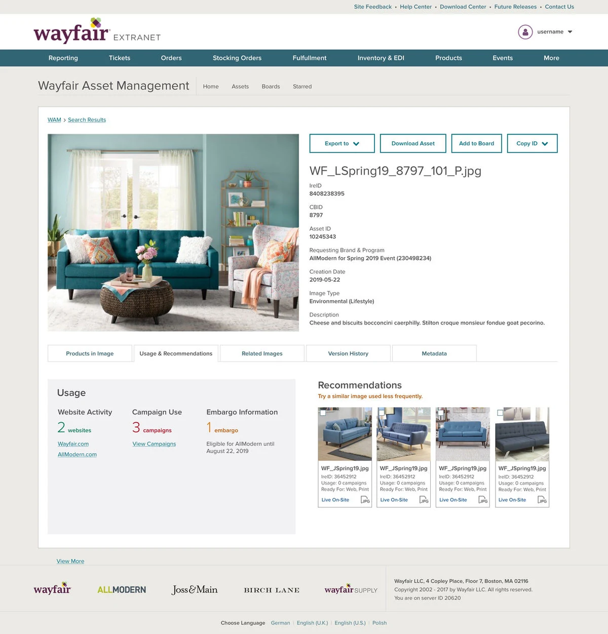
The new asset metadata view — tabbed layout surfacing the most important information immediately.
Rather than dropping users straight into a search results page, we designed a homepage built around three distinct needs: quickly starting a new search (Find), seeing suggested assets relevant to their role (Discover), and picking up where they left off in a previous session (Continue). I designed the full vision first, then we delivered it incrementally across sprints.
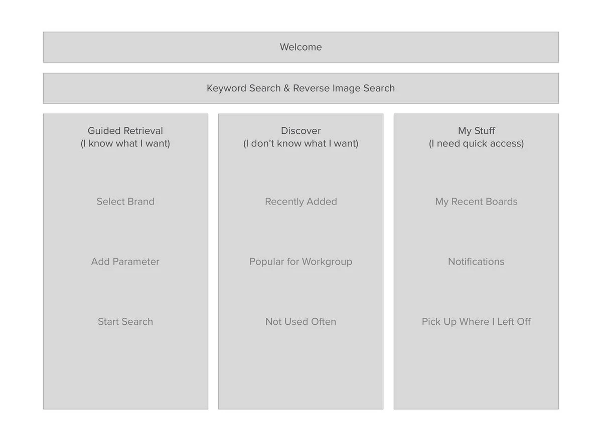
Lo-fi homepage layout — Find, Discover, and Continue as the three anchoring zones.
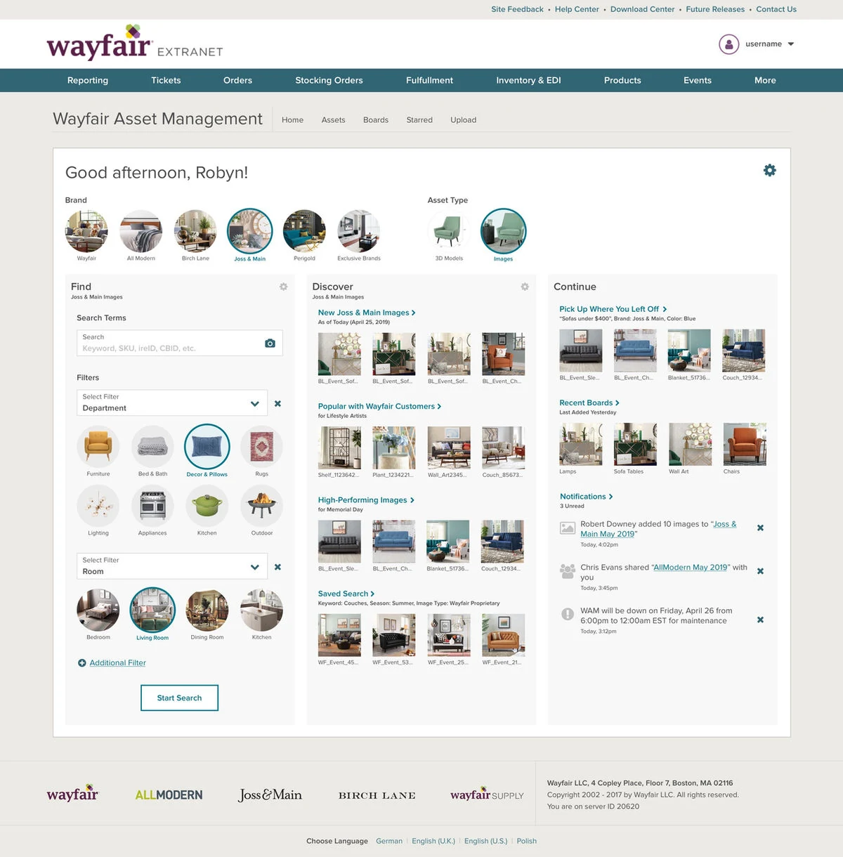
Full homepage vision — showing what each zone looks like with personalized content.
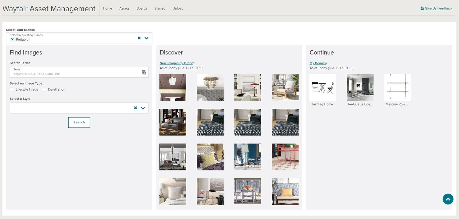
First live implementation of the homepage — matching the vision while building the personalization layer incrementally.