After four interviews and a side-by-side redesign, I rebuilt a cramped, error-prone QA tool — and three-plus years later, employees were still calling it one of the best redesigns they'd seen.
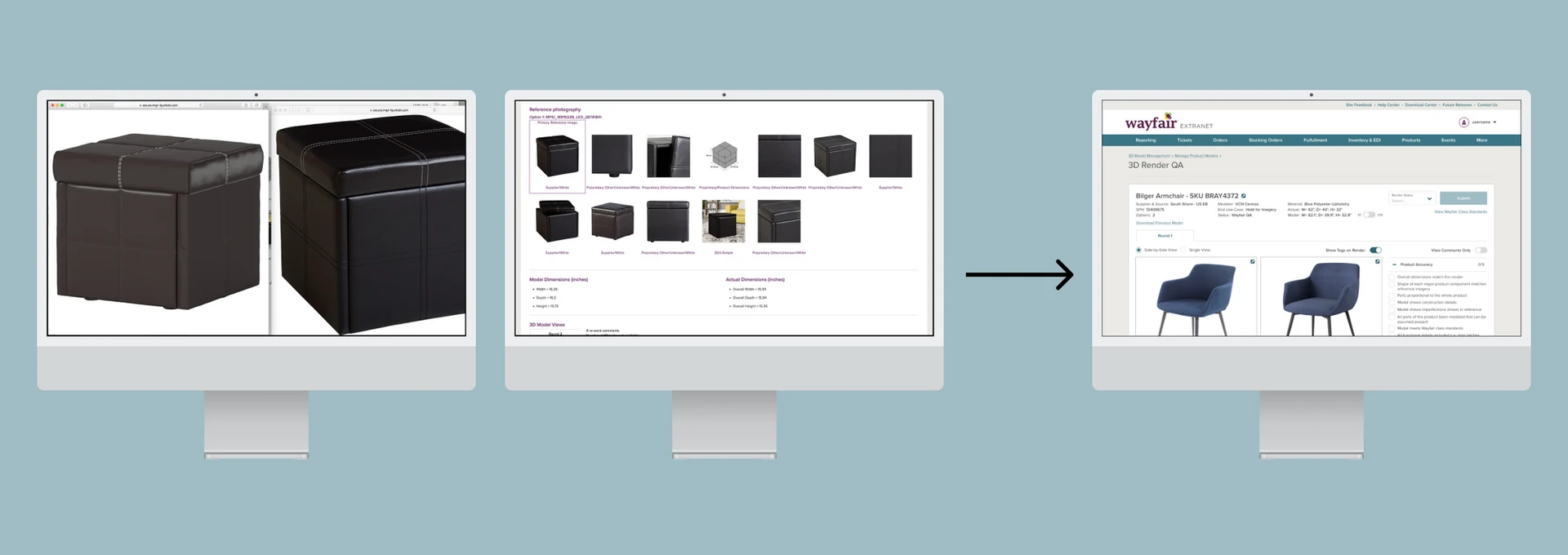
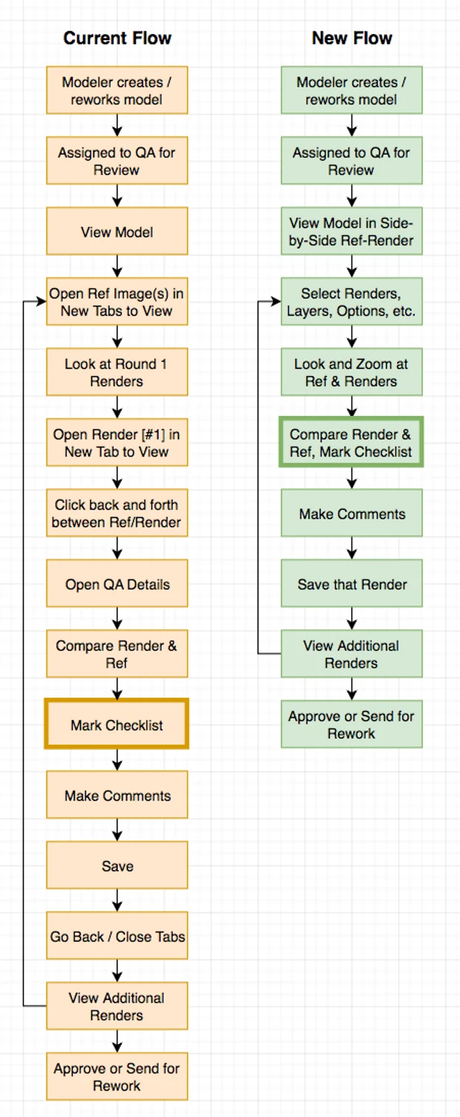
Every 3D model that appears on Wayfair's website goes through quality review before going live. The existing QA workflow required opening each reference image and each 3D render in a separate browser tab — sometimes up to 10 tabs for a single model — while keeping a separate Excel checklist open in another window.
Moving through all of those tabs and windows constantly was slow and prone to error. I interviewed four 3D QA employees and asked each one to walk me through a complete review. I was genuinely surprised by how long even a single model took to QA.
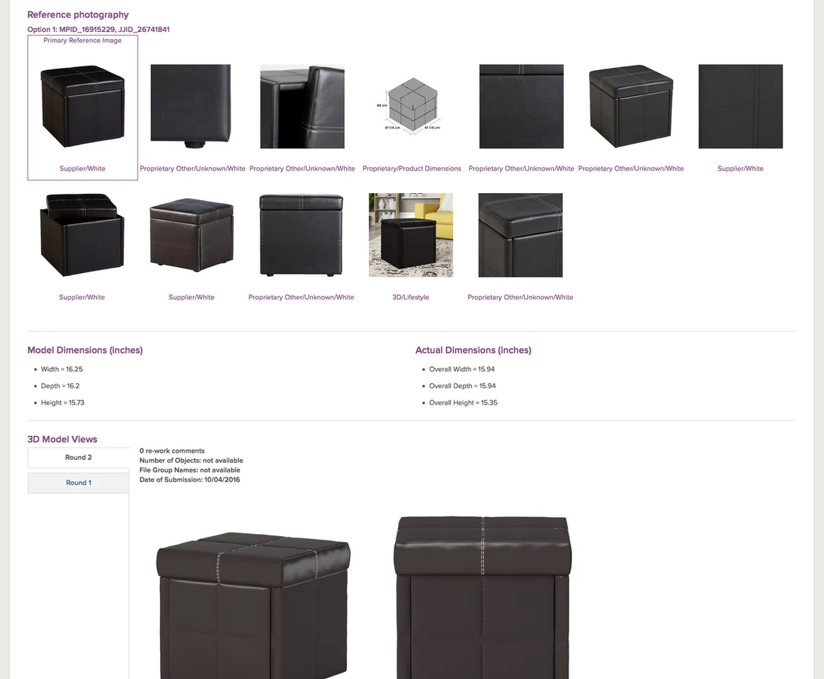
The original workflow — six steps requiring multiple tabs and a separate spreadsheet for the checklist.
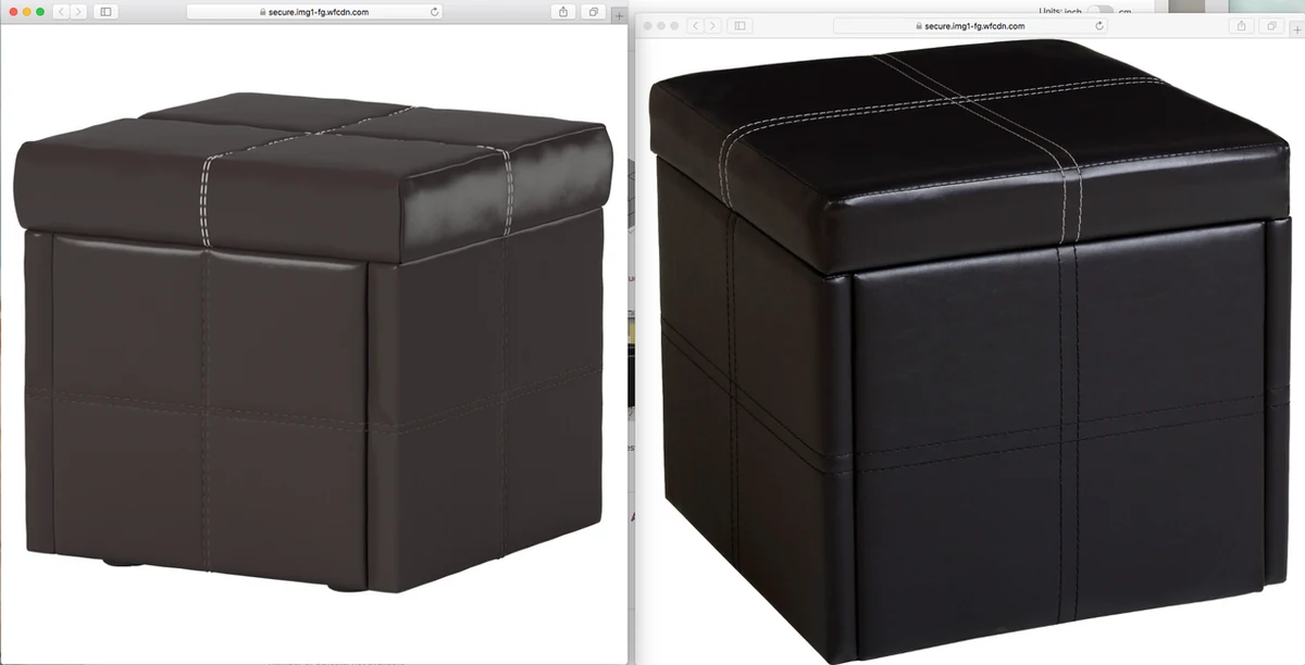
QA employees comparing 3D renders against reference images across two monitors — exactly the problem the redesign was built to solve.
I created an affinity map from my interview notes, grouping pain points into themes. Three core needs emerged clearly:
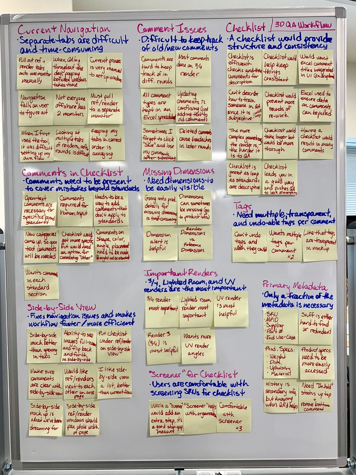
Affinity map from the four interviews — each note a direct observation from the QA session walkthroughs.
Documented QA workflow — mapping every step to find exactly where time and attention were being lost.
The solution was elegant in its simplicity: put the reference images and the 3D render next to each other on a single screen, with the checklist beside the render and key metadata at the top. I whiteboarded a side-by-side layout, then built lo-fi mocks to test the concept with QA employees.
Testing showed they understood the layout immediately. Their one request: a way to toggle to a full-screen view of the 3D render when they needed to inspect very fine details. I added a toggle between the side-by-side and full-screen modes.
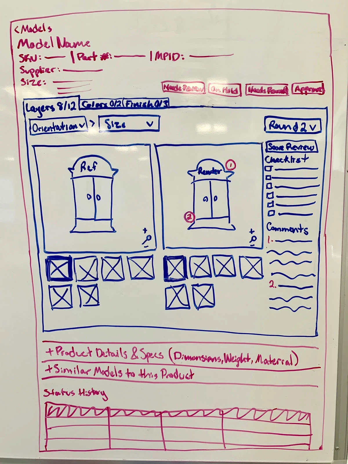
Whiteboard sketch of the side-by-side layout — tested well immediately with QA employees.
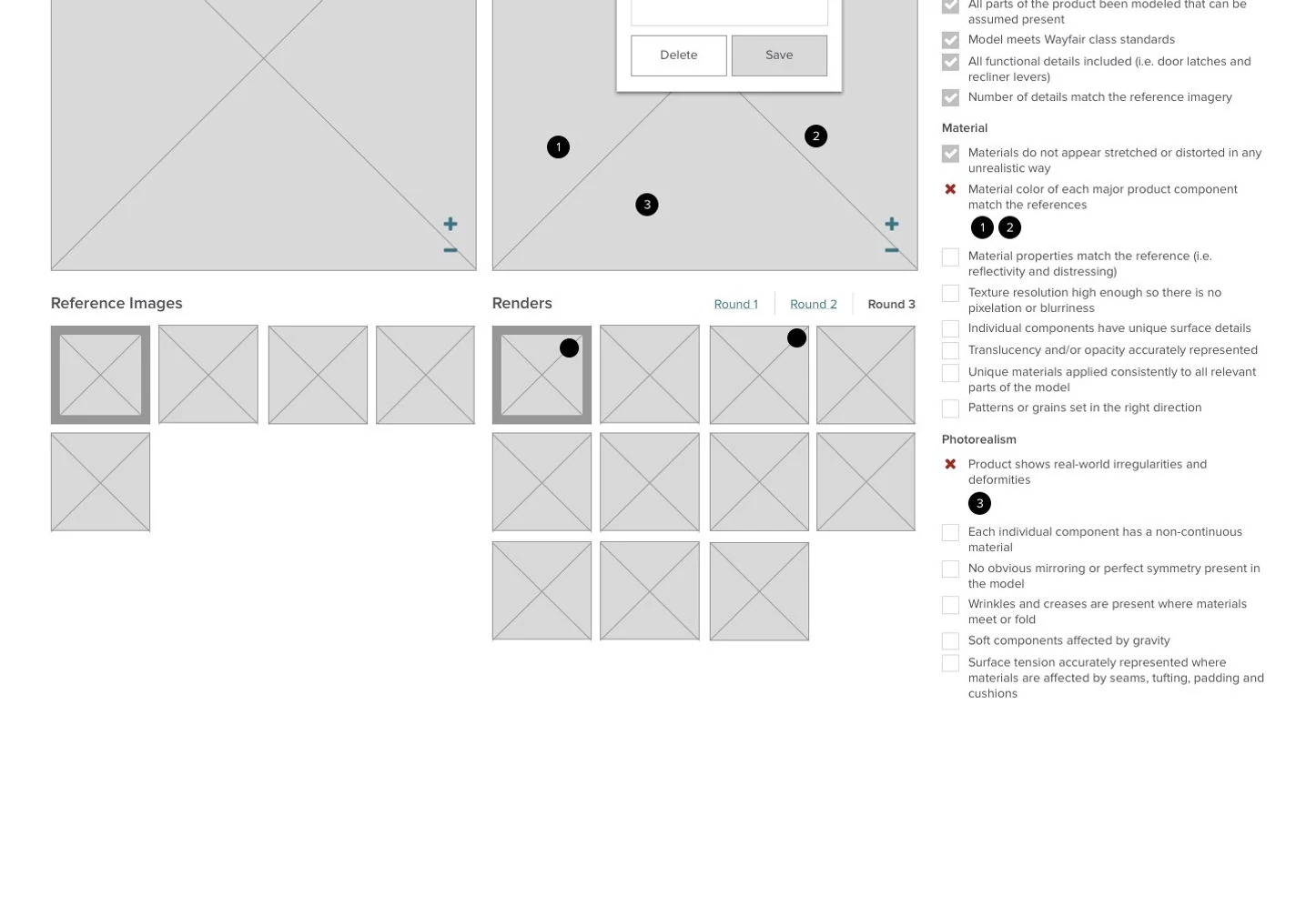
Lo-fi mock: checklist beside the render, metadata visible at the top without scrolling.
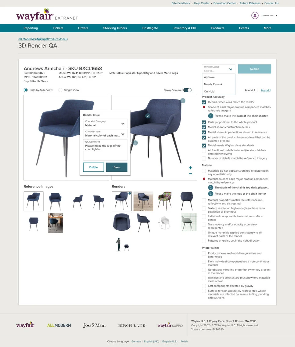
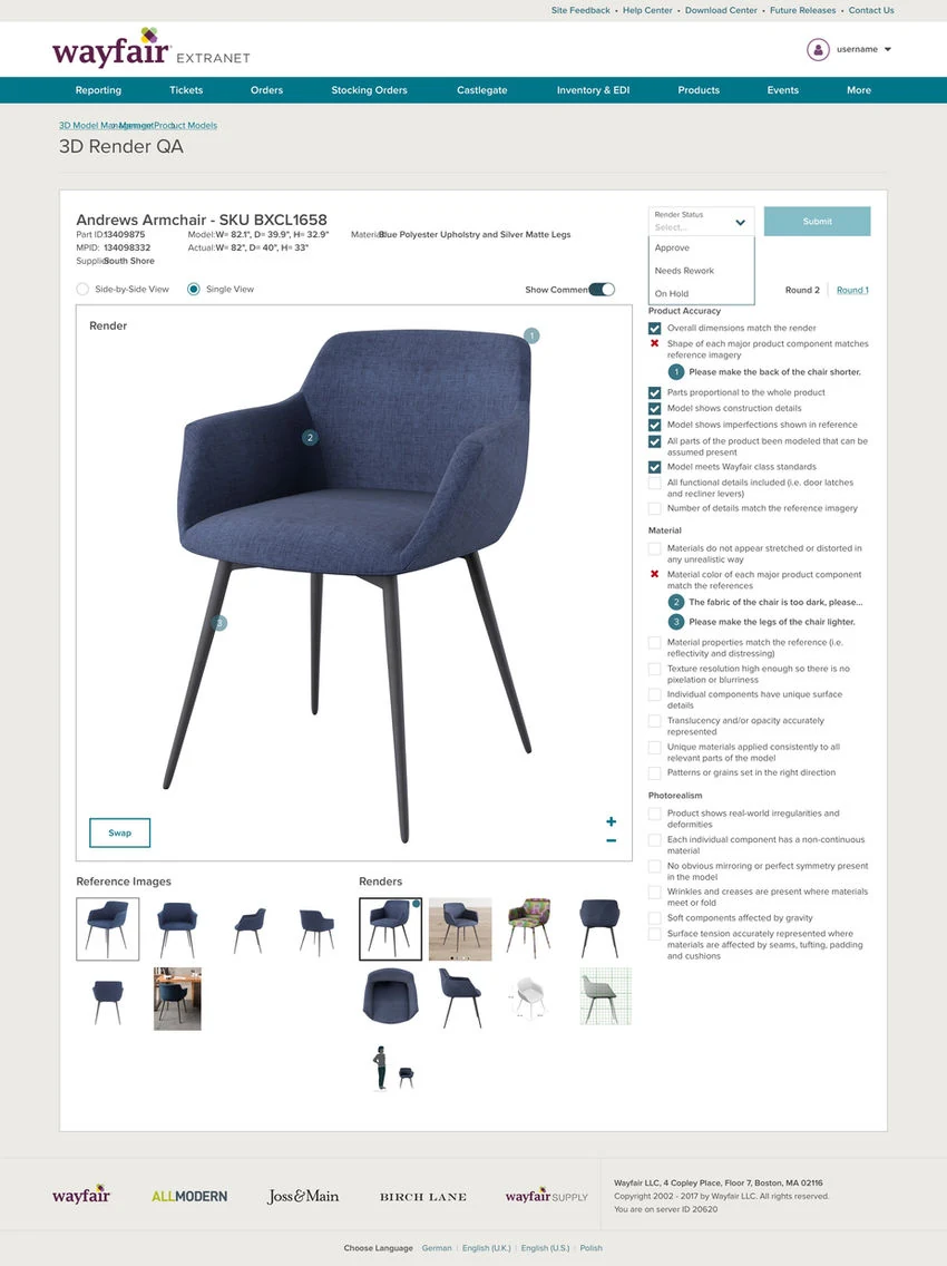
Hi-fi comparison view: reference images on the left, 3D render with checklist on the right.
Full-screen view mode for detailed inspection — added after QA employees asked for it in testing.
After the hi-fi designs tested well, we shipped the redesign. A post-launch addition handled a new use case we hadn't originally designed for: "options" (color, material, and pattern variants for a single product). I added grouped thumbnail sections within the interface so each option was clearly organized without needing a new layout.
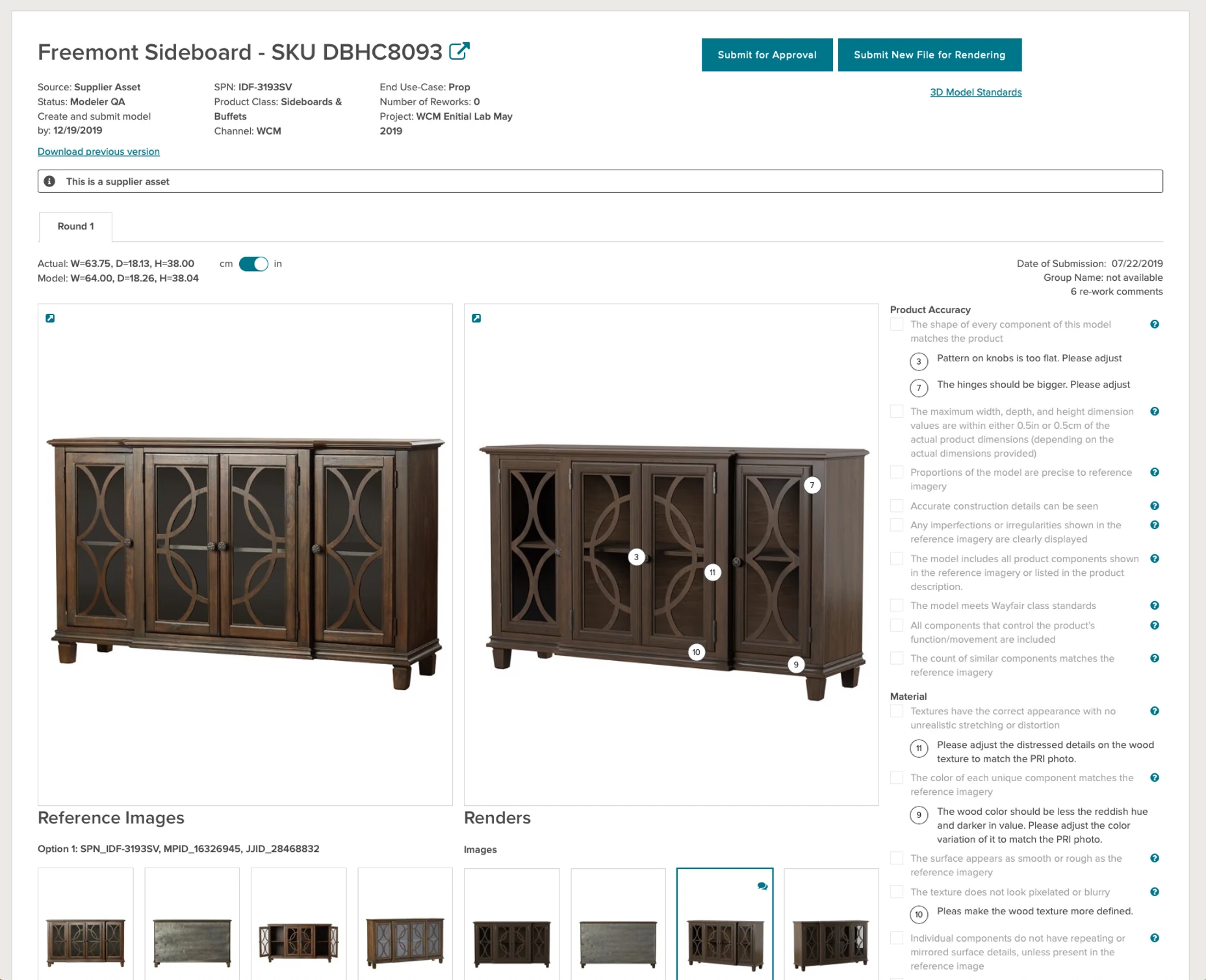
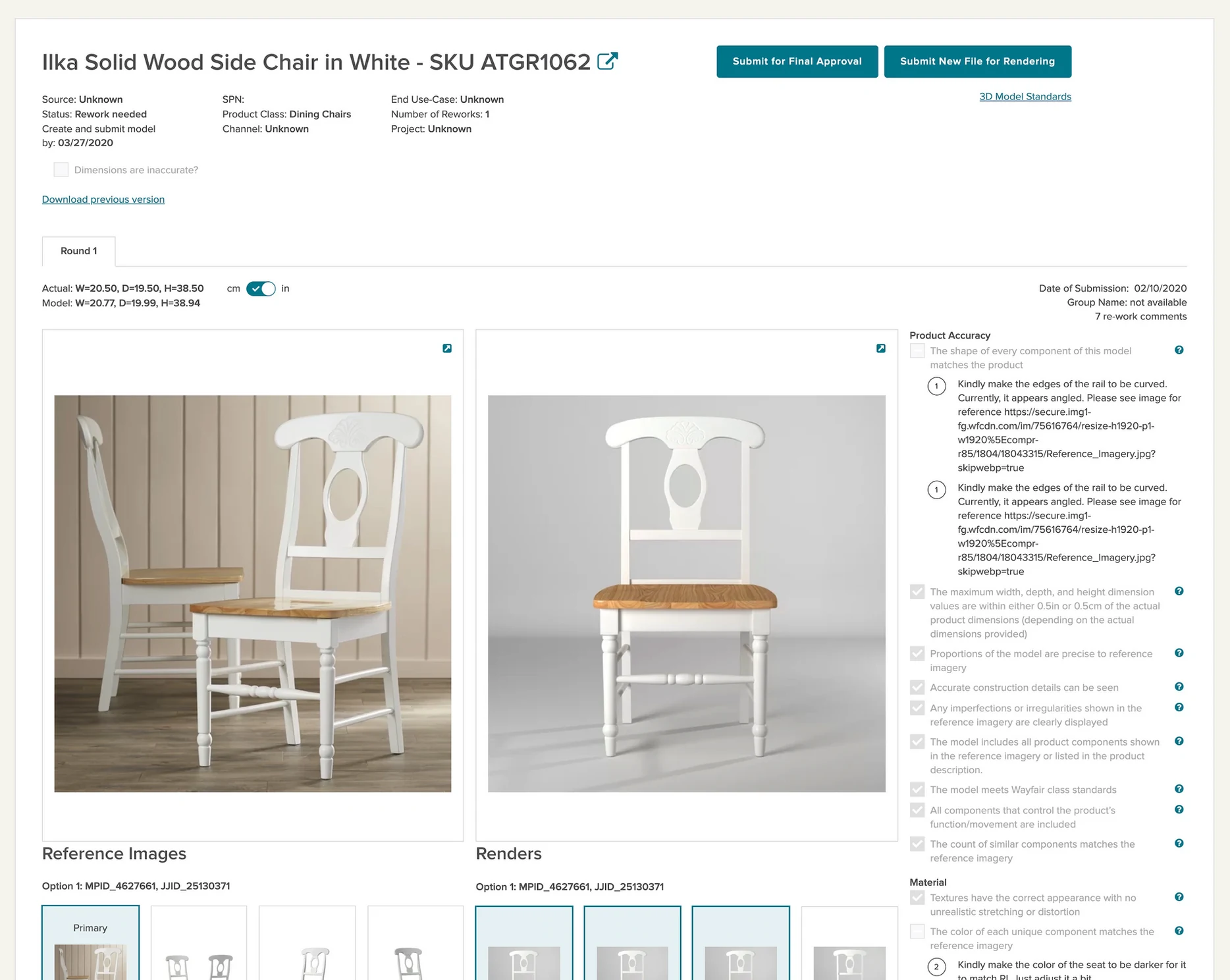
The final tool: reference images, 3D render, built-in checklist, and key dimensions all visible on one screen.
Options variants (color, material, pattern) organized clearly within the same side-by-side layout — no new screen needed.