Across 150+ tested screens and an App Store launch, I designed a safe, collaborative space for K–12 teachers to share, connect, and grow — built from one research insight: teachers feel isolated.
Before I joined, the team had interviewed 25 teachers about their professional lives. Three quotes captured the core insight that shaped everything we built:
The need was clear: a safe, non-judgmental community where teachers could share ideas, ask questions, and connect with others who genuinely understood their experience.
The original concept used isolated "spaces" by subject and grade. Testing showed teachers felt too separated from the broader community — they wanted to learn from teachers unlike themselves. We shifted to a universal feed with filters to narrow as needed. The name "Discover" tested best because it felt like exploration, not just consumption.
For emotional reactions, testing showed "Helpful" and "Me Too" resonated most. "Helpful" felt more meaningful than a generic Like, and "Me Too" gave teachers a powerful sense of not being alone in their experience.
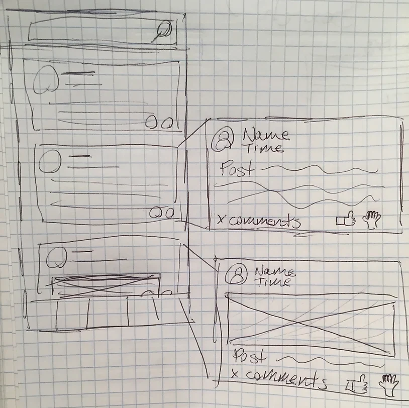
Discover section sketch — working through the feed structure, reactions, and post types.
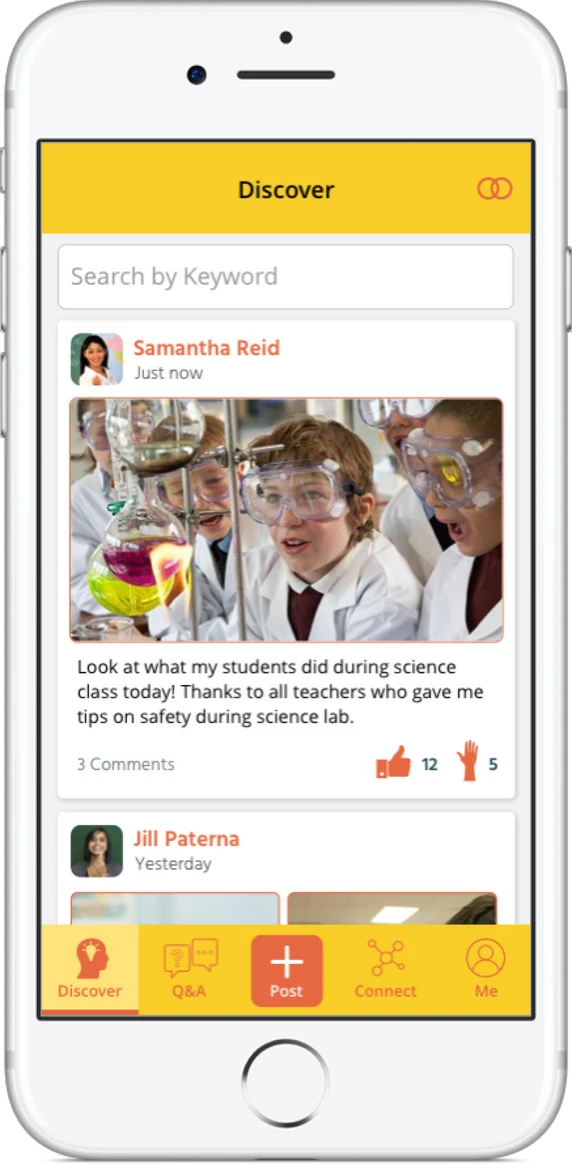
Discover hi-fi: universal feed with "Helpful" and "Me Too" — reactions chosen based on testing.
The initial design showed one question at a time with swipe-to-skip. Testing showed teachers felt guilty skipping and found the format constraining. We switched to a feed of questions — the same interaction pattern as Discover but filtered for direct questions. This also saved development time through component reuse, which was a welcome bonus for a small startup team.
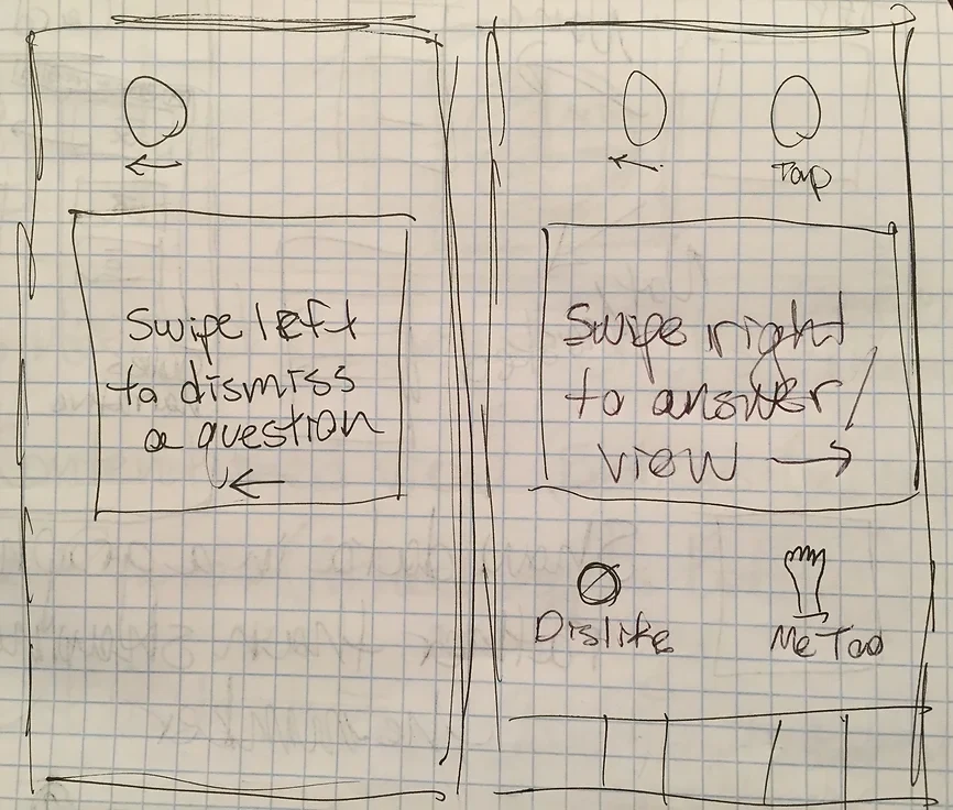
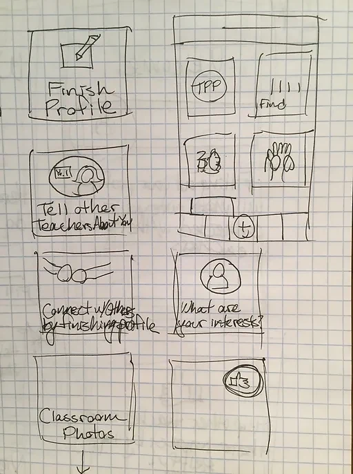
Q&A sketch — the initial one-at-a-time format that testing showed didn't work for teachers.
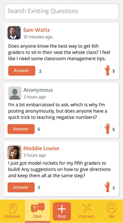
Q&A hi-fi: a questions feed using the same components as Discover — much better for teachers and faster to build.
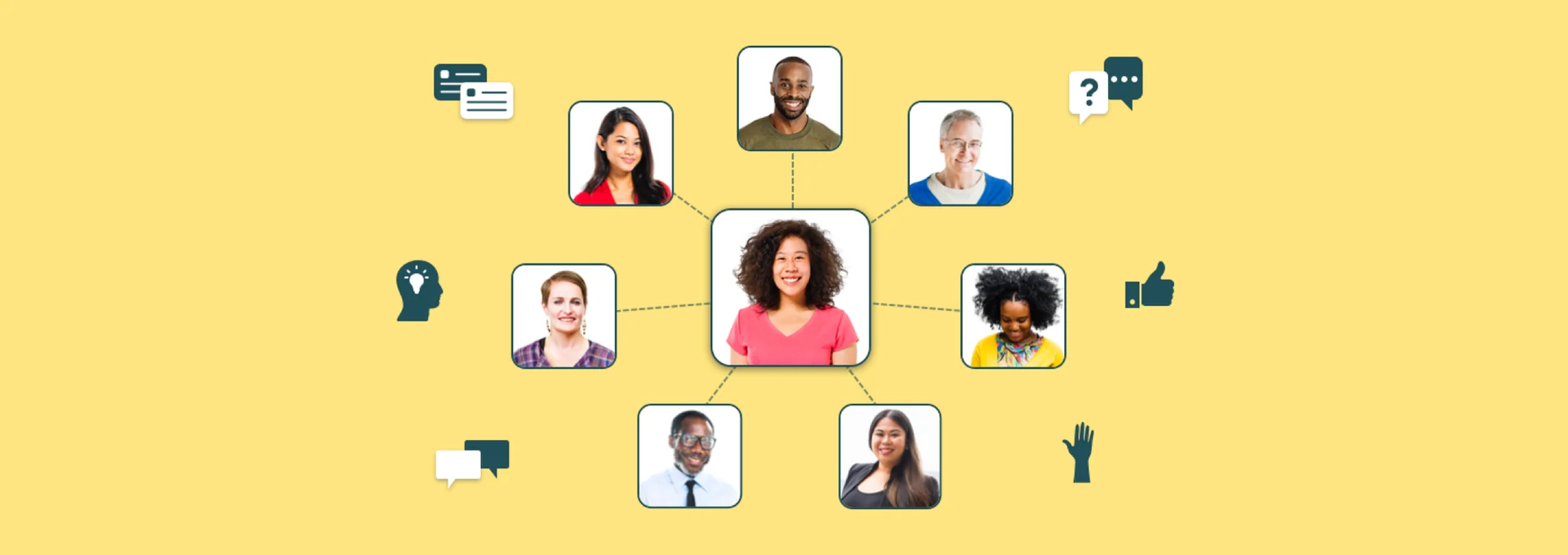
Originally designed as a list, I redesigned Connect as interactive tiles for four key tasks: Search Members, Direct Messages, Alumni Network, and Impact. When asked "where would you go to find a teacher friend?", every single test participant tapped "Connect" without hesitation — a strong signal that the section and its label were working.
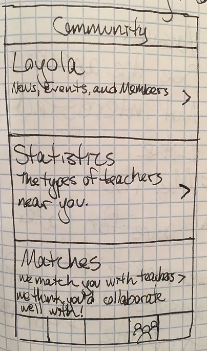
Connect section sketch — exploring tile layout and the tasks teachers needed to find others.
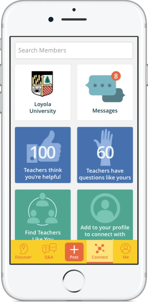
Connect hi-fi: Search Members, Direct Messages, Alumni Network, and Impact — all from one clear landing point.
We kept Me minimal for both development feasibility and usability. Every profile field was validated through testing — we only asked for information teachers were genuinely comfortable sharing in a professional context. Nothing more.
Me section sketch — keeping the profile minimal and validating each field through testing.
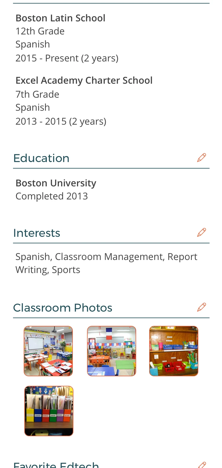
Me hi-fi: a clean profile showing only what teachers were comfortable sharing professionally.
Throughout the six months, every major decision was shaped by what we learned in testing. Some of the most impactful changes:
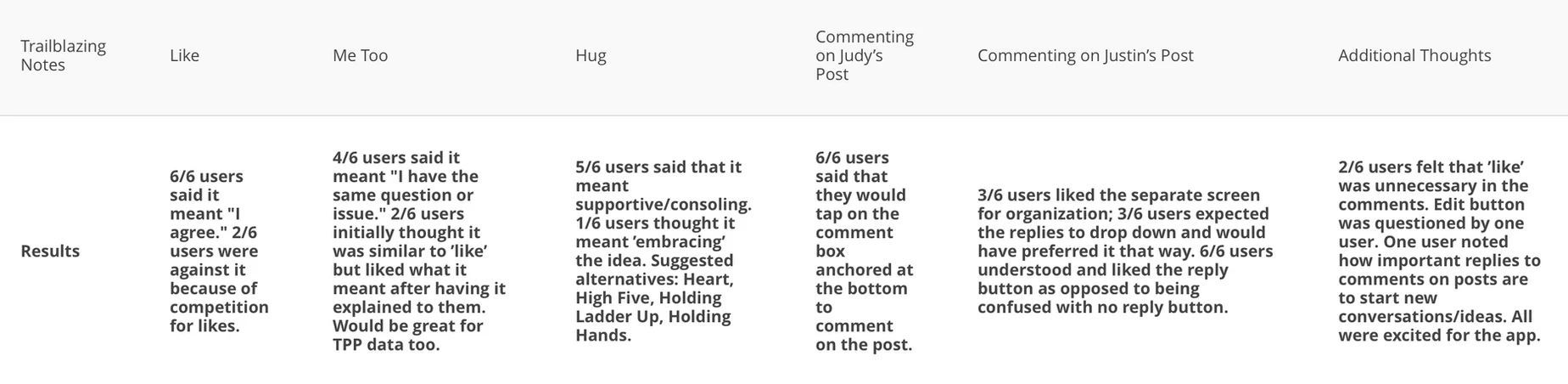
User testing results across all sessions — showing which decisions were validated and which needed iteration.
TeachersConnect launched on the Apple App Store. The launch secured funding and new partnerships with alumni programs, giving the company a stable and recurring revenue stream. Hundreds of teachers from those programs joined immediately — finding a professional community they'd never been able to access before. That was the whole point.