With 10 weeks and no prior research, a cross-functional team and I designed a marketing page and registration experience to help people take the first step toward quitting — by connecting the program to what they care about most.
CVS's Pharmacy Smoking Cessation program needed a marketing page and patient registration experience designed completely from scratch, with a 10-week deadline and no existing research or full business requirements to start from.
There was also a significant structural challenge: our legal partners had a questionnaire of nearly 60 questions they wanted in the registration flow. We needed to work with them respectfully but directly to understand which questions were truly necessary for the pharmacist, reduce cognitive load without removing anything required, and create an experience patients would actually complete.
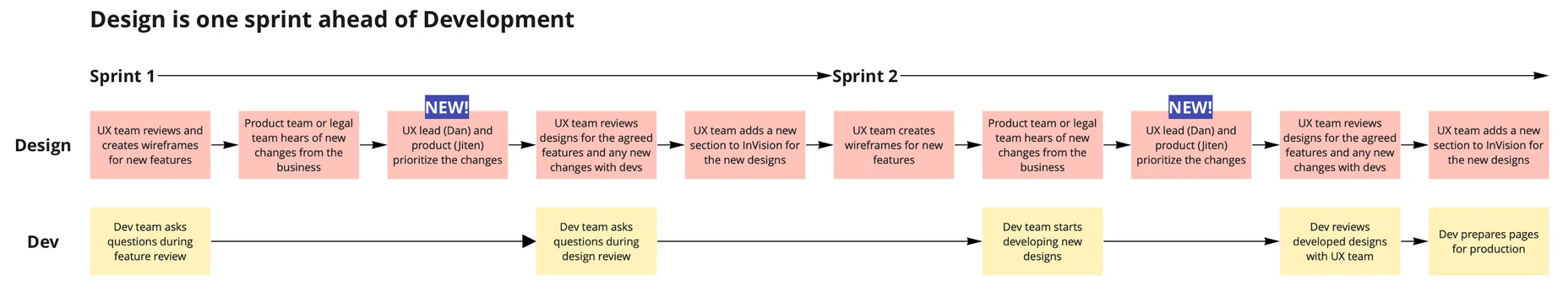
Before any design work began, I worked with the team to map every task across all five sprints. Knowing we had zero research to start, I prioritized user interviews in Sprint 1 — so all of our design decisions would be grounded in something real, not assumptions. I also scheduled stakeholder reviews at the end of each sprint, giving Product and Legal consistent opportunities to give input early rather than reviewing everything at once at the end.
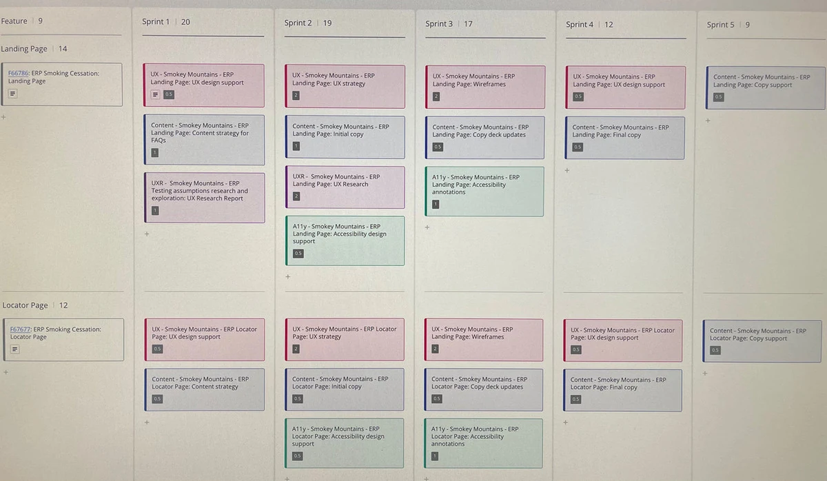
Sprint planning board for the full 10-week project — every task mapped before design work began.
I worked with Laura Paradis to design our interview guide and conduct research with people who had tried to quit before. What we heard reshaped how we thought about the entire project:
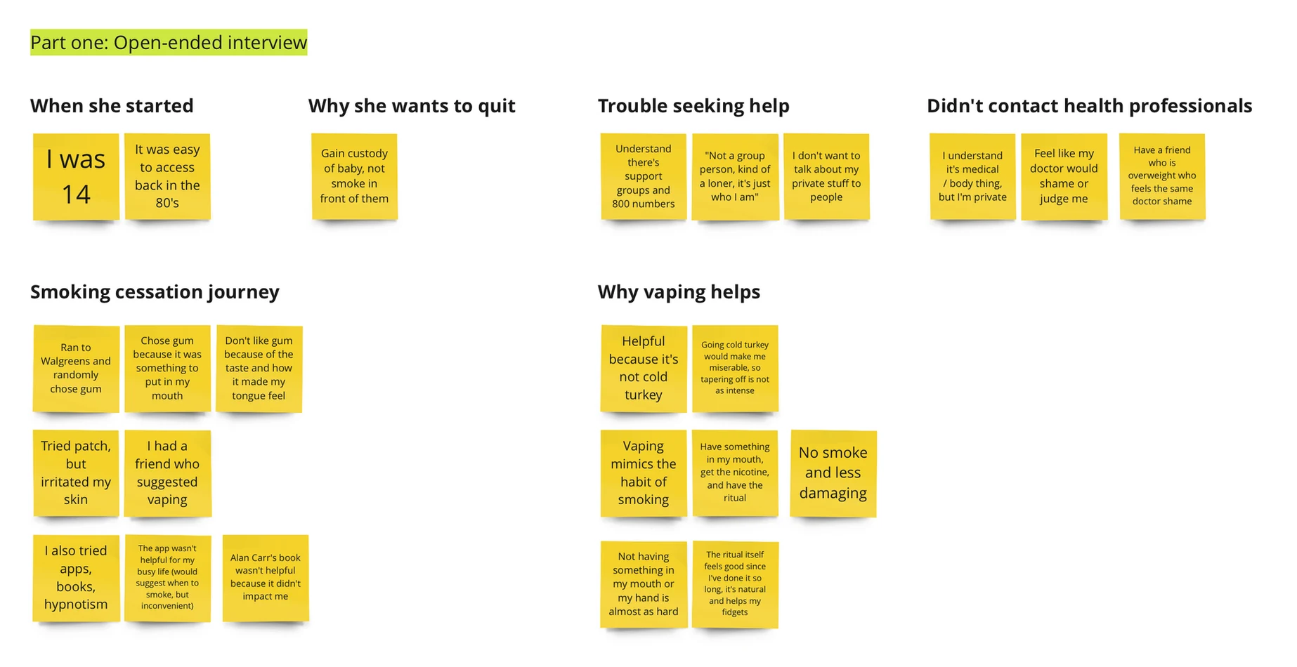
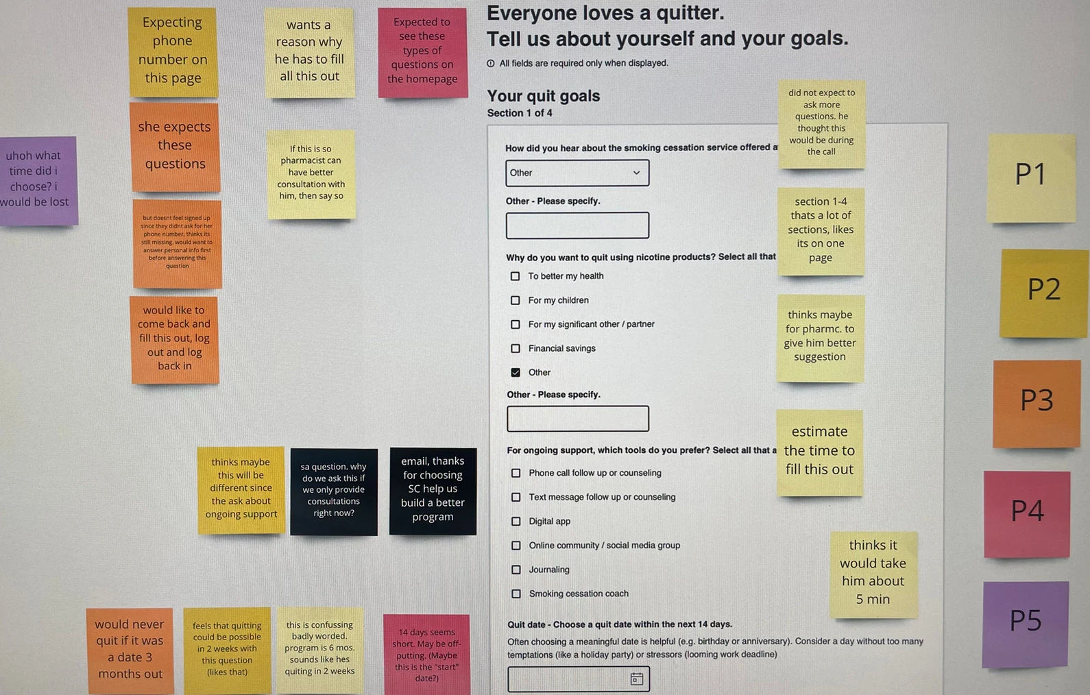
Research synthesis — themes from our interviews with people who had previously tried to quit.
The most important finding from our research was this: when participants could connect quitting to something meaningful and specific in their own life — not just "get healthier" in the abstract — something shifted. They stopped talking about why quitting was hard and started asking when the program would be available and how they could sign up.
That single insight shaped our entire landing page direction. Instead of leading with clinical information or generic health benefits, we designed the page around the idea of life goals. We helped patients imagine quitting not as giving something up, but as making space for what they actually wanted to do. This was the breakthrough that made the marketing page genuinely persuasive rather than just informative.
Our last round of testing confirmed this was the right direction — when participants saw their personal goals reflected in the messaging, engagement and intent to sign up increased noticeably. It reinforced something I think is really valuable to remember: good initial research doesn't just inform a design, it can completely reframe what the design needs to do.
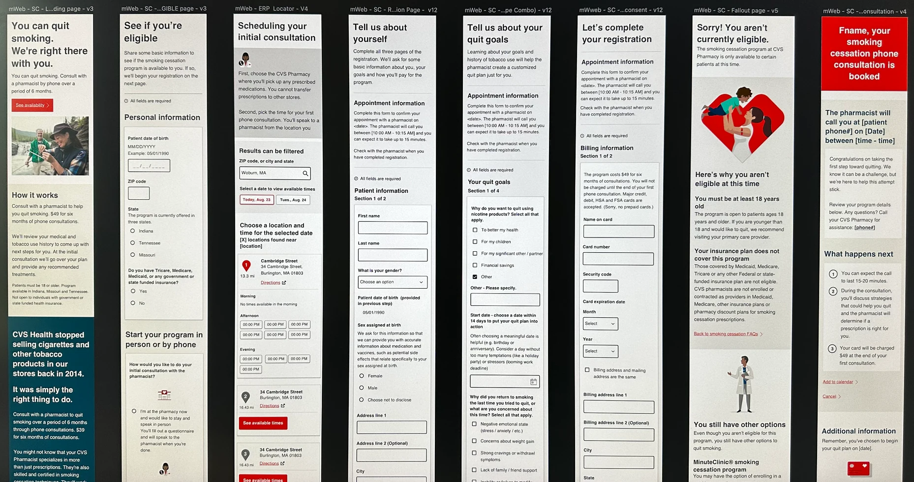
After meeting with our legal and clinical partners to understand what was genuinely required versus what was simply nice-to-have, Steph and I organized registration into three clearly labeled pages: "Tell us about yourself," "Your smoking history," and "Consents and payment." Each Continue button was also labeled with the name of the next page, so patients always knew what was coming next.
We also designed the user flow to handle the full range of patient scenarios: an eligibility page filtered out patients outside the pilot states, under 18, or on Medicare, while also routing patients differently depending on whether they were signing up from home or through a CVS pharmacist in-store.
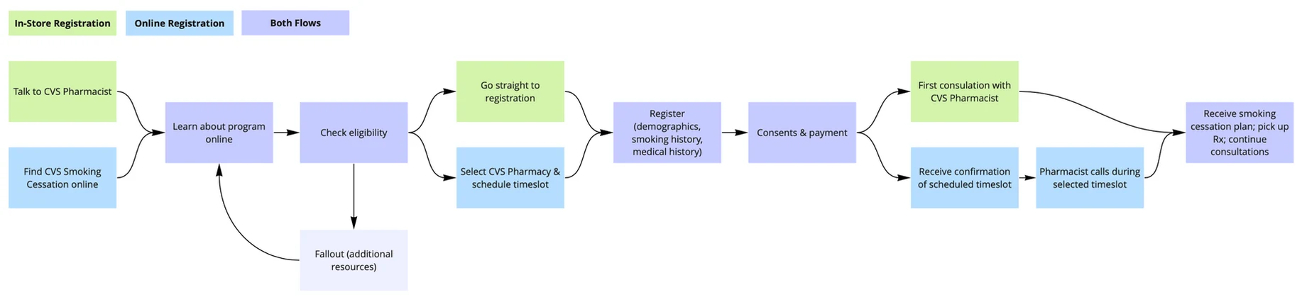
Full registration user flow — eligibility gate, in-store vs. online path, and the three-page structure.
We tested three different approaches to help patients understand where they were in the registration process: "Page X of X" text at the top, a list of all page titles with the current one bolded, and an overview screen shown before patients began. Participants preferred "Page X of X" — they rated the form as faster to complete, and the labeled Continue buttons meant they could accurately predict what they'd be filling out next. More elaborate progress indicators actually increased perceived effort rather than reducing it.
User testing the registration form — three progress indication approaches tested with real participants.
Throughout all five sprints, new business information kept coming in — the number of pilot states shifted, the program price changed, and program details continued to evolve. For a while, we were accepting every change as it came and trying to fit it into whatever sprint we were already in, which put real pressure on the team.
I set up a better process with Product: log every mid-sprint request, review and prioritize before accepting, and make deliberate trade-offs. This meant simplifying the "How it works" section to a text-only format for the initial launch — saving enough time to still deliver on schedule without compromising the parts of the experience that mattered most.
Mid-sprint requirements tracker — reviewing and prioritizing new requests rather than accepting everything immediately.
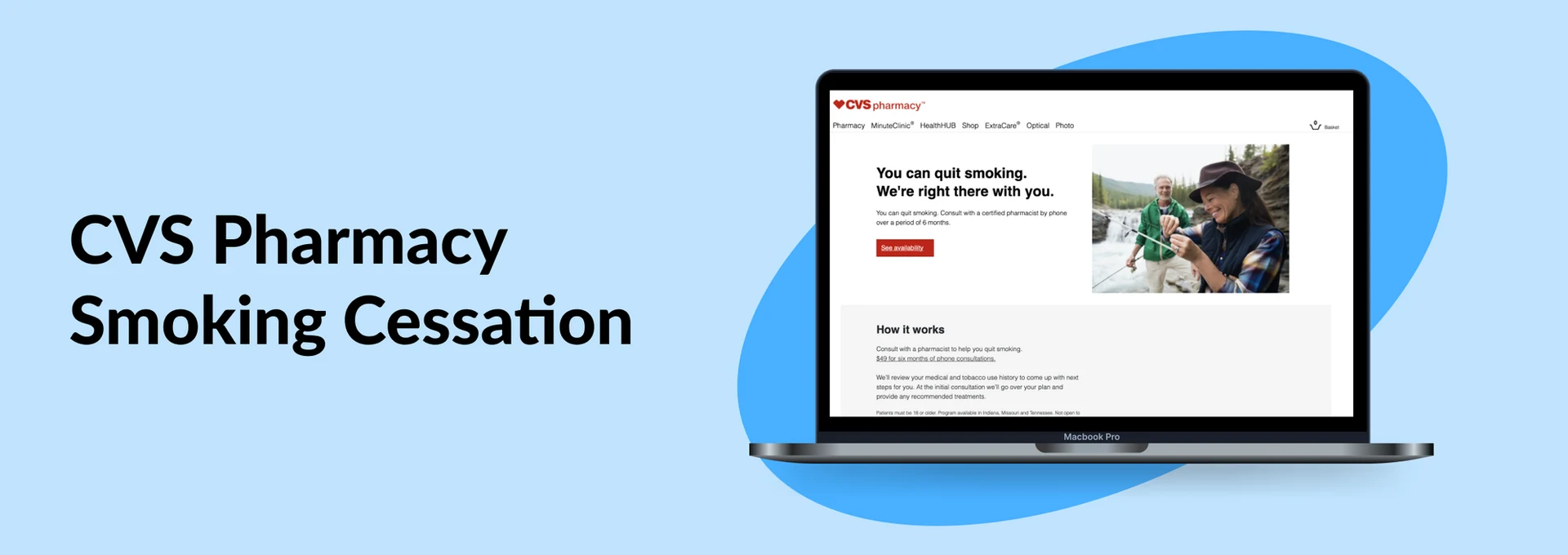
We successfully launched the CVS Pharmacy Smoking Cessation program in Indiana, Missouri, and Tennessee — the first time CVS offered a structured pharmacist-led quit program with ongoing patient consultations. Patients could sign up from home or be enrolled directly through a CVS pharmacist in-store.
Looking back, this project is one I'm genuinely proud of because the quality of the outcome was so directly tied to the quality of the research we did at the very start. When you go into a design problem with real empathy and a genuine curiosity about what actually drives people's behavior, the work gets better in ways that are hard to fake. The motivation framing on the landing page is a perfect example of that.
Final high-fidelity designs — marketing page and registration experience, ready for pilot launch.