From a generic quick-links page to a personalized health hub. Three weeks of workshops, three personas, and a vision that earned CTO approval and shaped six months of product roadmap.
CVS's Health Landing page technically worked — patients could navigate to health resources from it. But it wasn't personalized, it put the work on patients to find what they needed, and it offered very little value to anyone who hadn't had a recent visit or lab result.
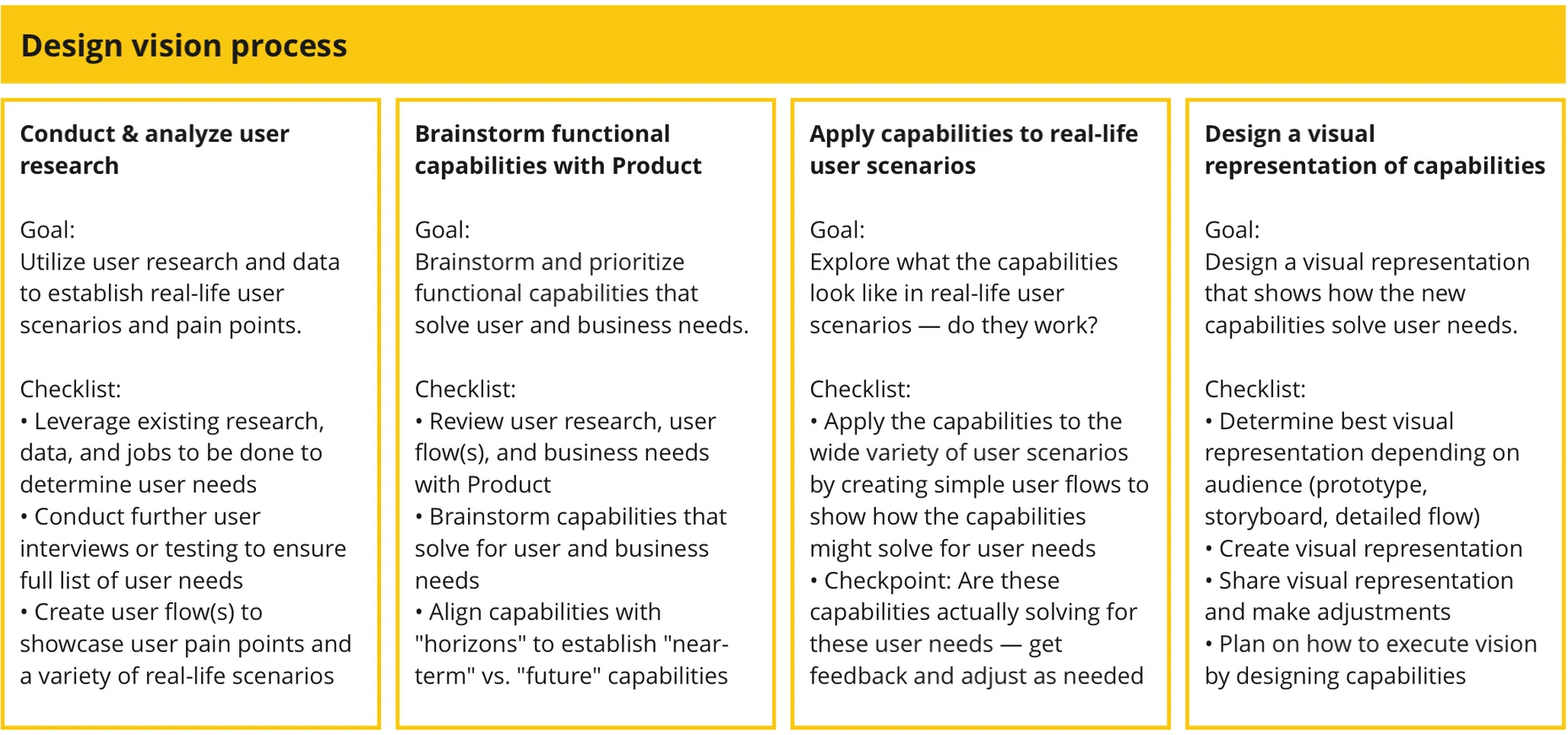
We had a three-week deadline for a CTO review. Cora Books and I facilitated vision workshops to push the team from MVP thinking toward something patients would genuinely want to open every day, a health hub built around their real lives and needs.
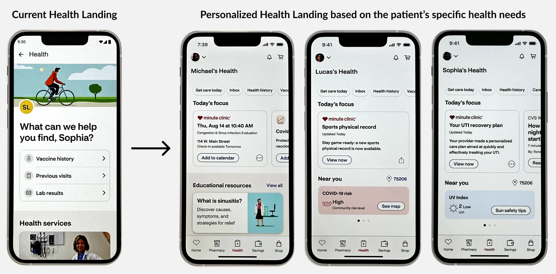
The shift: from a generic quick-links page to a personalized health hub tailored to each patient's unique situation.
Our goal was to make this page more personalized, actionable, and informational — and to increase daily engagement with patients who have complex health needs. A design vision was the right tool. It would let us push past MVP thinking and show Product what this page could look like if we actually designed around patients.
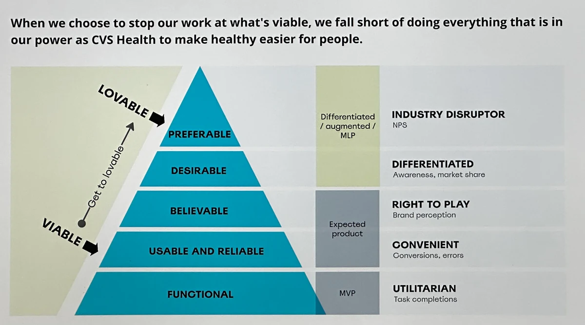
The MVP to MLP framework: moving from basic functionality to a product patients genuinely love.
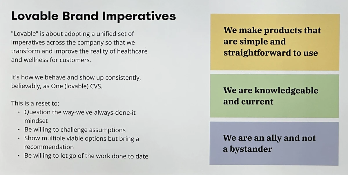
CVS Lovable Imperatives — our guiding framework for pushing beyond the status quo.
We ran structured daily checkpoints: Monday heads-down, Tuesday and Thursday collaboration sessions, Wednesday design feedback, Friday stakeholder reviews. This gave the team real creative momentum while keeping us on track under an intense deadline.
We reviewed our health patient personas as a full team before brainstorming anything. Each persona was grounded in real-life scenarios from our research:
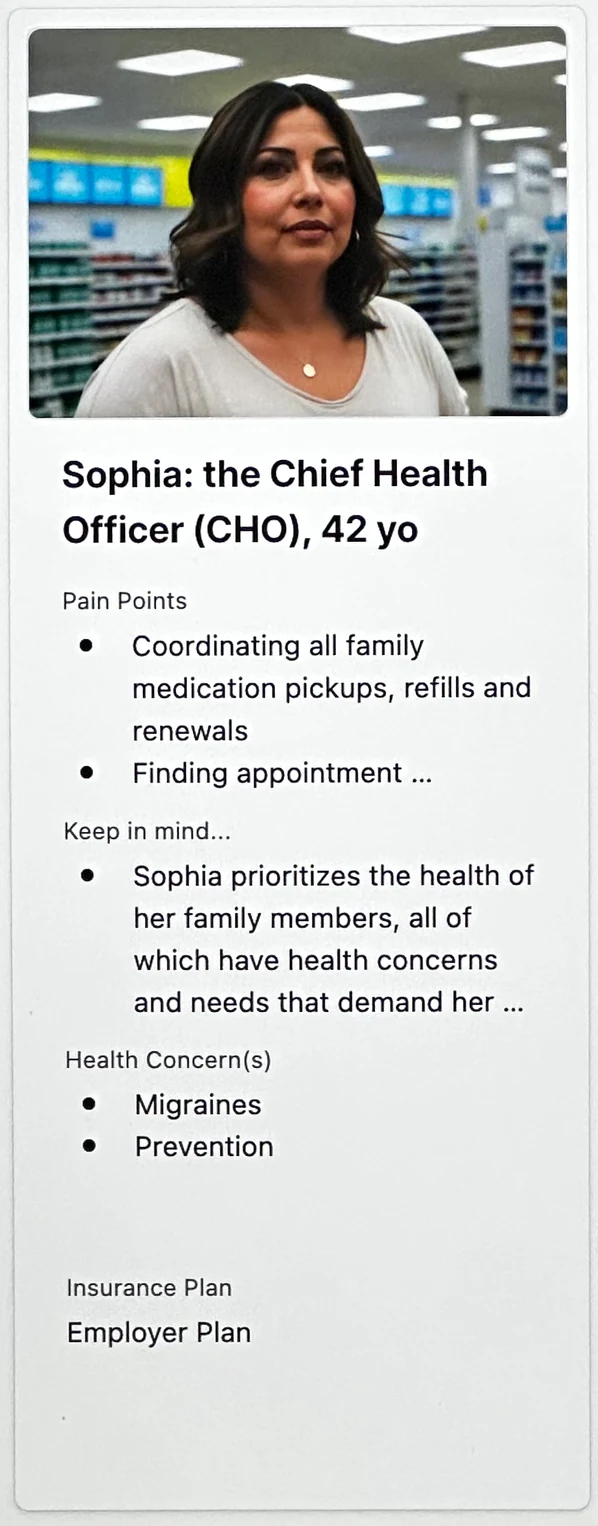
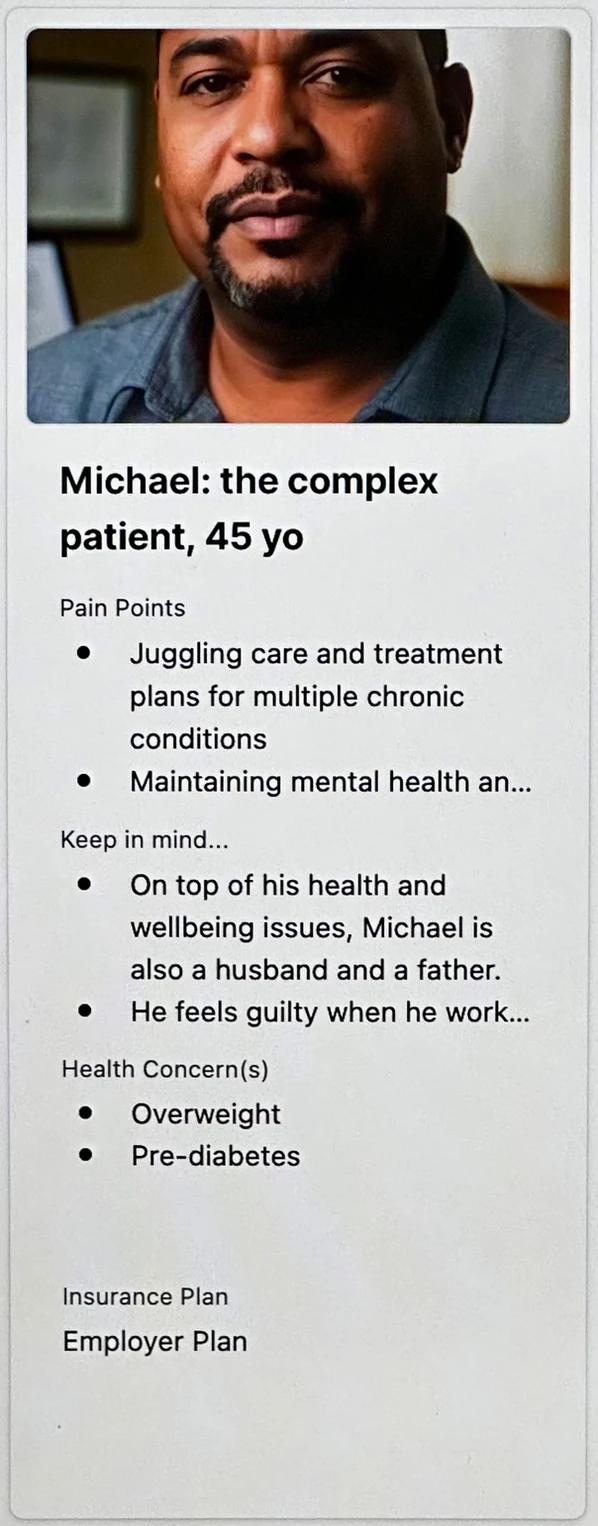
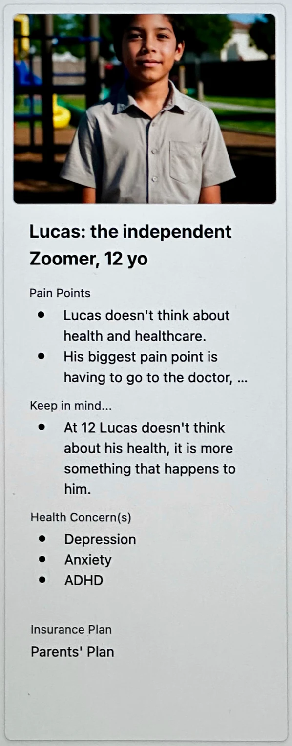
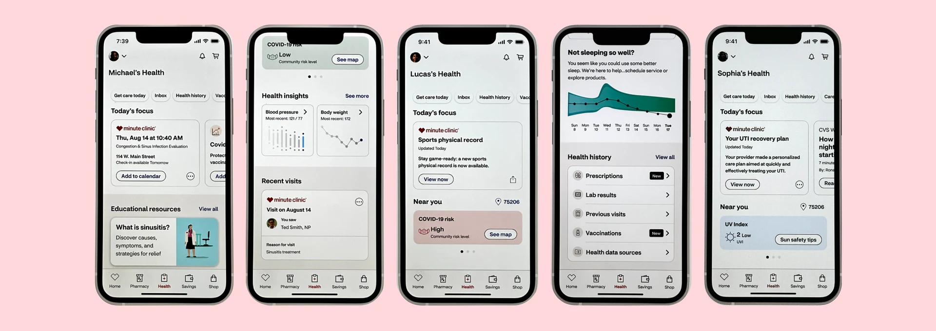
Sophia, Michael, and Lucas — three personas representing the breadth of health scenarios CVS patients face daily.
We collaborated with Product to brainstorm capabilities that could serve both user needs and business goals. Then we used McKinsey's Horizon mapping framework to prioritize what to build near-term versus long-term, based on technical feasibility, business impact, and the weight of our user research.
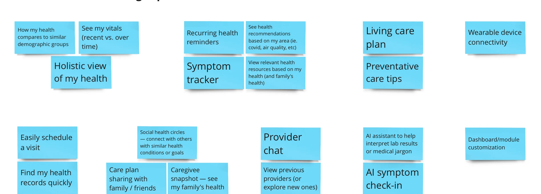
Capabilities brainstormed with Product — mapped against user research and business impact.
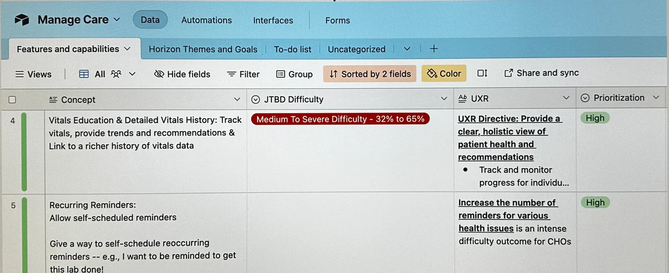
Horizon mapping: each capability sorted by timeline, feasibility, and user impact.
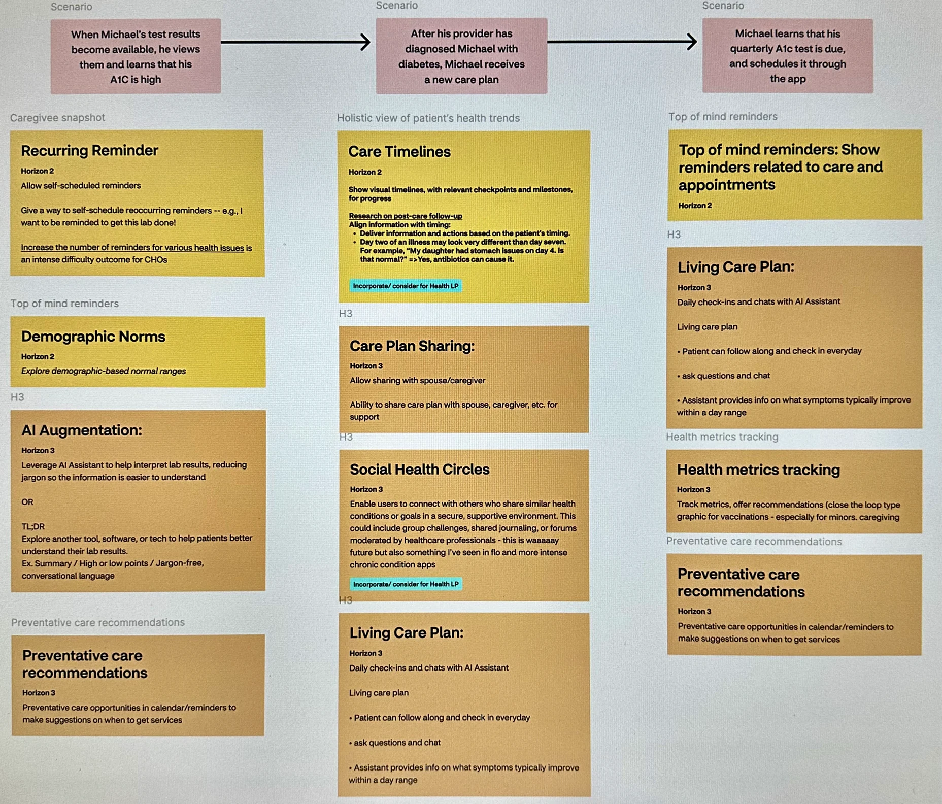
Michael's diabetes scenario — mapping how new capabilities could support him from diagnosis through ongoing care.
Cora and I led workshops for the team to design together, starting with information architecture and lo-fi "dynamic zones." The idea was to maintain a consistent page structure while allowing the content inside each zone to be personalized for each patient.
We assigned each designer a zone and asked them to use our design system to build high-fidelity versions quickly. The resulting prototype told Sophia, Michael, and Lucas's stories — each patient's experience looking meaningfully different, but built from the same underlying system.
Lo-fi dynamic zones establishing the information architecture of the new Health Landing page.
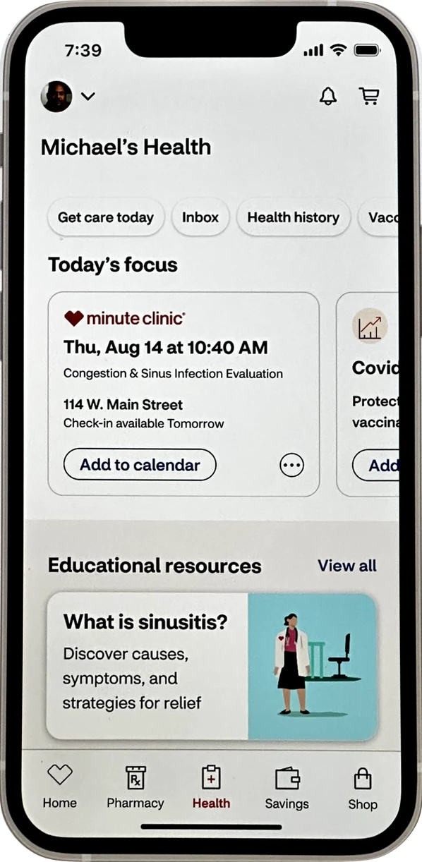
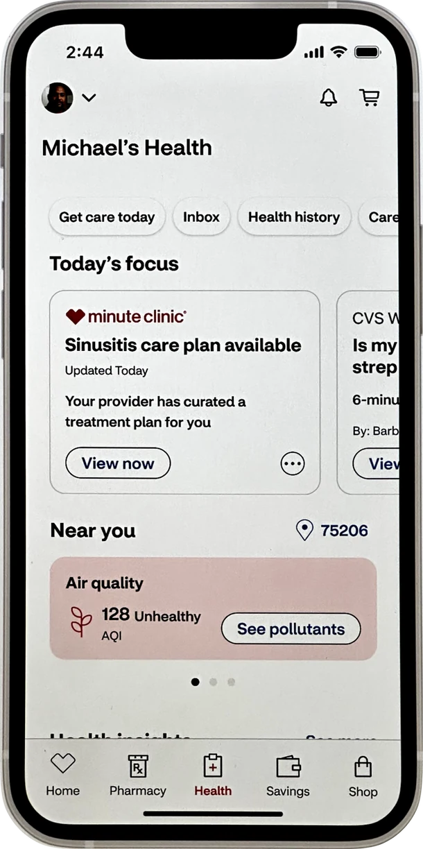
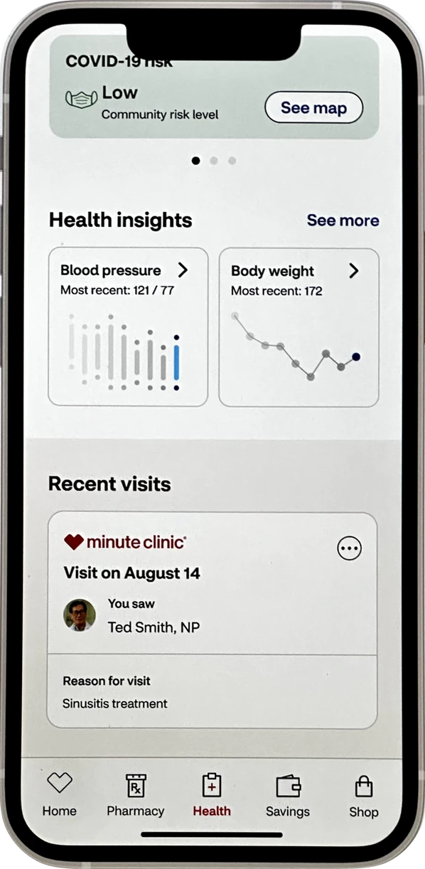
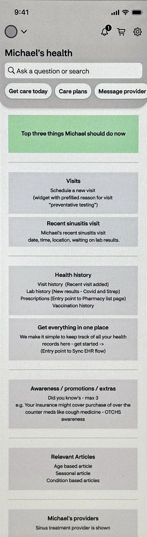
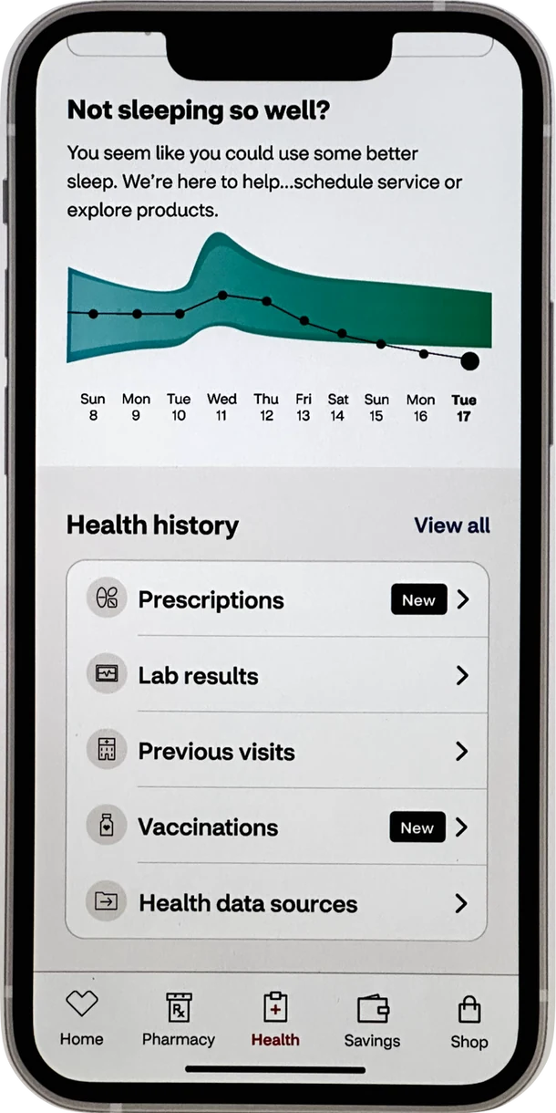
Michael's personalized health view across three scrolled states.
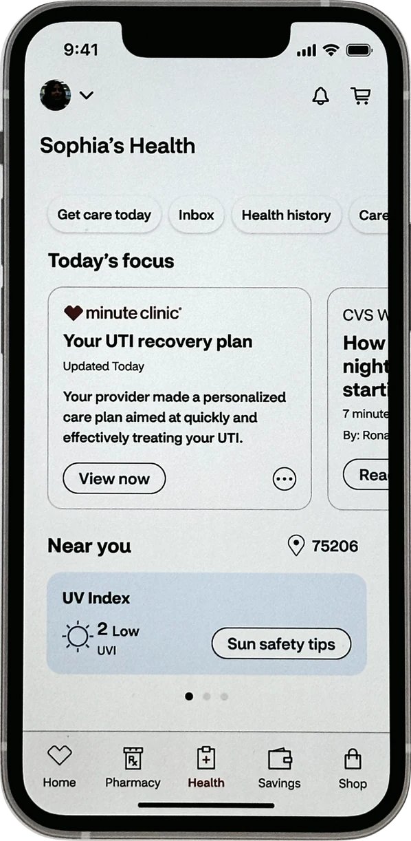
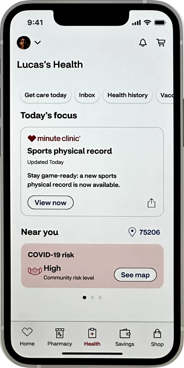
High-fidelity prototypes for Sophia (family caretaker), Sophia (continued), and Lucas — each showing a distinct, truly personal health experience.
Our Executive Design Director presented the vision to CVS CTO Tilak Mandadi. Tilak loved the innovative capabilities, particularly those empowering patients to manage their health proactively and prevent future issues.
With his approval, Product and Design collaborated on a feature roadmap based on our Horizon mapping, pairing designers and engineers with each capability to test and build over the following six months.