From backlog to live product in 24 hours — a story about speed, trust, and what's possible when a small team moves together.
On the afternoon of July 16, 2025, I got word that the team needed help getting a new Apple Watch feature into the next release — due at noon the following day. Everyone was stretched thin. I stepped in and made it happen.
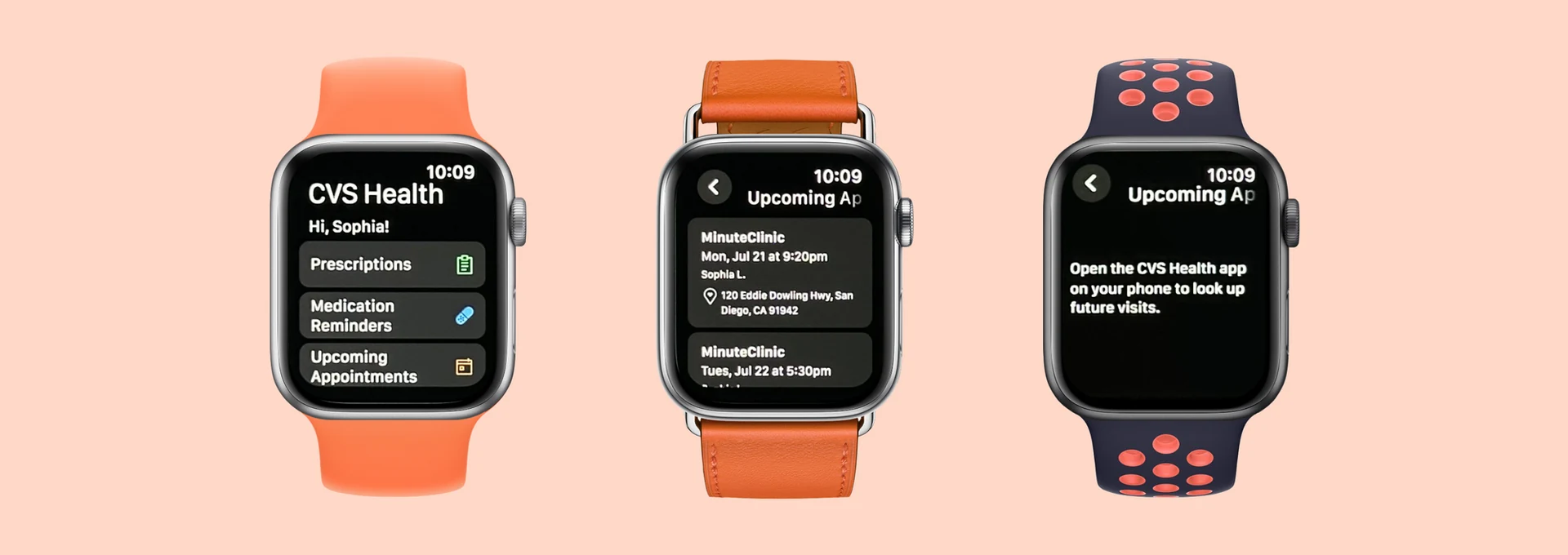
By noon the next day, "Upcoming Appointments" was live in the CVS Health Apple Watch app, designed, QA'd, and shipped. Along the way, I built the first foundation of our team's Apple Watch design system using CVS styling and components.
Apple Watch is designed for quick glances without pulling out your phone. But viewing upcoming CVS appointments required multiple steps through the iOS or Android app, or digging through emails and texts. I mapped out the flows to illustrate the contrast: fewer taps on Apple Watch, more immediate value for patients.
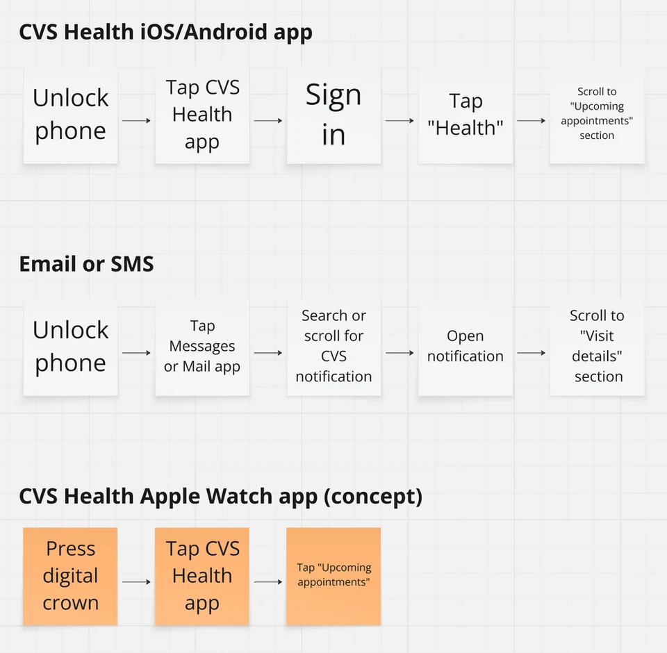
Flow comparison: Apple Watch requires significantly fewer steps than iOS/Android or searching through email and texts.
This feature had been sitting in the backlog for a while. During a sprint with extra capacity, engineers Naresh and Bhanu took it upon themselves to create a proof of concept, replicating the existing "Prescriptions" screen structure for appointments. When they showed it to Product members Himanshu and Carly, excitement was immediate. Then came the ask: could we get it into the next release, due tomorrow at noon?
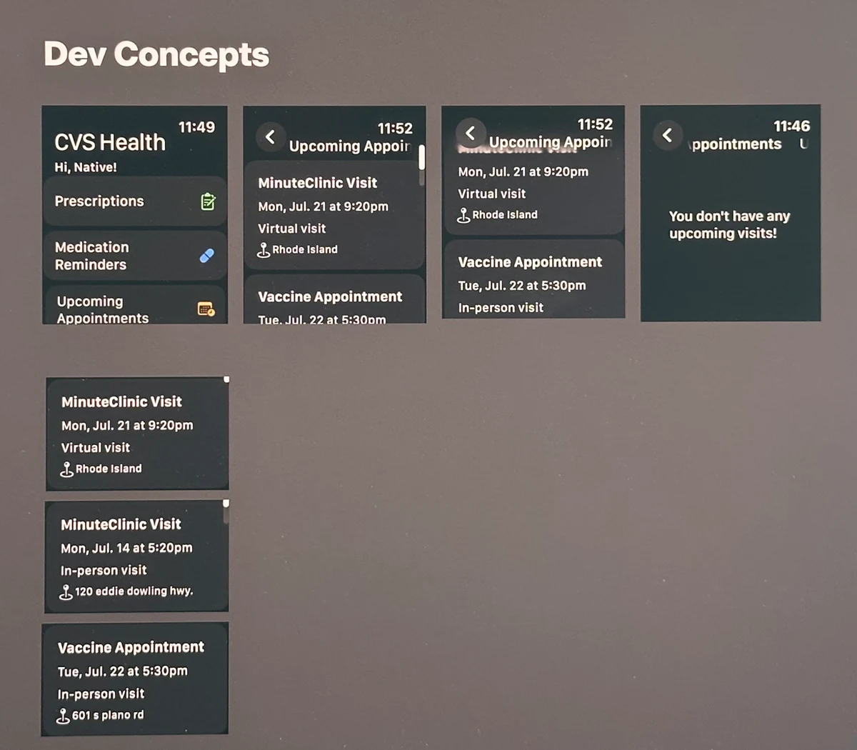
The engineer concept — a starting point that proved the idea was feasible, but needed design thinking around authentication and content.
I stepped in and immediately wrote down every requirement and open question I had. The key complexity was authentication. Patients fall into different levels of access, and each needed its own screen state:
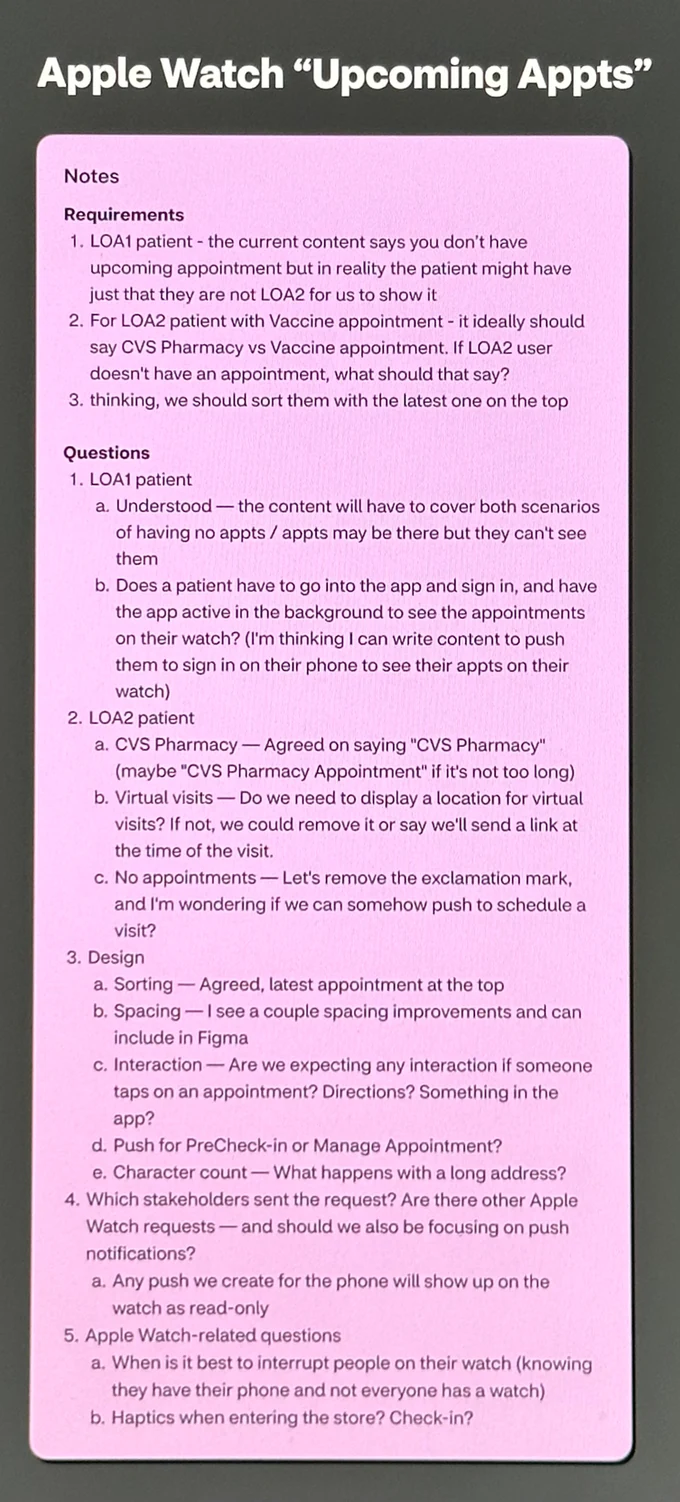
Requirements and open questions captured before design began.
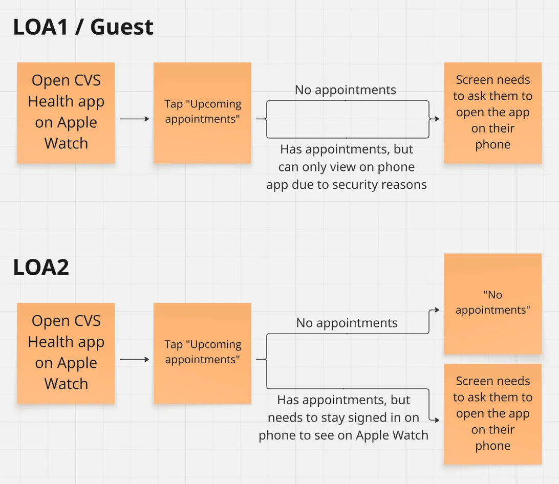
Authentication flow mapping for both LOA1 and LOA2 scenarios.
Our design team had no CVS-styled Apple Watch components. The existing Apple Watch sections had been built entirely by engineers without any design involvement. So I searched for community Figma files, then used them as a starting point to build a mini design system with CVS text styles, icons, and colors. It was exactly what I needed to move quickly the next morning.
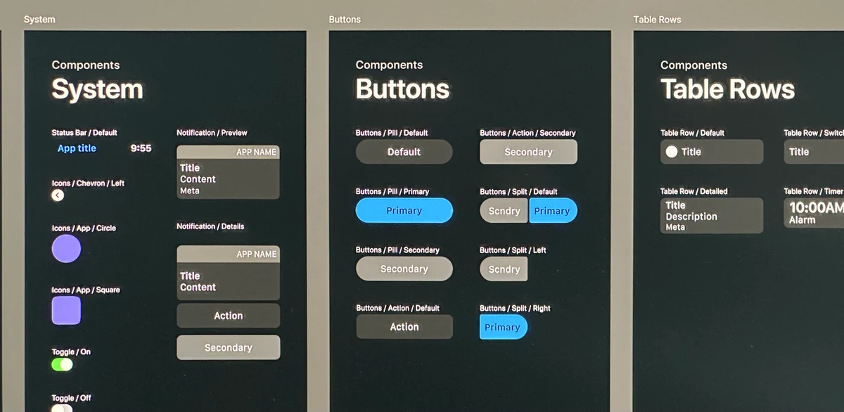
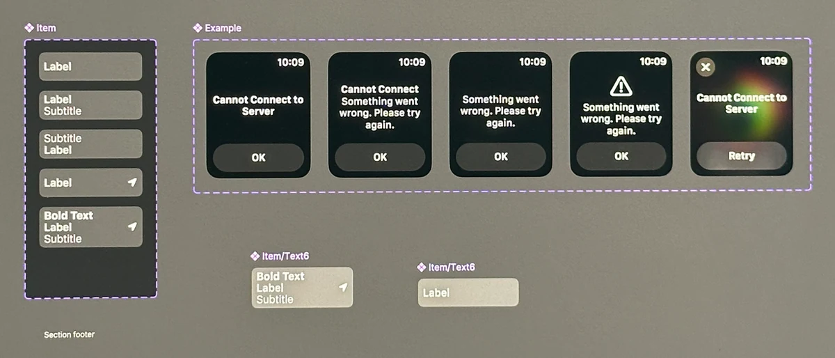
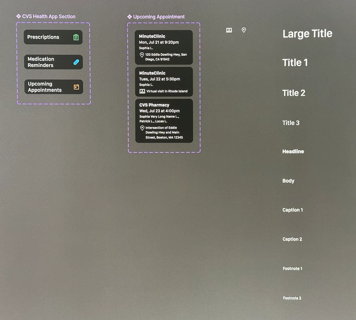
The mini design system: CVS-styled text styles, icons, and list-view card variants — a foundation for future Apple Watch features.
First thing in the morning, I pulled the components into frames using auto-layout, accounting for every authentication scenario. Then Himanshu, Carly, and I got on a call together. We worked through the content for the error states and made a few small text adjustments in real time. It was a genuinely good collaboration, and we were done quickly.
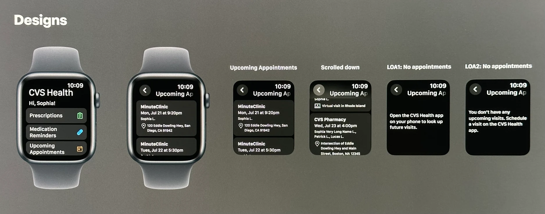
All screens designed with auto-layout: appointment list, empty states, and both authentication scenarios.
Naresh, Bhanu, and I needed to move fast. We huddled over Slack while Bhanu shared his screen, going through each scenario live. I took screenshots, annotated them directly in Figma, and sent them back in the same call. Within 30 minutes, the coded implementation matched the designs exactly. We hit the release window. "Upcoming Appointments" was live.
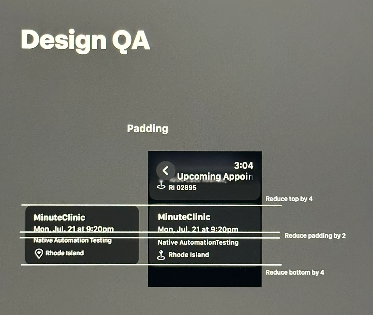
Live QA over Slack: screenshots annotated in Figma and sent back in real time until the implementation matched the designs.
Patients can now check upcoming appointments directly from their wrist. The mini design system I built serves as a foundation that can grow with future Apple Watch features. More than anything, this collaboration proved something we already suspected: when a small group has clear ownership and real trust in each other, incredible things can ship in 24 hours.