CVS Notifications:
Email, SMS, Push
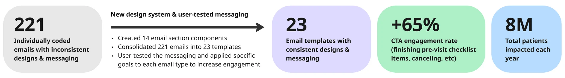
As the lead designer, I helped consolidate 221 separately managed notifications into one unified system in a single quarter — it now reaches 8 million patients a year.
As the lead designer, I helped consolidate 221 separately managed notifications into one unified system in a single quarter — it now reaches 8 million patients a year.
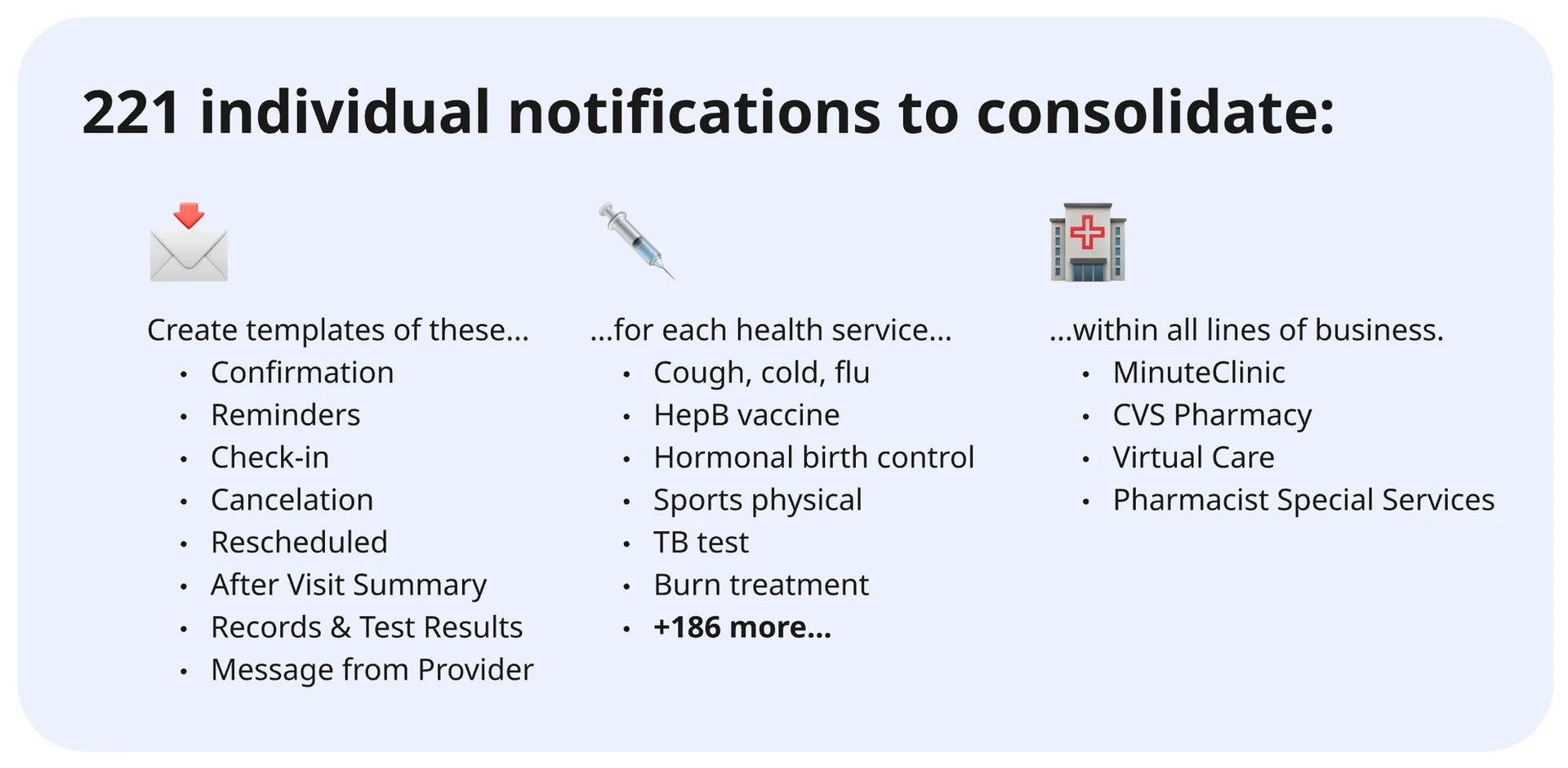
CVS was managing 221 separately coded notifications across their health services — MinuteClinic visits, Pharmacy visits, Virtual Care, and more. Each was individually designed, individually coded, and individually managed.
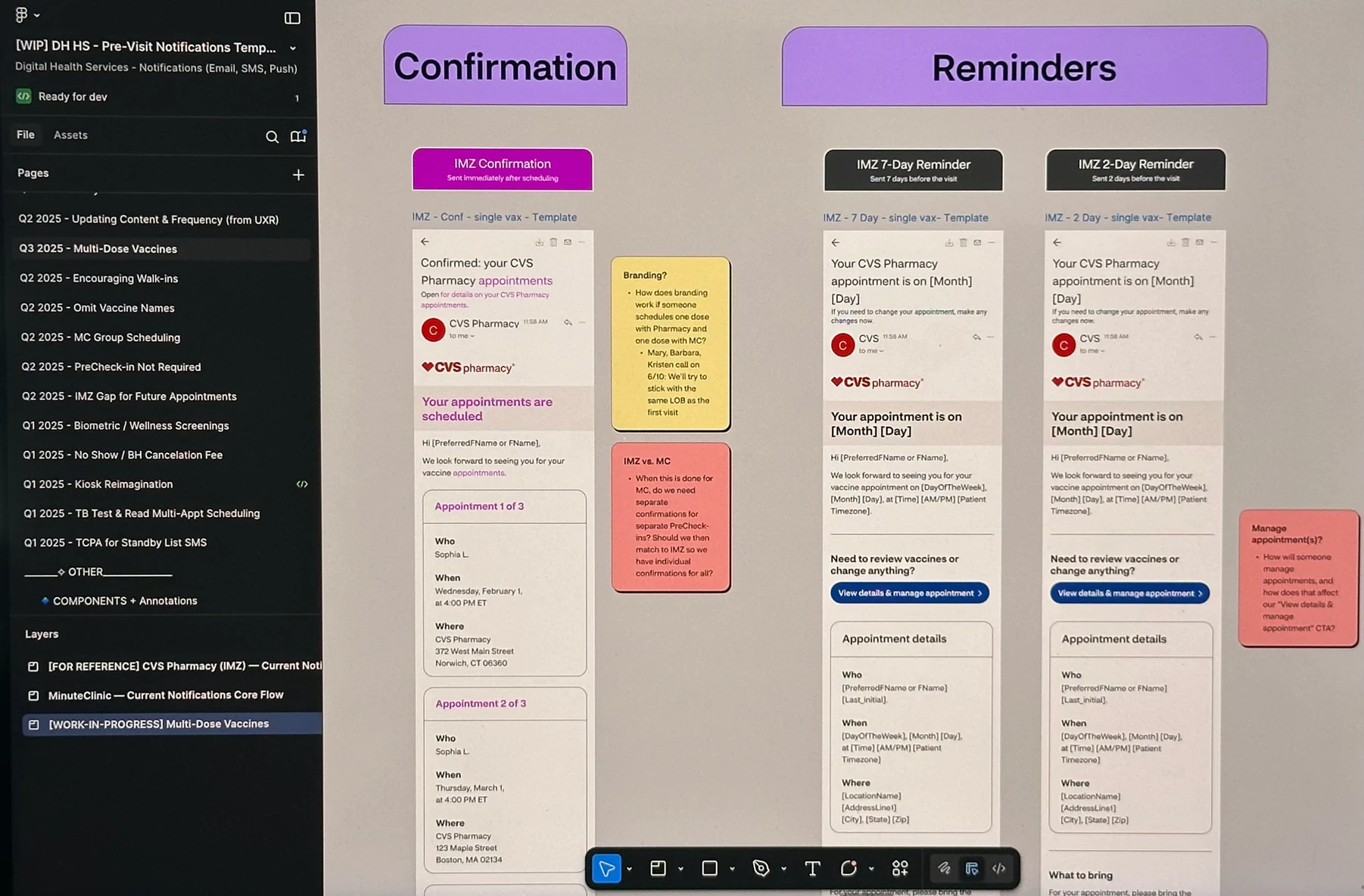
My team and I created a design system to unify email, SMS, and push notification designs, resulting in 23 user-tested templates that now serve as the foundation for every patient communication at CVS Health.
This case study covers the creation of that system and its application to confirmation emails. Work in 2024 and 2025 — expanding to reminders, check-ins, cancellations, reschedules, post-visit notifications, SMS, and push — is covered at the bottom.
CVS had 221 notifications that were individually coded with varying designs and content, managed in different BCC (Business Controlled Content) slots. Engineers had to manually update each one — a process that was becoming unsustainable.
For patients, this meant an inconsistent experience every time they received a notification from CVS. For the team, it meant design and content changes that should take minutes were taking days.
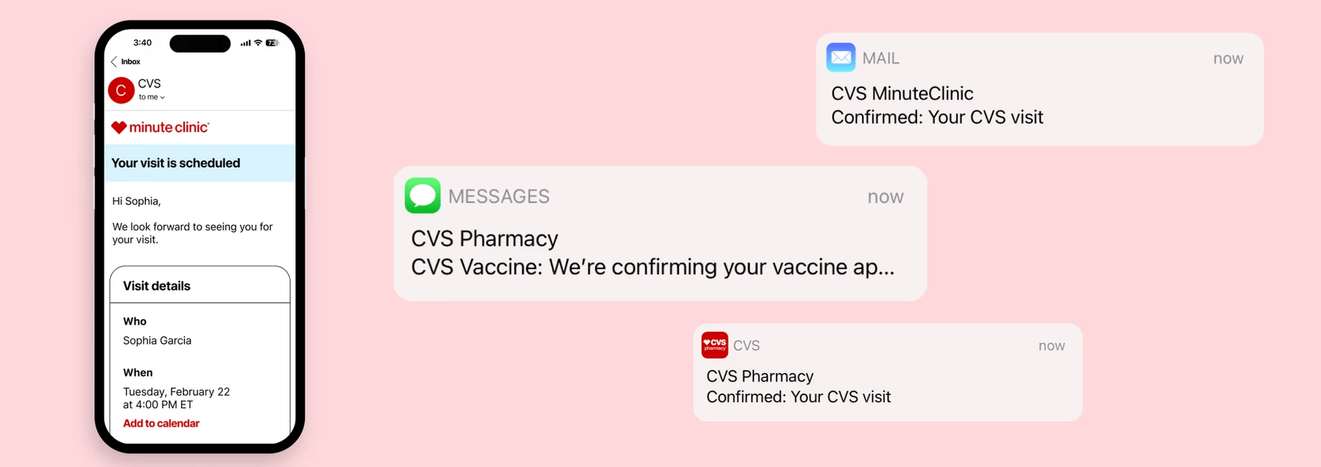
Confirmation emails alone had significant variation across service lines:
The full scope: notification types across every CVS health service and line of business.
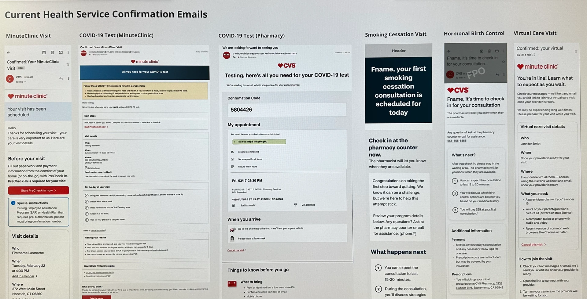
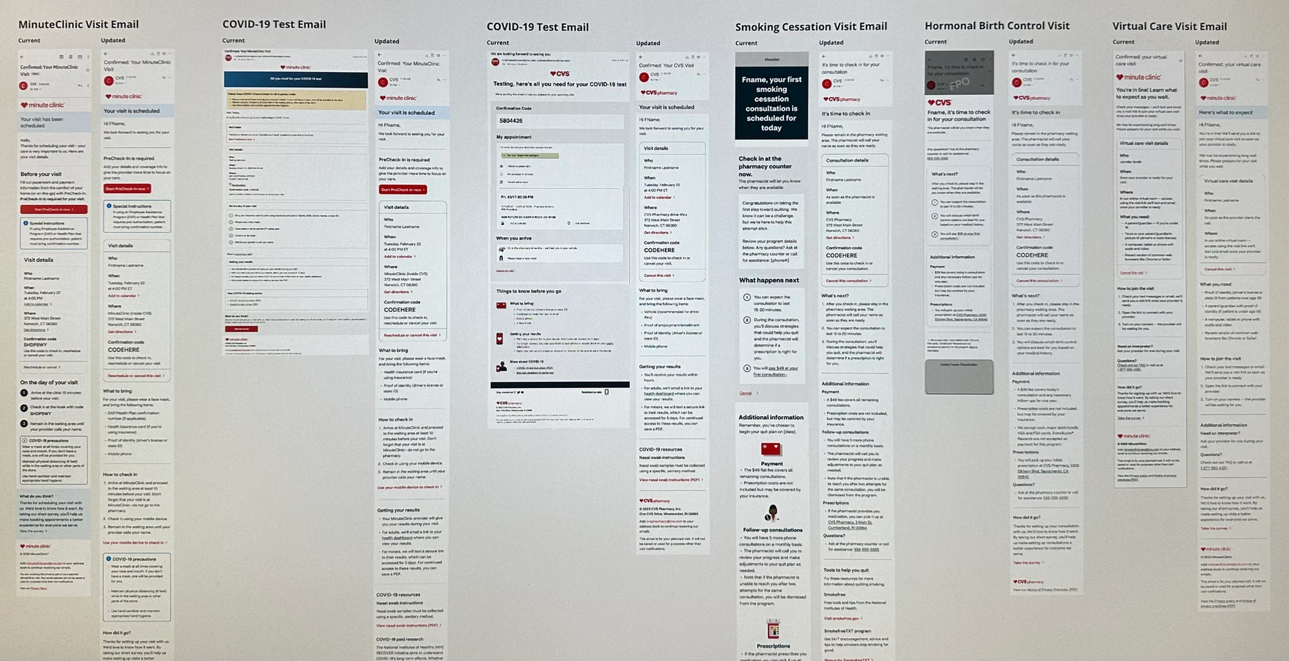
Examples of health service confirmation emails prior to the redesign — each with different design, content, and branding.
I worked closely with Jordan Williams, our Senior Design Lead, to map out a step-by-step approach to consolidating the design and content of the emails, then delegate it effectively to the team.
We understood we needed to: gather all existing emails, identify common sections, create a new template, and then design new emails based on that template. We reviewed the plan with Product and Engineering leadership to validate the timeline, then I planned the work across 2-week sprints — five sprints in total.
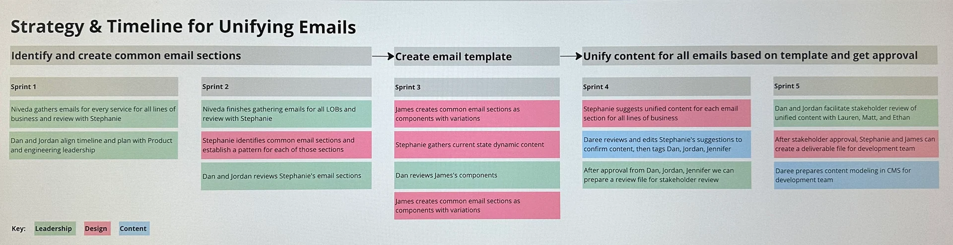
Our phased consolidation strategy and timeline, broken into defined roles and sprint milestones.
After Niveda gathered all confirmation emails for every service, Stephanie reviewed them to identify common sections that appeared across every line of business:
Within each section, she identified common elements: headings, paragraph text, and CTAs. With this mapping complete, there was now a consistent pattern for every part of a confirmation email, regardless of line of business or service type.
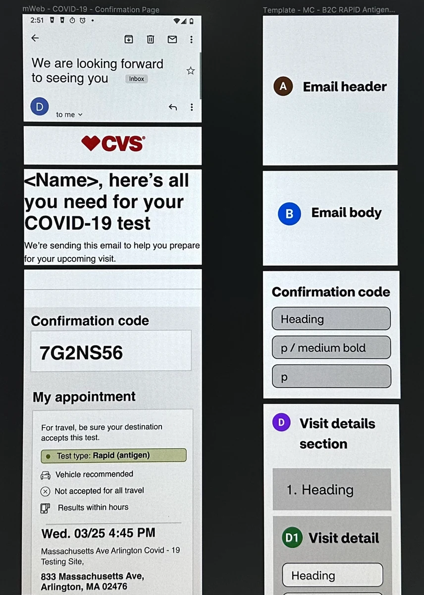
Email sections identified: header, body, confirmation code, and visit details.
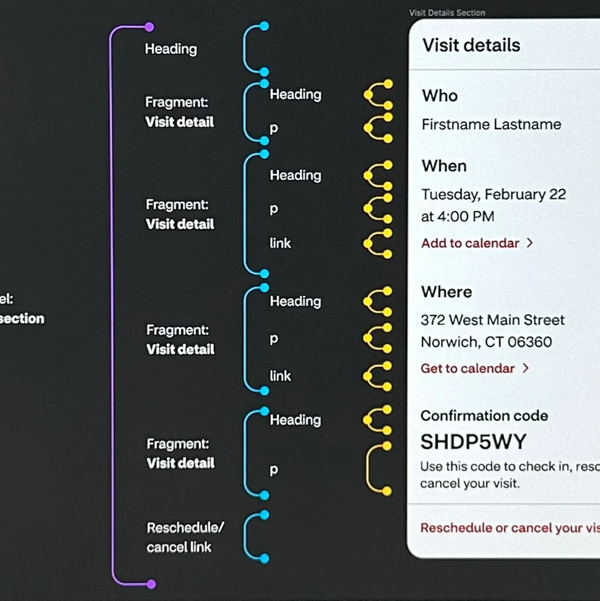
The Visit Details section, broken into headings, body text, and links — a universal pattern for every email type.
Our Visual Design Lead James Quirk took Stephanie's common sections and built them as Figma components — each one designed to contain all the information that could possibly be needed, but able to show less when a particular service didn't require it.
For example, "Confirmation code" wasn't needed for Virtual Care visits, so that part of the component could be toggled off. The challenge James and I worked through was making components flexible enough for edge cases without becoming so complex they were difficult to use.
The result: any designer could pull components from the library, toggle the information needed, and drag-and-drop them to build a complete email.

Component variants for each email section, built to cover all possible service and line-of-business combinations.
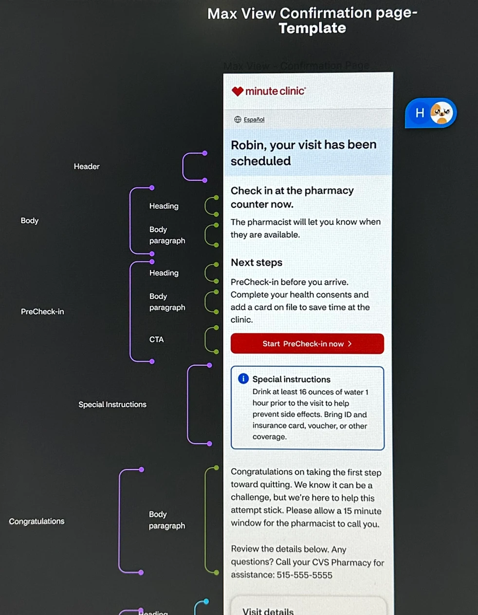
The "Max View" confirmation template — every possible section, built from James's components, ready to be configured for any service type.
While James built the components, Stephanie gathered existing content for each email section across every line of business. The inconsistency was striking — the email header alone had five different variations:
Our Content Strategist Daree reviewed Stephanie's findings and consolidated them. In this case, five headers became two:
Consistent content doesn't just improve the patient experience — it means CVS teams have far less to manage. A single change can now update multiple emails at once, instead of each one separately.
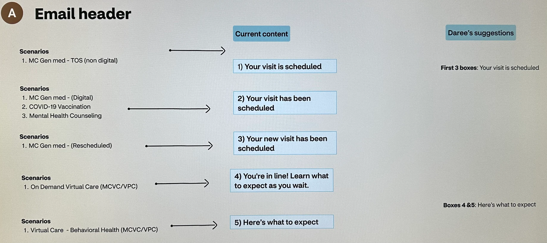
Before and after: five inconsistent email headers consolidated into two clear, consistent messages.
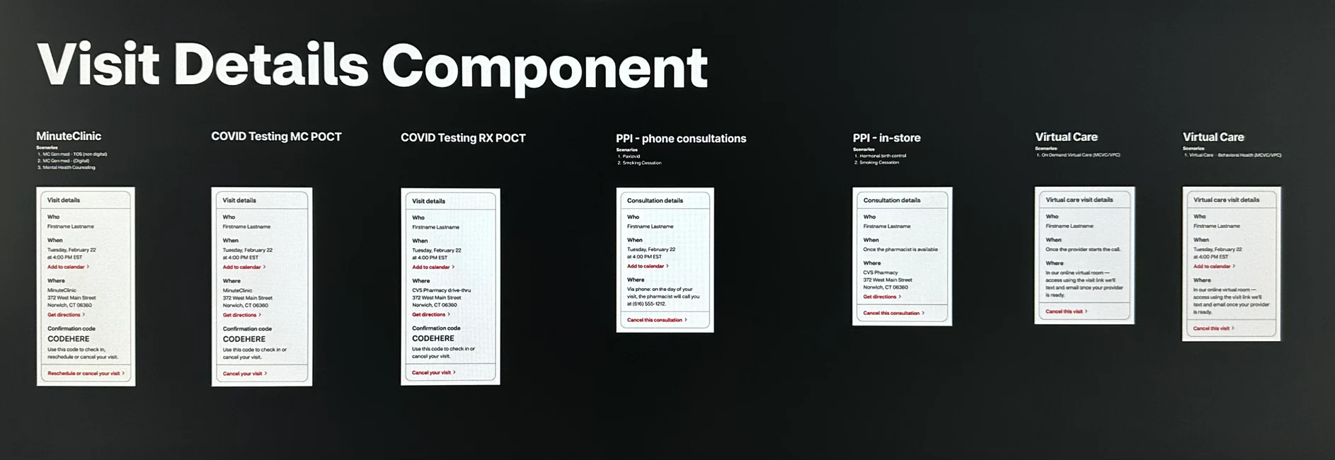
The Visit Details component applied across lines of business — MinuteClinic includes a confirmation code, while Virtual Care and Pharmacy visits do not.
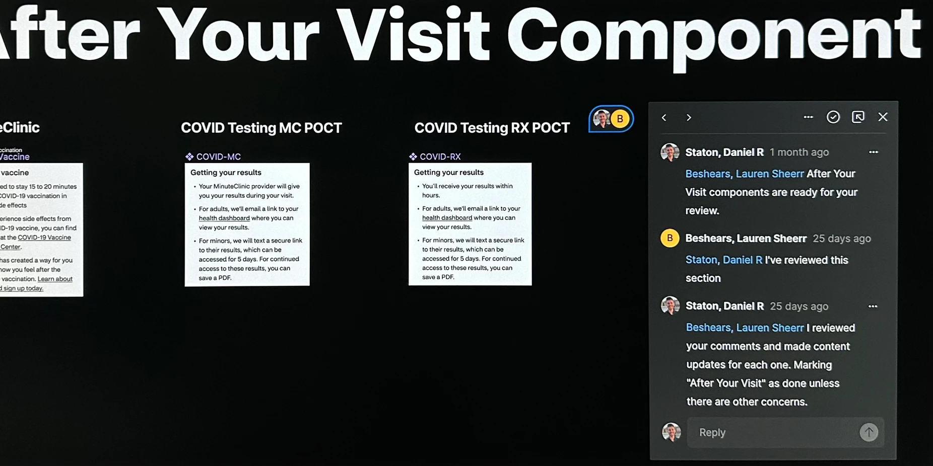
Once Stephanie completed each email using James's components and Daree's content, I looped in our Product Director Lauren to review from a business perspective. Based on her feedback, I made content adjustments directly — keeping the revision loop tight and moving quickly.
Jordan and I then facilitated broader stakeholder reviews, meeting with business partners across each line of business — including Product, clinical partners, legal, security, and other stakeholders. KC attended those meetings and made content adjustments in real time.
Reviewing components with Lauren, our Executive Product Director, to validate designs from a business perspective.
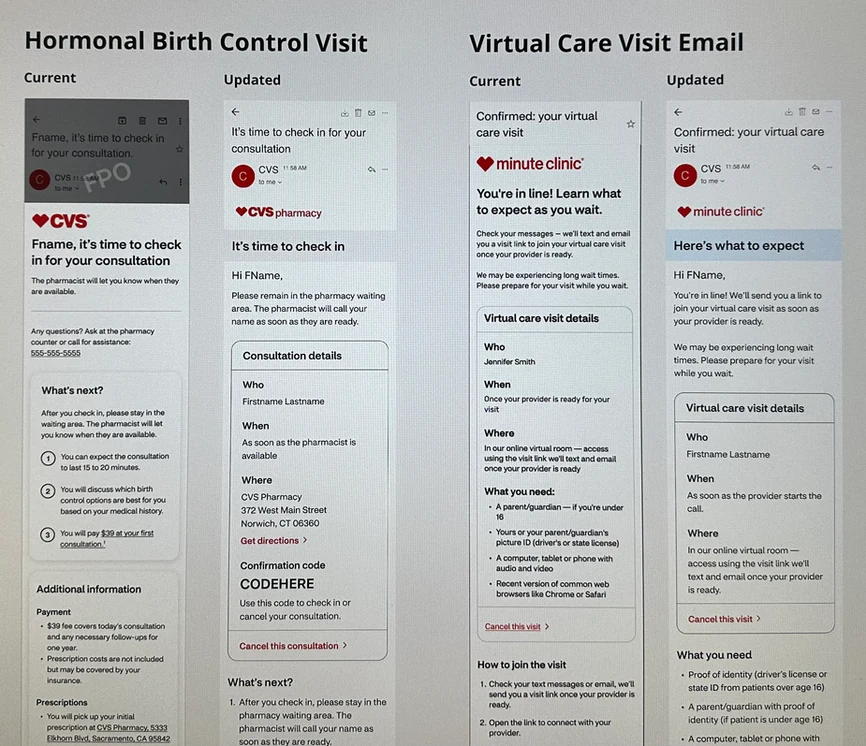
Hormonal Birth Control visit email and Virtual Care visit email.
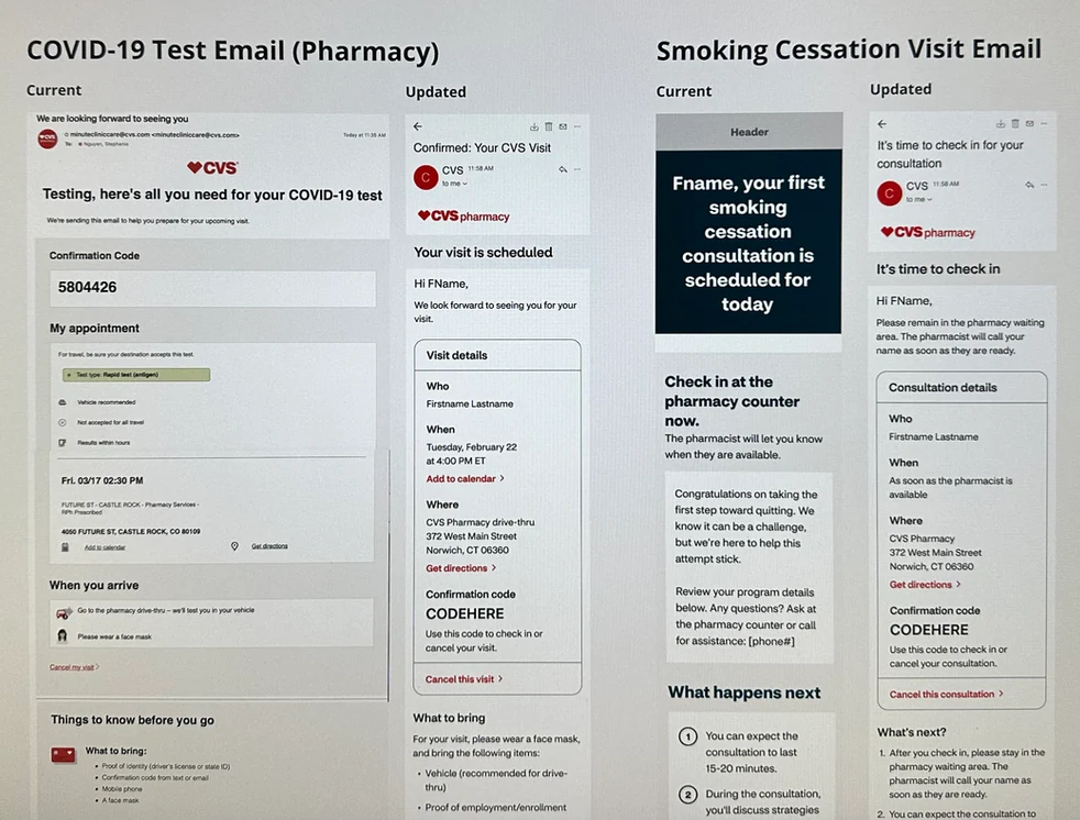
COVID-19 test email and Smoking Cessation visit email.
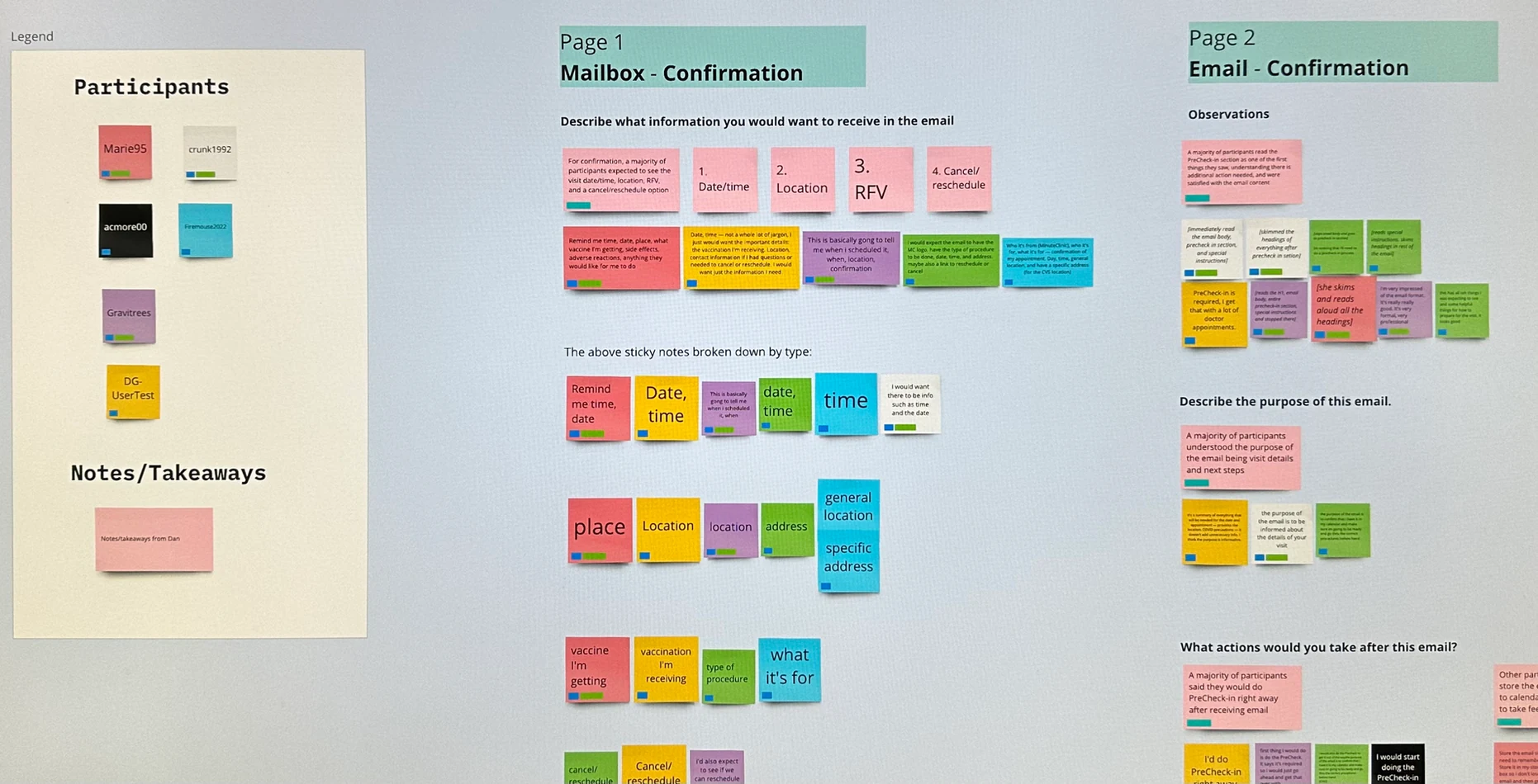
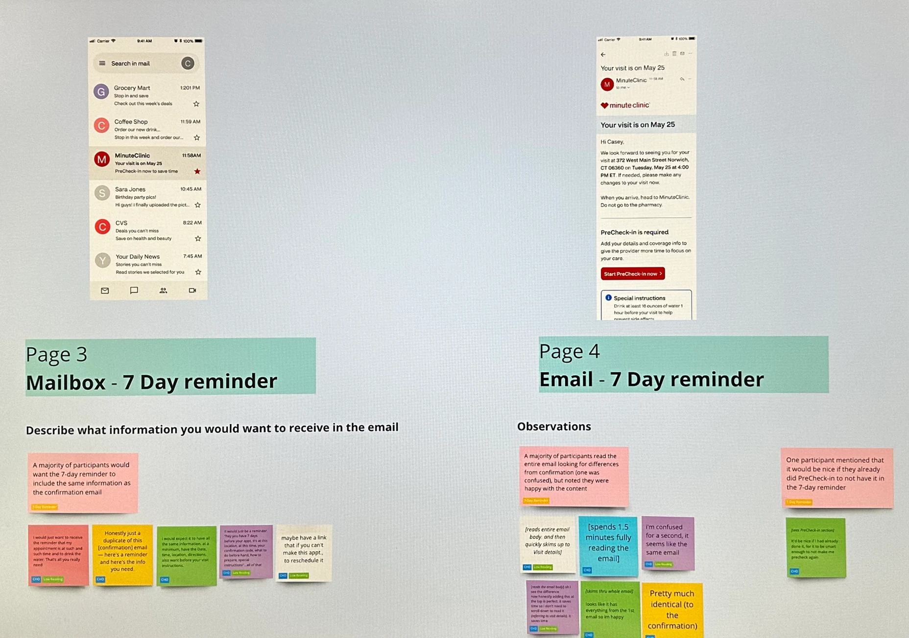
Stephanie, KC, and I designed a research study to validate our email designs, content, and CTAs against real customer comprehension and expectations. We tested across four task areas:
We submitted the test to UserTesting.com. Stephanie took detailed notes on all sessions, and I did the analysis — reviewing notes per question, drawing conclusions, and mapping insights back to our research goals.
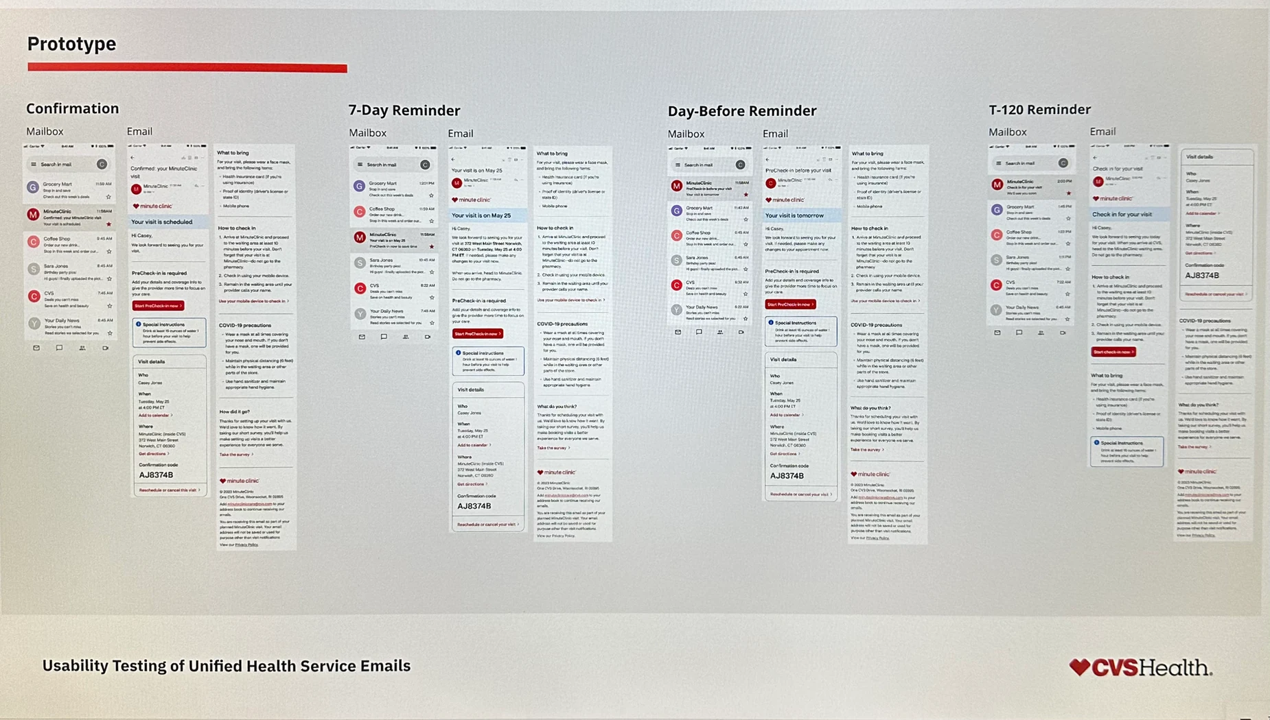
Prototype of mailboxes, confirmation emails, and reminder emails built by James and Stephanie for the usability study.
Summary of findings presented to design, design leadership, Product leadership, architecture, and engineering.
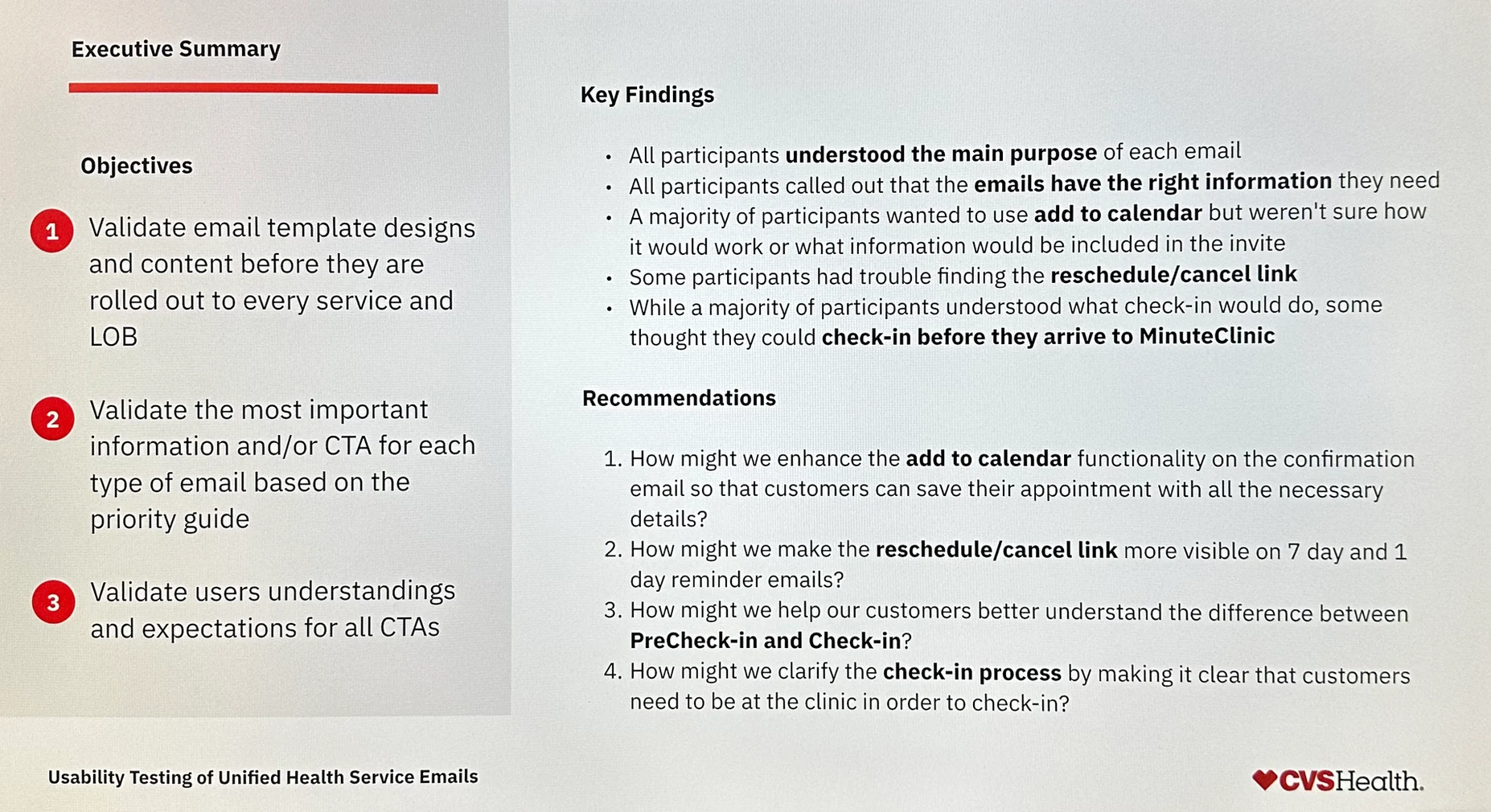
All participants understood the purpose of each email and said the information matched their expectations. But testing also surfaced important issues to address:
Next steps from testing: replace generic "Add to calendar" with "Add to Google Calendar" and "Add to Apple Calendar," visually emphasize the reschedule/cancel link, and conduct a follow-up study on PreCheck-in terminology.
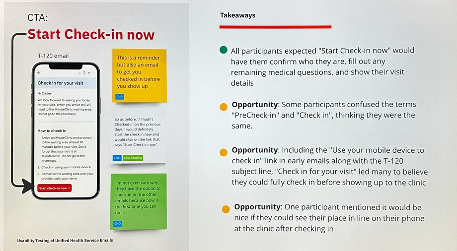
Testing revealed confusion between "PreCheck-in" and "Check-in" — two distinct processes that needed clearer differentiation.
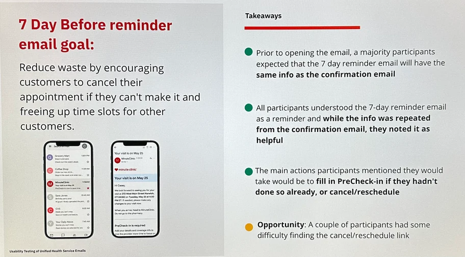
Participants consistently found the reminder emails helpful and said they matched expectations.
My team successfully executed on the full consolidation strategy. What started as 221 separately managed notifications became a unified, validated, scalable design system in a single quarter.
Before and after: old designs on the left, consolidated new designs on the right, for each line of business.
The design system we established proved wildly successful. After confirming emails, we rapidly consolidated reminders, check-ins, cancellations, reschedules, and post-visit notifications. We then added SMS and push notification components to the system.
Today, some notification requests can be completed in under an hour for small copy improvements. Larger requests can be mocked up quickly for discussion and iterated upon for fast delivery — something that was impossible before the system existed.
I integrated Writer AI — which connects to CVS's content style guide — to check grade level, align copy with CVS tone, and reduce text length for notifications. Research and design tasks that used to take days now take hours.
Cora Books and I collaborated on adding illustrations within emails, based on analytics showing patients weren't always completing PreCheck-in or reviewing full visit details. The illustrations helped draw attention to key sections. All illustration credit to Cora Books.
Our team added push notifications sparingly for specific use cases — for example, a check-in push when a patient is in the store. We made the deliberate call to keep push minimal, which was validated when later testing showed patients strongly prefer SMS and email over push notifications.
I partnered with Beth Koloski to run a preference test with 100 patients. The results surprised us — SMS was the most preferred channel for reminders, with email second for post-visit notifications. Push was not the convenience win we expected; patients found it overwhelming. We adjusted messaging frequency accordingly.
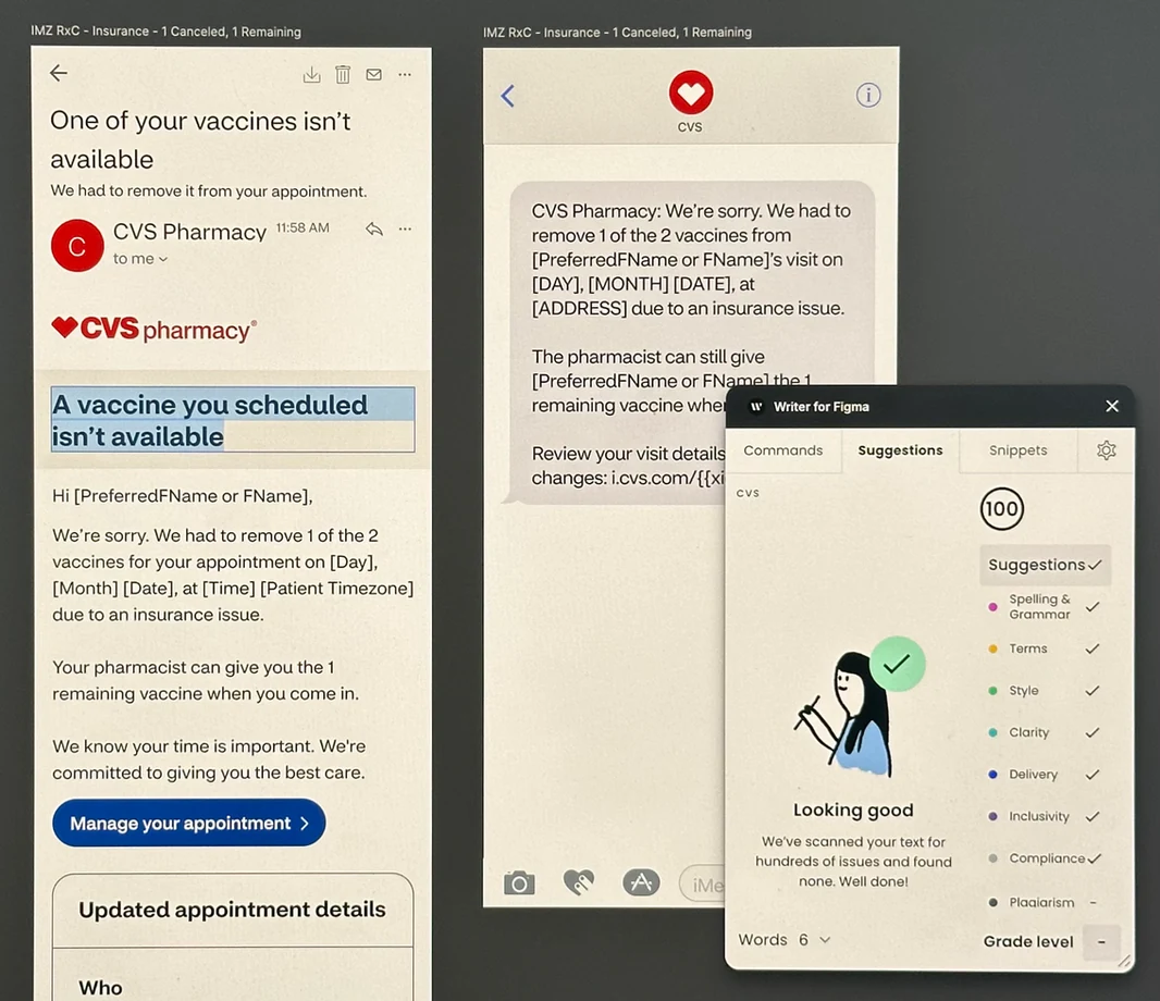
Writer AI integrated with CVS's content style guide for grade-level checking and tone alignment.
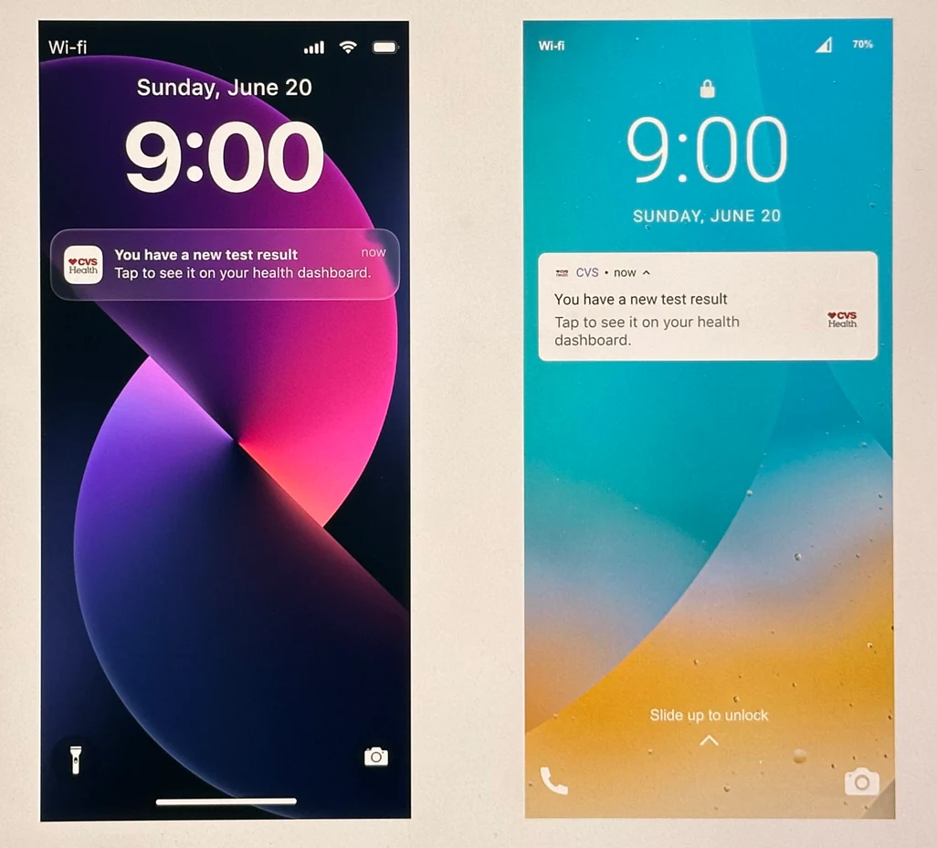
Push notifications, used sparingly for in-context moments like store check-in.
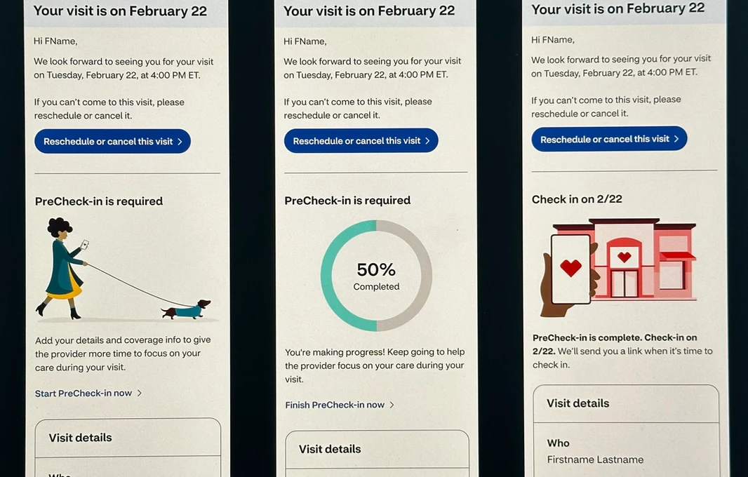
Updated PreCheck-in email with improved CTA clarity.
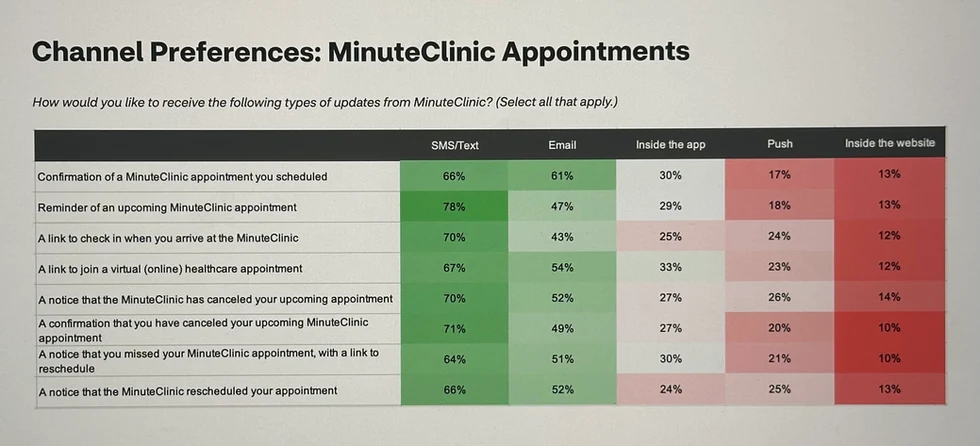
Channel preference testing results: SMS topped email for reminders, while push proved overwhelming.
We now send notifications to an average of 8 million patients per year — and continue to see that small tweaks and updates increase engagement. The templates proved to consolidate design and content in a way that's easier for patients to understand and easier for CVS to manage and evolve.